


![]() Google Maps Logo PNG
Google Maps Logo PNG
The Google Maps logo is a symbol of location orientation. Maps will always show in which direction to move and what is nearby. The bright shades of the emblem embody diversity and system settings for various landmark types.
Google Maps began in 2003 in Sydney, Australia, far from Silicon Valley. Danish brothers Lars and Jens Rasmussen founded Where 2 Technologies with Australian programmers Noel Gordon and Stephen Ma. The startup worked from a spare bedroom in Gordon’s apartment in Hunters Hill and first built its mapping product as a downloadable C++ application.
The project changed after talks with Google. Lars Rasmussen met Larry Page, who wanted a web service rather than desktop software. The team moved the product into the browser under a tight deadline, and Google acquired Where 2 Technologies in October 2004. Around the same period, Google bought ZipDash for real-time traffic data and Keyhole, whose Earth Viewer later became Google Earth.
Google Maps launched on February 8, 2005, as a desktop web service with US maps. Compared with MapQuest and its static route sheets, Google Maps lets users drag and move across the map in a browser without page reloads. In June 2005, Google opened the Maps API, giving developers a free way to embed maps into websites and services. By late 2006, Google Maps was integrated into Google.com search results.
Street View launched in May 2007 in San Francisco, New York, Las Vegas, Miami, and Denver, using camera-equipped cars to capture 360-degree street-level imagery. Mobile expansion followed with Google Maps for mobile 2.0 in November 2007 and an Android app in September 2008. In 2009, Google replaced Tele Atlas data with its own mapping base. By 2020, Google Maps had more than 1 billion monthly users worldwide.
Meaning and History
![]()
The web service is compatible with iOS and Android, so almost all owners recognize its logo on their mobile devices. Google Maps’ symbol has constantly evolved. It has evolved from a multicolored verbal sign into a combined logo containing a gray inscription and a colorful drop-shaped pin, the so-called marker. This pin is patent-protected and copyrighted by Google Corporation.
2005 – 2006
![]()
When Google introduced the new service, Google Local, in 2005, the logo reflected the parent company’s identity, with added elements that highlighted the product’s focus. The first version combined the Google name with the explanatory word Local, setting the platform’s direction.
The main part, Google, followed the company’s established style, with each letter in one of the brand colors: blue, red, yellow, or green. A serif typeface similar to Catull gave the letterforms smooth, soft contours. A gradient and subtle lighting effects added volume and a glossy feel, as if the letters were slightly floating above the surface, with light gray shadows around their outlines.
The additional word Local sat below the center of the top line and appeared much more restrained. It was orange, set in a simple sans-serif typeface, and smaller. The lower line indicated the service’s purpose, but it was intentionally less prominent so the main focus remained on the word Google.
2006 – 2009
![]()
The Google Maps logo emerged after the platform was renamed from Google Local in 2006, marking the service’s move to an international scale. The application now covers many countries, including the United Kingdom, Canada, and Germany, and the new name followed that expansion.
In the mark itself, changes were minimal. The word Google retained the serif style close to Catull, with smooth lines and slightly rounded letters. The color scheme stayed traditional. A light gradient and reflections added volume, while a subtle shadow around each letter emphasized their relief, creating a glossy effect.
The name Maps replaced the word Local. It remained in the same sans-serif typeface, restrained and even. The color stayed orange, as in the previous version, and the smaller size continued to mark it as a secondary element to the main wordmark.
The change in the lower word reflected the application’s new role, shifting attention to maps and global use.
2009 – 2010
![]()
In 2009, the Google Maps logo received a minor update. The composition dropped the vertical arrangement and moved into a single horizontal line. The service name was placed to the right of Google, and the lowercase letters gave the new mark a lighter feel.
The style of the main word Google remained largely the same. The letters maintained smooth forms and volume through soft shadows and slightly brighter lighting.
The word maps on the right were set in a simple, concise sans-serif typeface. The color became a solid blue. The contrast between the bright, multicolored Google word and the calm blue of maps kept the focus on the core brand, with the service name as a secondary element.
The linear layout and the word maps emphasized ease of navigation and a cleaner interface. The service became simpler and clearer to the eye without losing recognition.
2010 – 2013
![]()
The Google Maps logo update in November 2010 coincided with a redesign across Google products, including Gmail and Google Apps. Along with other services, Google Maps received a simplified mark, in which decorative elements were set aside in favor of restraint and minimalism.
The main part, the word Google, remained set in the familiar serif typeface similar to Catull. The colors stayed bright and contrasting: red, yellow, green, and blue. At the same time, the previous volume created by shadows and highlights was reduced. The gray shadows around the letters disappeared, and the gradient became less noticeable, giving the word a calmer, almost flat appearance.
To the right sat the word maps, set in a simple sans-serif typeface without decorative additions. The blue color remained unchanged, as did the lowercase letters.
The transformation reflected a broader move toward simplicity and clarity. The logo no longer appeared complex or dimensional, shifting toward flat visuals and calmer tones.
2013 – 2015
![]()
In 2013, Google Maps introduced an updated logo to accompany the launch of a mapping site with new functionality and satellite imagery. Alongside increased interface personalization and the addition of space views, the service identity moved further toward simplification.
The logo abandoned dimensional effects for the first time. The word Google kept its typeface and familiar set of corporate colors. The letters became flat, without gradients, highlights, or shadows, losing the previous sense of volume. The colors became brighter and lighter.
The word maps on the right remained unchanged. It used a simple sans-serif typeface, a consistent blue color, and lowercase letters.
With this update, Google Maps adopted a minimalist style, prioritizing clarity and typography.
2015 – 2020
![]()
As part of a broader modernization of Google’s identity, Google Maps received a redesigned logo. The global rebrand brought changes to typefaces, proportions, and the perception of both parts of the service name.
The word Google was now set in Google Sans, a geometric sans-serif typeface. The letters were softly rounded and appeared simpler and lighter than the previous Catull-based version. The brand color sequence remained the same: blue, red, yellow, and green.
The word Maps also changed. It used the same Google Sans typeface, visually aligning both parts, though with slightly thinner letterforms. The first letter became uppercase, the rest lowercase, and the color shifted from blue to gray. This reduced contrast but created a more unified and lighter appearance.
The updated typography conveyed a sense of technological relevance and currency.
2020 – 2026
![]()
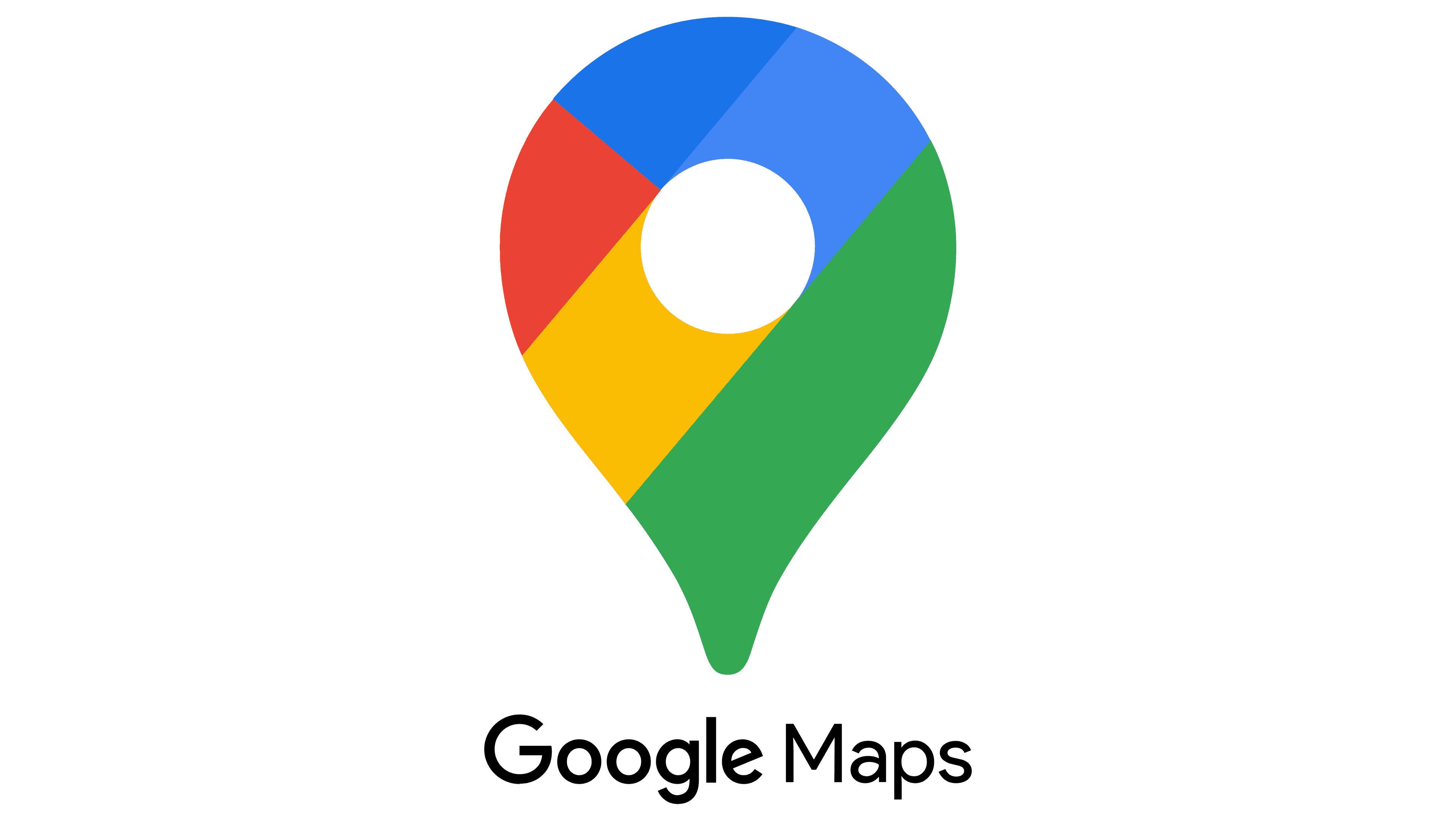
For the 15th anniversary of Google Maps, marked on October 6, 2020, the brand rethought its logo to mark a new stage in the mobile app’s development. The service had moved beyond basic navigation and had become an information assistant, offering a wide range of data to users worldwide. The new logo reflected that shift through a travel-and-orientation metaphor.
For the first time, a bright symbol was added alongside the text: a colored pin shaped like an inverted drop with a circular cutout. It had long existed as a standalone app icon and has now become part of the identity. The pin icon indicates the service’s core function, marking the start and end points of a route. The four main Google colors appear in segments across the shape, with blue shown in two shades for variation and depth.
The Google Maps wordmark is set in gray to avoid conflict with the symbol’s brightness and to balance the composition. The typeface remains the same, with rounded letterforms. The contrast between the words comes from their weight: Google appears slightly bolder, while Maps is thinner, making the text easier to read.
The colored pin on the left draws attention and becomes the main element, while the text moves into a supporting role. This distribution allows the pin to be used independently in interfaces and on mobile devices, reinforcing its association with the brand even without the name.
2026 – today
![]()
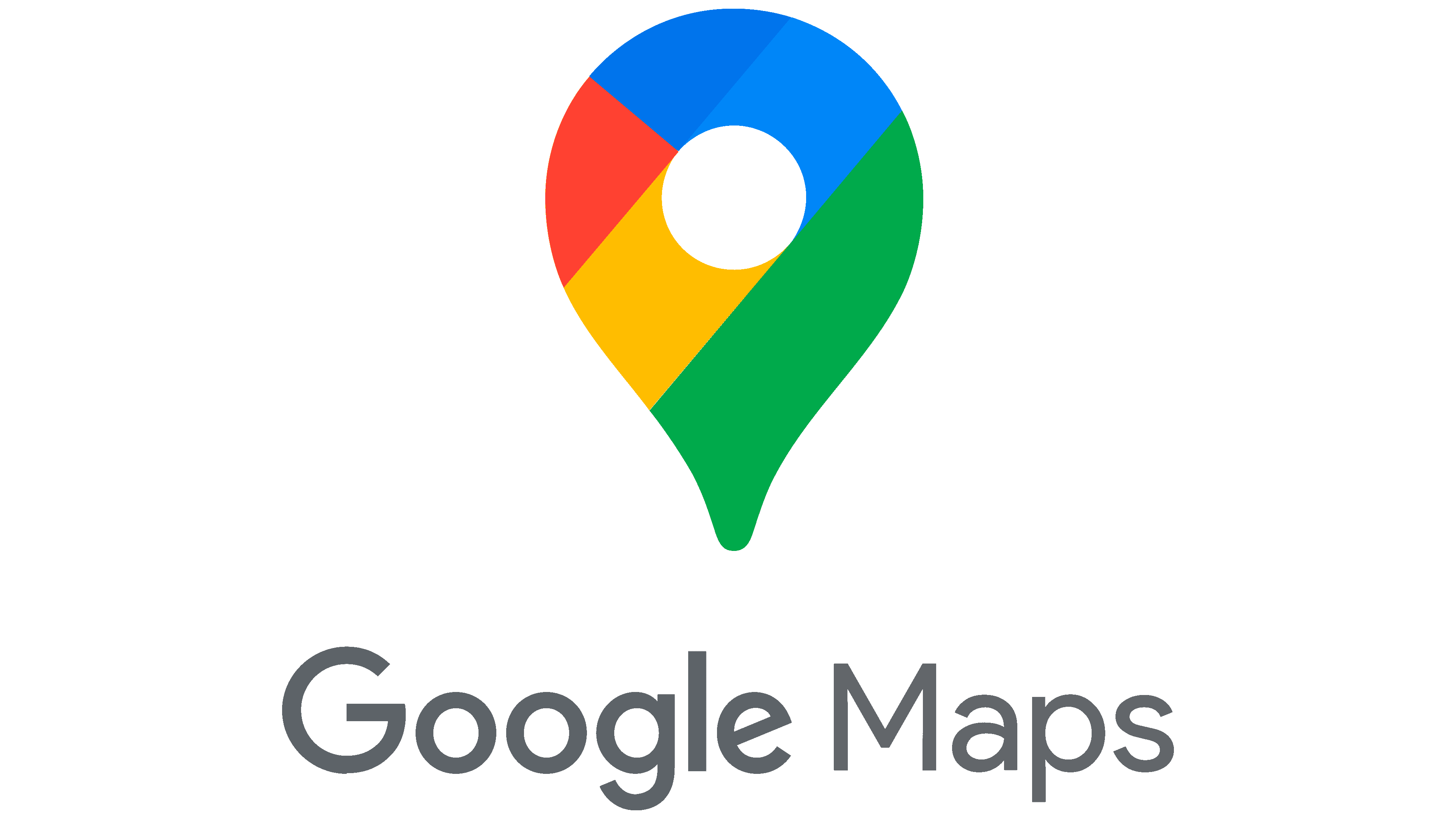
A new stage in the evolution of the Google Maps logo is marked by smoother forms and softer colors, giving the symbol a lighter, more cohesive appearance. The composition remains the same. The logo still consists of a symbol and text, but the overall perception has changed.
The pin on the left retains the shape of an inverted drop with a circular cutout inside, but it has become more rounded, resembling a balloon. Instead of a clear division into segments, the colors now blend through a smooth gradient, merging red, green, yellow, and blue into a continuous circle. The color boundaries disappear, creating a unified and soft visual impression.
The text part on the right of the pin has not changed in its main parameters.
The priority of the symbol over the text remains. The main emphasis continues to rest on the pin, which remains the key to recognition.
Icon
![]()
2009 – 2012
![]()
In 2009, Google users first saw the Maps icon. The icon looked like a miniature map folded into three parts, as if ready to fit into a pocket. The structure was rectangular, with a slight bend in the middle, making the central section appear slightly recessed compared to the right side.
The icon’s surface featured a street grid formed by intersecting roads. Yellow lines marked major routes, while narrower and less important roads were shown in gray. The remaining space was filled with brown and dark gray tones, creating a muted urban effect.
The lower edge of the map appeared to float above the surface, emphasized by soft, natural shadows. Light and shadow transitions enhanced the sense of realism and added a tactile quality.
The main visual accent was a blue marker placed at one of the bends. It resembled a glass sphere with a soft glow along the edges and a gentle gradient that shifted from a lighter center to more saturated edges. The marker stood out clearly against the overall composition, indicating a destination or a user’s location.
This was the first time Google Maps had its own expressive symbol, with high-level detail that helped the application stand out among other navigation services.
2012 – 2014
![]()
In 2012, Google Maps on Android received an updated icon that became simpler and clearer than the previous one. Designers moved away from dense detail and a complex road grid, instead dividing the map into large color segments.
The base remained rectangular, with two smooth folds that created volume. The map surface was divided into three areas: green, light beige, and blue. A single major intersection of yellow roads ran between them. The map scale increased, details were reduced, but the main focus remained on the intersection, emphasizing the navigation function.
A new element was the brand symbol, a lowercase “g” on the left. Rendered in white, it occupied nearly half of the area, slightly overlapping the map. The letter used a serif typeface with smooth contours and traditional serifs, referencing the classic Google style.
Another change affected the marker, now placed on the right. Its color became bright red, and the shape took on a drop form slightly extended downward. A subtle shadow beneath it made it appear to float above the map.
The overall perception became cleaner and calmer due to restrained gradients and softer shadows.
2014 – 2015
![]()
After another update, Google Maps received an icon that abandoned dimensional styling in favor of a flat surface. The user now saw a flat square with rounded corners, without the previous shadows and gradient transitions.
The surface was divided diagonally into color areas. In the upper left corner, there was a green section with a small white letter “g”. Its form used a serif typeface with smooth lines and traditional serifs, maintaining a connection to Google’s established style.
A diagonal yellow stripe crossed the icon at the center, dividing it into upper and lower zones. Below this line were two fields: a blue triangle and a darker gray area. A light stripe between them resembled road markings.
A larger red pin stood out on the right at the intersection of the areas. It retained the familiar drop shape but became bigger. Rendered in a solid red color without effects, the marker contrasted with the restrained overall style.
In this version, Google Maps moved toward flat design, removing excess detail and focusing on basic elements and colors.
2015 – 2020
![]()
Small changes can refresh a recognizable image without breaking its integrity. Google Maps demonstrated this again, as the icon changed by a single letter and the symbol’s size, while the overall appearance gained harmony and alignment with other Google services.
The base form remained unchanged: a square with softly rounded corners, divided into color segments by a yellow line. The red marker stayed in its usual position on the right but grew slightly, taking on a more prominent role.
The most noticeable change involved the letter. The previous lowercase “g” was replaced by an uppercase “G”. The typeface changed to Google Sans, a geometric sans-serif with simplified proportions. The new letter appeared cleaner and more natural within the company’s overall style.
The shift to an uppercase “G” and the increase in the pin’s size brought balance. The map appeared more unified, while the brand retained its visual identity with minimal changes.
2020 – 2026
![]()
Google Maps marked its 15th anniversary by simplifying the icon to its core. The service icon became a single symbol, a pin with a white circle at the center. All previous context of the map, roads, and letter elements disappeared.
The symbol is now a smooth drop-shaped marker with a pointed bottom. Its surface is divided into areas of different colors taken from Google’s standard set. The upper half features two shades of blue, along with red, yellow, and green sections. The color boundaries are sharp and unblended, though the two shades of blue create a slight sense of depth.
The central space is a clean white circle, representing the hole in the symbol.
Google Maps moved to a universal visual format that reflects its core function: indicating location.
2026 – today
![]()
By removing strict boundaries between color segments, Google Maps introduced an icon with soft color transitions and a smoother form. The symbol now appears more fluid and natural due to a unified gradient and a rounded silhouette.
The main outline is the familiar drop-shaped marker with a circular hole in the center. Compared to the previous version, the hole has increased in size. The overall look has shifted slightly, giving the icon a more inflated appearance.
Instead of sharp dividing lines, there is now a smooth flow of color. The gradient covers the entire marker, with colors blending seamlessly.
Font and Colors
The absence of a map on the Google Maps icon and logo can be interpreted as a hidden message. Initially, the app was an alternative to a paper plan of the area because it helped construct routes. But with the addition of new features, it became a global GPS capable of analyzing all surrounding objects. The service has become a tool for exploring the world, so using a clerical button without a map tells you that location comes first. After all, almost any location on Google Maps can be explored by reading reviews about it and looking at photos.
The marker symbol, in the form of an upside-down blob, only became part of the program’s official logo in 2020. But it has existed before: it has been used in promotional materials and in the app. The pin icon was designed by Jens Eilstrup Rasmussen, who wanted to use a simple icon to indicate a location on a map. The drop shape was chosen specifically so that the graphic element would not cover the marked points.
The new Google Maps icon is similar to other symbols of the Google branding system primarily because of its colors. It’s painted in red, yellow, blue, and green, with blue being two shades. The logo features a stylized pin complemented by gray lettering. For the web mapping service name, the designers chose the Product Sans font. All Google applications use this grotesque, geometric font with a beveled “e.”