All subsidiaries of this corporation use almost identical logos. This is the fundamental principle of the parent company, which does not intend to abandon it, so the Google Photos logo is as close as possible to the original structure. It shows the service’s relationship with other digital giant services.
Google Photos: Brand overview
Google Photos is one of Google’s basic services for uploading and storing photos and video files. It is shareware (up to 15 GB of content) and allows you to edit and share content with other users. The service’s developer is Lawrence Edward “Larry” Page. It is compatible with several popular platforms: Android, iOS, and Web.
Google began the Google Photos story in 2015 by separating the photo organization and storage features from the Google+ social network into a standalone product. Google Photos was officially introduced at the Google I/O conference on May 28, 2015.
Initially, the service offered users unlimited free storage for images up to 16 megapixels and videos up to 1080p. This quickly attracted users looking for a reliable way to store their media files.
A key feature of the platform was its use of advanced artificial intelligence and machine learning to organize and search images. The service could automatically identify faces, locations, and objects in photos, making it much easier to find the right images.
Within just one year, the app gained widespread popularity. By October 2015, the platform had 100 million active users. The company continued to improve the product by adding new tools for creating collages and editing photos.
In 2016, the service saw significant updates. The Memories feature was introduced, which automatically compiled collections of photos taken on specific dates in the past. It also became possible to share entire albums and receive notifications when others added new photos to shared albums.
In 2017, the platform added a pet recognition feature, making it easier for users to find pictures of their pets. The photo-sharing functionality was also enhanced, allowing users to share photos with contacts from their address book easily.
Several new features were introduced in 2018, including Color Pop, which allows you to highlight the main subject in color against a black-and-white background. The app also introduced Automatic Photo Enhancement, which uses machine learning to optimize exposure and color balance.
2019, the platform received a new photo-sharing tab and an updated interface. The “Live Albums” feature was also added, which automatically updated specific albums with new photos of certain people or pets.
2020 brought significant changes to the service. The company announced that starting June 1, 2021, it would no longer offer unlimited free storage for “high quality” photos and videos. This change was made to ensure the long-term sustainability of the platform. At the same time, new editing features were introduced, such as Portrait Light, which improves lighting in portrait photos.
In 2021, the platform changed its storage policies alongside various feature updates. A new feature called “Cinematic Photos” was introduced, making still images appear three-dimensional. The app also added the ability to lock specific photos within a password-protected folder.
In 2022, the service continued to advance. The “Real Tone” feature was added, improving the appearance of various skin tones in photos. The app’s video editing capabilities were enhanced, allowing users to create more complex video montages.
By 2023, the platform remained one of the leading services for managing and storing images, continuously adding new features. The company focused on developing artificial intelligence tools to improve photo quality and simplify photo organization.
Over the years, the platform has faced challenges, including competition from other cloud storage providers and the need to balance offering free services with maintaining financial sustainability. Despite these challenges, the product’s innovative features and ease of use have earned it the loyalty of millions of users.
Meaning and History
At first, this service was built into Google’s social network, which was organized to compete with Facebook. The virtual giant hoped for high popularity by launching its social networking site. Still, he failed to achieve it – neither a medium for user interaction nor a repository for photos. Therefore, he received the status of an offline image editor after some time. The presentation of the photo service in this role took place at the Google I/O 2015 conference.
As a result, Google Photos has changed its specialization, turning from a content exchange service into its repository. By the end of 2015, it introduced a Shared Albums feature, where users combine pictures by sharing them all at once. The recipient can add their photos and videos to it and set notification settings when new products appear. The service allows you to share full-size photos between iOS and Android mobile platforms.
However, the free content on Google Photos after independence was reduced to 15 GB. Anything above is monetized. Then, other applications and options were implemented to allow you to use the online platform conveniently in any life situation. For example, add pictures thanks to PhotoScan. One of the latest implementations is a feature that shows a heat map of the location of photos. In 2020, the parent company noted that the site already has over 4 trillion images because it has gained popularity and is well recognizable by its authentic symbols.
What is Google Photos?
Google Photos is one of the services of Google, which is its parent company. The service is designed to host user photo and video content for storage, viewing, editing, and sharing. The platform developer is Lawrence Edward “Larry” Page, one of the founders of the Internet Corporation. Previously, the site was part of the Google+ structure, but in 2015 it gained independence.
2011 – 2015
The 2011 Google Photos logo is the brand’s first visual representation, reflecting the era when cloud technologies were just gaining momentum. The centerpiece is a bright, stylized pinwheel of four petals in Google’s classic colors: red, yellow, green, and blue. The petals create a dynamic and light image, symbolizing movement and constant renewal, emphasizing the key function of the service—storing and organizing photos. At the center of the emblem is a white star, reminiscent of a camera flash, symbolizing important moments and memories captured in photos.
The logo’s background features a smooth gradient transitioning from light blue to deep blue. This background evokes the sky and clouds, directly referencing the idea of cloud storage—making photos accessible at any time and from any device. The light shades create a sense of ease and simplicity when using the service, highlighting the idea of accessibility and reliable storage.
A white frame around the pinwheel visually separates the emblem from the background, giving it clarity and completeness. It creates the effect of a photo in a frame or album, reinforcing the association with memory storage. The dimensionality of the petals, achieved through shadows and gradients, adds a sense of “physicality” to the logo, a popular design trend at the time.
2015
The logo, which resembles a pinwheel, consists of four bright diamond-shaped elements, each split into two parts with different shades. This design highlights the diversity and richness of colors found in photos. The classic red is paired with magenta-purple, deep green with a more pastel shade, sky blue with bright blue, and yellow-orange with vibrant yellow. This palette emphasizes that Google Photos is where memories are preserved in all their shades and details.
The blades of the emblem are connected so that a hollow space remains in the center, resembling a white star with four points. This element can be interpreted as a flash from a camera, symbolizing light and the moment captured in a photograph. The previous background of the visual mark has been removed, making it more modern and light while maintaining its brightness and recognizability.
The logo conveys a sense of movement, reminding us that photos and memories are always revolving in our lives. This design aligns with the service’s concept—simplifying and organizing a digital photo archive where any image can be found, regardless of its date or location.
2015 – 2020
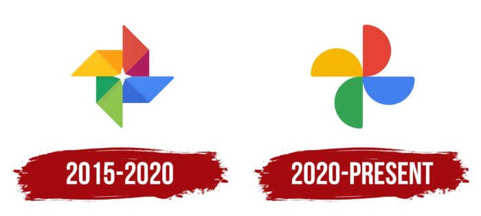
This logo, which has remained almost unchanged, reveals several noticeable changes upon closer inspection. While the blades’ overall appearance and arrangement have been retained, the corners of the elements are now more rounded, giving the emblem a softer and more approachable look. This move emphasizes the trend toward simplification and visual “softness,” often seen in modern brands.
The petals now have a slight outline, creating a subtle 3D effect. This detail becomes noticeable only when the image is enlarged, giving the logo a more “tangible” appearance as if it were made of real materials. This effect of depth highlights the sense of “layers,” possibly symbolizing the depth of memories and photos stored within the service.
The blades’ colors have become slightly lighter and less saturated than the previous version, making them more subdued and pleasant to the eye. This change may reflect a desire for the visual elements not to distract the user but to support the service’s core functionality.
The logo maintains its traditional colors, symbolizing its connection to the Google ecosystem: yellow, red, green, and blue. These continue to highlight the brightness and variety of the photos users store. In the center, the white star remains—it still symbolizes the flash of a camera, serving as a reminder of the process of creating photos and capturing important moments.
2020 – today
The new Google Photos logo retains its brightness and recognizability but has a redesigned look. The main change is the shift from the pinwheel shape to a more simplified geometry. Each blade has been replaced with a solid-colored semicircle, giving the visual mark a more structured and modern appearance. Google’s bright corporate colors—yellow, red, blue, and green—remain, but they now better emphasize the connection between the service and its parent company.
The symbolism of the emblem lies in its simplicity and clarity. The semicircles gathered at the center represent unity and order, reflecting the main purpose of the service—to organize users’ photos and make them accessible at any time. Unlike the old logo, which resembled a star or flower, the new one is more minimalist and underscores the company’s commitment to simplicity and clarity across its products.
The connection of the semicircles at the center creates a sense of movement and interconnection—exactly what happens with your photos: they are synced, organized, and always available. Now, the elements are more tightly connected at the center, symbolizing the system’s cohesion and reliability.
This redesign reinforces the service’s connection to the Google brand, enhancing the sense of unity within the ecosystem. The logo appears more mature and serious, aligning well with modern trends toward simplified design and a focus on functionality. As seen in other company products, the new Google Photos emblem reflects the trend toward minimalism and lightness.
Font and Colors
The evolution of the Google Photos logo has moved from a complex “childish” theme to a serious but simple one. This is clearly seen in the design of geometric figures: at first, rhombuses were shown, divided into triangles, and now semicircles are drawn. The same thing happened with color. There are only four if there were eight shades earlier in the emblem.
The official logo lacks text, so there is little to say about the typographic elements. But his color, on the contrary, is incredibly diverse and saturated. First, it conveys the proximity of the Google Photos service to other services in the family that are colored in the same gamut. Second, it reflects the colorfulness of the photographs collected from its users.