


![]() Google Play Logo PNG
Google Play Logo PNG
Brightness and variety are the main distinguishing features of all Google services. The Google Play logo signals a large family of products known worldwide. The emblem inspires confidence. To use the content, just click on the button.
In March 2008, Apple announced the App Store, setting a new model for mobile software distribution. Google responded on August 28, 2008, by launching Android Market on October 22 alongside the first Android devices. At the start, all applications were free.
Paid apps appeared only in February 2009, initially in the US and UK, with wider rollout reaching 29 more markets by September 2010. Growth was rapid. Within two months, the store reached 3,000 apps and 100 million downloads. By 2010, Android activations were reported at 400,000 devices per day.
In February 2011, a web interface allowed remote installation from a browser. At the same time, Google expanded into digital content with Google eBookstore in December 2010 and Google Music in 2011, each operating as a separate service.
On March 6, 2012, Android Market, Google Music, Google eBookstore, and Google Movies were merged into Google Play. The platform launched with 450,000 apps, millions of tracks, films, and books. App size limits were increased to 4 GB, and by the end of 2012, downloads reached 22 billion. Gift cards were also introduced that year.
In May 2012, in-app subscriptions were added and later became a key monetization model. In September, Google Play Services enabled updates to core Android components without full system upgrades.
By 2014, Google Play became the company’s largest non-ad revenue source. The same year brought PayPal payments and expanded app details. In 2015, hardware sales moved to the Google Store. In 2016, Play apps adopted a unified icon style and expanded to Chromebooks. Later, Play Music was replaced by YouTube Music in 2020, and Play Movies & TV evolved into Google TV in 2021.
Meaning and History
![]()
As Google customized the graphical icons for its services, it created a coherent identity that unified its products. Therefore, the Google Play logo evolved alongside it, eventually adopting a modern design.
There has been a dramatic transition in the app store’s history from the green robot logo to the triangular button icon. This happened in 2012, when the portal leaders rebranded the Android Market as Google Play. Since then, many new versions of the logo have appeared, combining a multi-colored triangle with a gray inscription. Such a contrast apparently attracts attention and is well remembered; therefore, the brand owners are in no hurry to change the symbol. They adjust the shape of the elements and experiment with different shades.
What is Google Play?
This is the name of the Google online store, which allows software developers to distribute their applications and allows users to download them to mobile devices. It also offers movies, music, games, and books for sale. The web service was launched in 2008 as Android Market and was renamed in 2012.
2008 – 2011
![]()
In 2008, the online store Android Market was added to the Google family of applications. Its emblem featured elements associated with the popular operating system: a green robot and gray “android” lettering, using a custom font with open letters. The green word “market” was located under the OS name. The first thing that caught my eye was the rounded corners and fuzzy shapes. The text on the left reads “white shopping bag” with two black handles and a familiar image.
2011 – 2012
![]()
Three years after launch, the app store updated its logo. A new font was chosen for the phrase “Android Market,” simpler and sans-serif. Simultaneously, the colors were reversed: the first word became green, and the second, on the contrary, gray. The robot bag has been expanded and expanded. Due to the darkening at the top, it appeared to be bent in the middle.
2012 – 2015
![]()
After the rebranding, the Android Market portal was renamed to Google Play, so the old icon was no longer relevant. The designers gave the service a new name on the logo, using the same font for the first word, familiar from Google logos: Catull, with serifs. “Play” was written in sans-serif letters. On the left was the silhouette of the play button, painted in four colors: blue, red, orange, and pale yellow. The gradient created a 3D effect.
2015 – 2016
![]()
The font was changed in 2015 because Google ditched Catull in favor of Product Sans. As a result, both words were spelled the same. The rounded triangle icon remained the same, but not for long – this version was used until April 2016.
2016 – 2022
![]()
The latest logo redesign has brought the colors closer to the official Google palette. The graphic now has no gradient. The pattern consists of four well-defined segments colored in vibrant shades of blue, green, yellow, and red. The inscription, as before, is gray.
Since 2016, the application’s name has been written in Product Sans, the same font used for the Google logo on the parent company logo. It’s a streamlined sans-serif typeface with a swollen “e.”
The color palette also aligns with Google’s identity. It includes red (#ff3333), yellow (#ffd400), light green (#48ff48), and cyan (#3bccff).
2022 – today
![]()
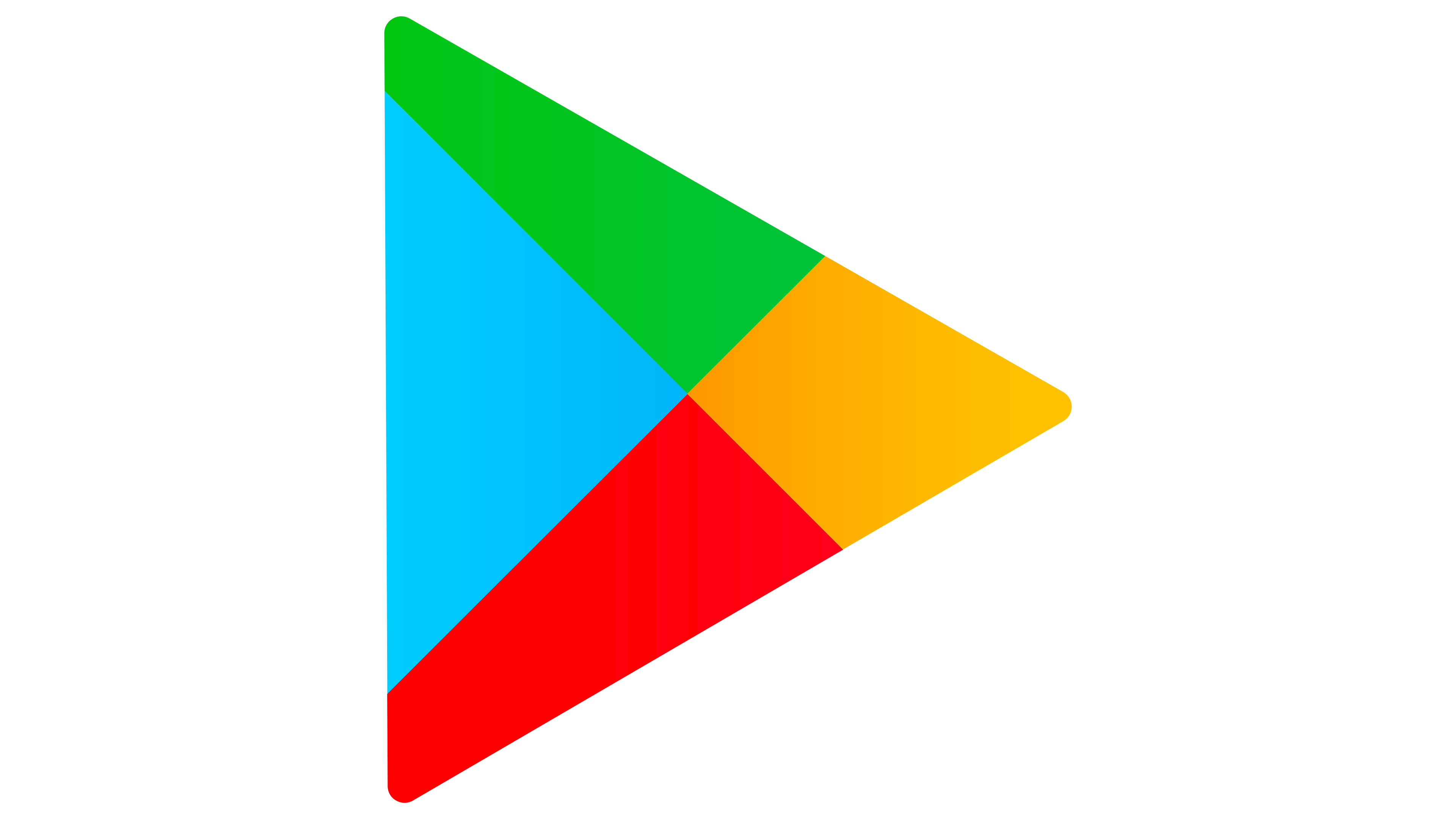
In 2022, the app store celebrated its 10th anniversary of being named “Google Play.” In honor of the round date, he updated the identity and introduced a corrected logo that became flat due to the absence of a gradient. Designers have kept the primary colors but changed their shades: now, blue, green, orange, and red are more saturated and brighter. The triangular icon is also in place, but only its shape was affected, as the developers rounded all the corners. The triangle, as before, consists of four multi-colored blocks. At the same time, these parts look much more proportional than in previous versions of the emblem. The blue fragment is scaled down to make room for the other colors.
The balanced symbol is combined with a well-read “Google Play” inscription. She became noticeable after the designers chose a dark gray instead of light gray. It didn’t affect the font itself.
Font and Colors
![]()
The online store’s current logo resembles the icons of other Google services (music, games, books, films). Each contains a colorful play button silhouette and a symbol indicating the media type. Only Google Play has the triangular button; it is bright enough without it.
The font used in the Google Play wordmark is called Product Sans. This is a modern geometric sans serif designed specifically for Google and to unite its brands. It was created in 2015 based on four typefaces: Avenir, Tempo, Neuzeit Grotesk, and Futura. The influence of Futura is most noticeable, except for the very different “a.”
The gray inscription is combined with a triangle that incorporates all the corporate colors of the American corporation. After a 2022 redesign, their shades are closer to the “reference.” The green (#34A853), yellow (#FBBC04), red (#EA4335), and blue (#4285F4) are now vibrant enough to match the palette of other new Google logos.
FAQ
What is the symbol of Google Play?
The symbol is a distinctive triangle inspired by the play button. Positioned on the left-hand side of the logo, it consists of three partly overlapping semi-transparent triangles. These triangles differ in shape, proportions, and colors, creating a vibrant watercolor effect.
This design choice gives the logo depth and movement, reflecting the diverse and dynamic content on the Google Play platform. The semi-transparent triangles add layering and complexity, symbolizing the variety of apps, games, music, movies, and books available.
The bright and colorful logo makes it stand out and is easily recognizable. Its playful and modern look aligns with the brand’s identity, emphasizing innovation, creativity, and accessibility.
Has the Google Play logo changed?
Yes, the logo has changed over time. The most recent update includes more rounded corners on the triangle, a noticeable change without a complete overhaul.
The last major redesign was in 2017 when Google removed the shopping bag icon from the Play Store logo. These updates show Google’s effort to keep the logo fresh and modern while maintaining its core elements.
What is a Google Play badge?
A badge is an official graphic promoting apps, games, music, movies, and books on Google Play. Marketing campaigns use badges to direct users to download or purchase the content.
The badge usually features the Google Play logo and a call to action such as “Get it on Google Play.” This creates a clear and recognizable link to the platform. The badge makes the promotion look professional and easy for users familiar with Google Play to identify.
What does the Google Play logo mean?
The logo is a colorful triangle that resembles a play button. This design was created when the service was renamed to Google Play. The triangle represents “Play,” reflecting the platform’s focus on digital media and entertainment, including apps, games, music, movies, and books.
The logo is meant to be straightforward and recognizable, capturing the platform’s purpose without additional meanings. Its vibrant colors and simple design make it easily identifiable, reinforcing the brand’s identity and helping users quickly associate it with digital content and entertainment on Google Play.
What is the font of the Google Play logo?
The font used for the wordmark is called Product Sans. Google specialists created it based on the geometric sans-serif font Futura. Since 2015, this typeface has been used in almost all of Google’s product logos.
Product Sans is characterized by its uniform line thickness, giving it a clean and modern look. A unique feature is the beveled crossbeam of the letter “e,” which adds a distinctive touch. The font blends rounded shapes with right angles, creating a balanced and appealing appearance.