The simple Google Slides logo conveys the ease of use of the application for online interaction between users participating in a joint project. It provides access to remote editing and real-time control over changes in the document.
Google Slides: Brand overview
Meaning and History
The program helps work in real-time, promptly respond to changes, and communicate at a distance. A unique digital environment enables editing and monitoring of the edits of other participants in the process. Each step is recorded in the history of changes, which is automatically saved. The range of user actions, however, is regulated by a permission system specified by the editor. A special cursor and color highlight their position. In general, the Google Slides logo effectively conveys these principles, helping users immediately understand what is before them. Such specificity of visual identity emphasizes the emblem’s style: business-like, strict, minimalist.
What is Google Slides?
Google Slides is a software developed by Google LLC and launched in 2006. It is available in 83 languages, allowing remote editing of documents in Microsoft PowerPoint and Microsoft Office formats from anywhere in the world. The software exists in three forms: as a PC application, a mobile device application, and a web application, adapted for Wear OS, ChromeOS, iOS, and Android.
2006 – 2010
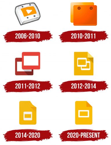
The key and only element of the logo is the start button. It symbolizes the start of the program and the beginning of user operation. This detail also conveys the ease of interacting with the application, its wide accessibility, and the simplicity of managing the process. Literally, press one button – and everything is ready. At the center is a classic start sign: a white triangle. It is set against an orange rectangle encased in a broad white frame. In turn, this is outlined by a thin gray stripe, giving it a strict and distinct appearance. This emblem was used by Google Docs Presentations.
2010 – 2011
The logo of this period is characterized by conciseness, as it features only one element, resembling a folder. It has a square shape, clear edges, and an orange color. Despite its minimalism, this combination makes the symbol very bright and eye-catching. It effectively attracts attention, indicating a connection with digital technologies.
2011 – 2012
The emblem features two elements – slides, which are partially overlaid on each other. The upper part, placed in the foreground, is light red, while the lower, serving as the background, has a darker shade. This play of colors helps create a shadow effect, making the image look realistic. The frames have rounded corners, but the white rectangles maintain sharp edges.
2012 – 2014
After the launch of Google Drive in 2012, a presentation sheet appeared in the logo. It is colored mustard-yellow and contains two slides placed diagonally. Unlike the previous version, the left file is in the foreground, not the right. The top corner of the sheet is folded into a triangle and lowered, as indicated by its shadow.
2014 – 2020
A series of changes brought a more tranquil logo with a friendlier atmosphere. This was achieved through the rounded corners of the presentation sheet. The shadow from the downward-bent fragment became transparent and barely noticeable. The emblem’s simplicity was enhanced by merging the two symbolic files, making them appear as one element. Designers made the white frame wider and the inner rectangle narrower. The mustard-yellow sheet, now positioned vertically, is significantly taller than before.
2020 – today
To demonstrate the application’s versatility, usable not just for Microsoft PowerPoint but also for Microsoft Office, developers updated the content of the presentation sheet. They standardized the symbolic file, turning it into a rectangle with clear edges. The frame surrounding it also has straight angles. Designers changed the color of the bent part from light to dark yellow.
Font and Colors
The Google Slides logo doesn’t contain text, as the application prioritizes a personal symbol for easy display on smartphones, tablets, laptops, and computers. Such an icon allows for quick identification of the program.
The brand’s emblem color is a mustard-yellow shade. It effectively attracts attention and serves as a unique marker of utility. This palette is characterized by its softness and inviting atmosphere. It symbolizes confidence, a wealth of opportunities, and strength.

