Another Internet giant family representative has chosen the emblem’s corporate identity. As a result, the Google Translate logo is made in a single design from Google so that all its services are instantly recognizable. First of all, this includes the overall color scheme. It adds originality to the identity and helps to structure parent services and programs in different areas.
Google Translate: Brand overview
| Founded: | April 28, 2006 |
| Founder: | |
| Headquarters: | United States |
| Website: | translate.google.com |
Meaning and History
It all started with traditional machine translation, in which selected fragments were translated into English and then adapted into the required language. As of now, the program processed various forms of texts (documents, tables, presentations), multimedia data (phrases, words), and entire web pages.
In 2010, a mobile version for Android was launched, and a year later, an application for iOS appeared. Now they play the role of personal portable translators. Around 2011, the service was integrated into some browsers (Chrome), so the adaptation of sites to the desired language began to be performed with one click, and unfamiliar languages were detected automatically. In 2014, the parent company focused on the voice translator, for which it introduced Word Lens. This system immediately detects foreign speech and translates it without requiring you to press a microphone button.
Translations took a quantum leap in 2016 when Google Translate tried out neural machine processing with deep learning technology. Since then, not individual words and phrases have been adapted in meaning, but pieces of text – entire paragraphs and complete sentences. According to 2018 data, this service translates over 100 billion words in one day. Work on the quality of the translation is ongoing, so new versions periodically appear that require a clarifying identity.
What is Google Translate?
Google Translate is a multilingual service designed to translate various documents, texts, and websites automatically. It exists in two formats: a browser extension (web service) and software (mobile application). The platform has been operating since 2006 and supports 109 languages. Since 2016, the translator has been operating on a neural mechanism with a self-learning algorithm – GNMT.
2006 – 2009
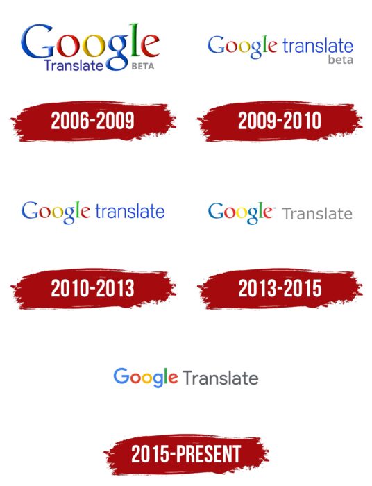
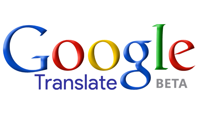
At the time of the web platform launch, the logo contained an indication of the parent company. Its name was presented in the form of a colorful inscription “Google” with multi-colored symbols. It was dominated by corporate colors: red, blue, yellow, and green. Light shadows complemented large letters. At the bottom was the word “Translate,” which ended at the loop with a lowercase “g.” Further to the right, “beta” was indicated in capital letters.
2009 – 2010
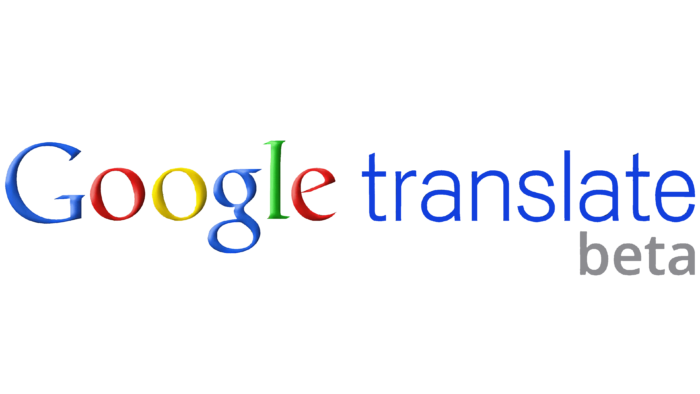
The developers enlarged the inscription “Translate” and moved it to the right of “Google,” adding status to it since it used to be small, inconspicuous, and with a lower location. The designers have equalized their rights by connecting them in one horizontal line. And so that the two parts of the application name do not merge and are still perceived separately, the authors of the logo typed the second word in thin lowercase blue letters.
2010 – 2013
The logo was designed much cleaner than before. The gray shadows that surrounded the letters in the word “Google” have disappeared from it, and the reference to the trial version (“beta”) has been removed as the testing period has expired.
2013 – 2015
After a series of manipulations, the logo got a completely white background and two-dimensionality. From this, the color of the letters looked much brighter and more colorful than in the earlier versions. In the second part of the name, the designers have radically changed. They converted the initial letter to uppercase (“T”), recolored the word gray, chose a different font, and thinned out the characters. As a result, the inscription “Translate” looked translucent.
2015 – today
In the modern interpretation, the initial text part in the logo of the Google Translate web service completely coincides with the emblem of the parent company. It is just as light and two-dimensional. The inscription plane was introduced on purpose, as the scope of the translation service has expanded: it has mobile versions. And to make the icon look adequate on all media, the developers slightly changed its design. The same was done with the second part of the name: the word “Translate” was enlarged and recolored in dark gray, which became catchy and distinct.
Icon
In addition to the main logo, an icon was presented that explained the meaning and purpose of Google Translate. It was intended to mark mobile software so that it can be quickly identified among other software in stores and on online download sites. The app also needed a personalized badge so that users could instantly recognize it in a list on their smartphone desktops. It is these functions that the icon performs.
2010 – January 2015
The debut logo is two squares superimposed one on the other. They were painted in different colors: the lower one was blue, and the upper one was grey. The figures had rounded corners, and in the middle were two elements taken from the alphabet of different languages: the letter “A” (it represents most language groups) and the hieroglyph (it is characteristic of eastern peoples). In this way, the developers showed the key direction of the Google Translate mobile application. The squares were placed diagonally and were complemented by a double-sided curved arrow that connected them. It was two-tone – blue-blue.
January – August 2015
The designers have redesigned the base for the language elements, turning two squares into one rectangle. It looked like a folded sheet of paper, which was painted in three colors for contrast: blue (top), light gray (bottom), and ultramarine (shadow zone at the transition point). Moreover, a diagonal shadow fell on the second sheet from the first. The authors moved the letter “A” to the upper left corner, and they moved the hieroglyph to the lower right. This version lasted the shortest period – 8 months.
September 2015 – today
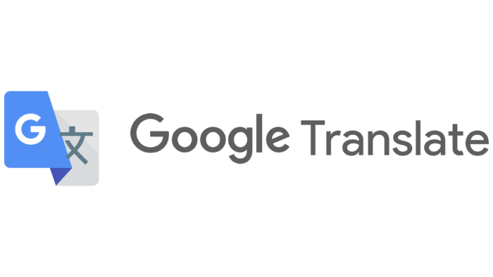
The actual icon for the mobile app was introduced simultaneously as the main Google Translate logo. It is almost completely identical to the previous version because the difference between them is minimal. The badge now uses “G” instead of “A,” the first letter of the parent company’s name. And another change that is almost not evident is the lightening of the blue color by one or two tones.
Font and Colors
To show that this service is part of the portfolio of Google-branded products, the designers used the corporate style of the name in the logo – with multi-colored letters decorated with small serifs. For the mobile app, they designed an icon in a different style, which is dominated by graphics rather than text.
The lettering in the Google Translate logos is a balanced combination of sans serif and serif, although the serifs are almost invisible. The modern version uses the Product Sans corporate font based on Futura New Age Grotesque Tempo. The palette is also branded and includes bright shades of red, blue, green, and yellow on a white background used in the corporate logo. The icon is more modest in color scheme: it consists of dark ash, light gray, blue, ultramarine, and white.
Google Translate color codes
| Moroccan Blue | Hex color: | #4c8bf4 |
|---|---|---|
| RGB: | 76 139 244 | |
| CMYK: | 69 43 0 4 | |
| Pantone: | PMS 2727 C |
| Cerulean Blue | Hex color: | #4857ba |
|---|---|---|
| RGB: | 72 87 186 | |
| CMYK: | 61 53 0 27 | |
| Pantone: | PMS 2726 C |
| Anti-flash White | Hex color: | #efefef |
|---|---|---|
| RGB: | 239 239 239 | |
| CMYK: | 0 0 0 6 | |
| Pantone: | PMS 663 C |
| Chinese White | Hex color: | #e0e0e0 |
|---|---|---|
| RGB: | 224 224 224 | |
| CMYK: | 0 0 0 12 | |
| Pantone: | PMS 663 C |
| Gainsboro | Hex color: | #dddddd |
|---|---|---|
| RGB: | 221 221 221 | |
| CMYK: | 0 0 0 13 | |
| Pantone: | PMS Cool Gray 1 C |
| Slate Gray | Hex color: | #667e8c |
|---|---|---|
| RGB: | 102 126 140 | |
| CMYK: | 27 10 0 45 | |
| Pantone: | PMS 5415 C |
