


![]() GQ Logo PNG
GQ Logo PNG
The restrained and stylish GQ logo is like a mark of belonging to the modern male world. It’s concise but expressive, practical but original, and business-like but fashionable. It concentrates on the desire for uniqueness and the wish not to be like everyone else, which is extremely important for a glossy magazine and its readers. It is an entire universe governed by the basic laws of beauty.
Meaning and History
![]()
Life itself made GQ a periodic men’s magazine. After all, at the outset, it did not pursue such a goal. At the time of its debut, its main task was to discuss the clothing trade. That is, it had an advertising character and was intended for retail sellers and wholesalers. The publication was called Apparel Arts; it had minimal circulation and was geared toward insiders, enabling them to advise customers on clothing sales.
However, its popularity was off the charts: it aroused great interest even among the non-target audience. Many wanted to see the cover (at that time, still without a brand logo). In the end, the publishers helped launch a related magazine, Esquire. But this did not help. Gentlemen’s Quarterly remained at the peak of demand, so it was translated into a quarterly publication format for everyone. In 1958, the word “Apparel” disappeared from the emblem, and the era of the concise abbreviation began. After the renaming in 1967, the publishers also excluded the full name. Only the simple “GQ” remained.
What is GQ?
GQ is an international monthly magazine dedicated to the world of men and their interests. It covers topics such as fashion, travel, books, technology, sex, culture, celebrities, sports, and much more that fall within the sphere of interests of the stronger sex. The publication’s release started in 1931 in New York City, where its editorial office is now located.
1931 – 1958
![]()
The debut logo contained the inscription “Apparel Arts,” executed in an elegant font with sharp serifs. They wonderfully combined with a needle with a thin eye. Moreover, the needle was for sewing machines, hinting at the industrial production of the advertised clothing.
Even though all the letters were in upper case, the first two (at the beginning of each word) were highlighted in particular. They were larger than the other characters. The needle was located between the parts of the magazine’s name, emphasizing the designers’ creative vein and the products’ artistic style.
1958 – 1967
![]()
After the rebranding, the men’s magazine received an updated logo that combined the full and short forms of the name. It was two-tiered. The first was a line with the expressive abbreviation “GQ.” The letters were large, block-like, and rounded. Moreover, the designers highlighted their similarities, drawing readers’ attention to them.
- The symbols had the same width.
- The smooth lines are elegantly curved.
- The central white circles were identical in area.
The only difference was in the rectangular segments: the “G” pointed inwards, and the “Q” pointed downwards diagonally. Underneath the letters was the publication’s new name, “Gentlemen’s Quarterly.” It was set in a small, narrow font, enhanced with wide serifs that looked like bricks. The emblem’s color remained the same – dark grey, almost black.
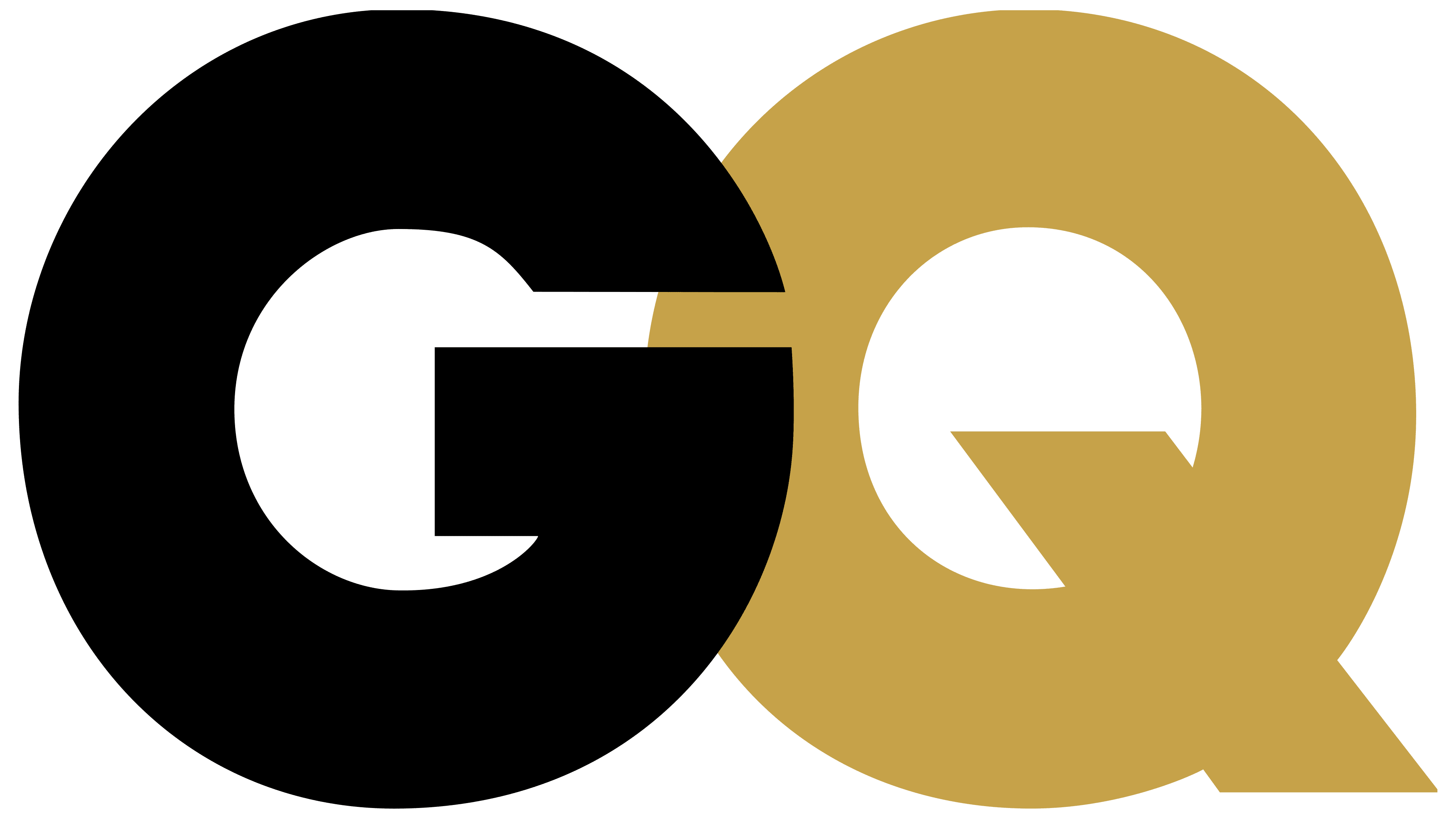
1967 – today
![]()
The letters “G” and “Q” are depicted overlapping, not just touching. Therefore, in the central part, at the junction, their segments intersect to form a complete figure. To this end, the designers visually cut off the curves, thereby connecting the remaining surface.
The inscription style, which now acts as a graphic element, is succinct, strict, and restrained. Such a format is characteristic of fashion brands, to which GQ belongs, as it covers fashion, culture, and other aspects of modern men’s lives. There’s no longer a lower line with the full name, as the glossy magazine’s recognition has grown, and the publishers deemed it unnecessary.
Font and Colors
GQ chose a hefty font for its logo, which adds weight and makes the magazine feel very substantial. Moreover, the title stands out and immediately catches the eye, even against other inscriptions. This is the Gotham font, created by U.S. designer Tobias Frere-Jones. Architectural samples from the past century inspired him, so the letters are hefty and bulky. They have no serifs because the developer tried to modernize the fashion magazine’s typography, making it more stylish.
The “heavy weight” of the inscription in the logo is also explained by the desire to expand the magazine’s reader base. The letters are so large that they dominate, morally looming over a person. But they have no serifs: this is antiquity, a classic, which, in the designer’s opinion, turns progressive periodicals into retrograde ones. Therefore, he chose a bold aspect – youthful, indicating a desire to keep pace with the times, adhering to the laws of simplicity and lightness, despite the bulkiness.
The original color palette of the emblem is modest; it is restrained and unobtrusive. However, black often “mutates” into any other color, depending on the cover’s background. Sometimes the overlay of letters is highlighted by the segments’ transparency.