


![]() Gran Turismo Logo PNG
Gran Turismo Logo PNG
The complexity and unusualness of the racing tracks are encrypted in the emblem’s signs. Cars fly over them so fast that seeing the surrounding objects in detail is unrealistic. The Gran Turismo logo is an ode to fast driving and invites everyone to feel as if they are behind the wheel of a sports car.
Gran Turismo began with Kazunori Yamauchi, a Sony Computer Entertainment Japan employee born in 1967, who disliked the simplified racing games of the early 1990s. In 1992, he started building a realistic simulator with a small team, then known as Polys Entertainment. Sony first rejected the idea, so Yamauchi kept working while the team released Motor Toon Grand Prix. After that game’s commercial success, Sony approved Gran Turismo, which took five years to develop.
Gran Turismo launched in Japan for PlayStation on December 23, 1997. It offered 140 licensed cars, 11 tracks, real technical data, racing licenses, prize money, and a career structure closer to motorsport than arcade racing. Need for Speed from Electronic Arts and Ridge Racer from Namco followed an arcade-style approach. At the same time, Gran Turismo focused on simulation and car culture. The first game sold over 10 million copies.
In 1998, the team became Polyphony Digital. Gran Turismo 2 followed in 1999 with over 600 cars and separate arcade and career modes. Gran Turismo 3: A-Spec launched for PlayStation 2 in 2001 and sold nearly 15 million copies, including over 1 million in Japan during its first three days. Gran Turismo 4 arrived in 2004 with photo mode, while Gran Turismo 5 came in 2010 with dynamic weather, day-night cycles, and GT Academy.
GT Academy turned players such as Jann Mardenborough into real racing drivers. Gran Turismo Sport gained FIA recognition in 2017, and Gran Turismo 7 launched in 2022 with PSVR2 support. In 2023, Neil Blomkamp’s Gran Turismo was based on the story of Mark Mardenborough. By June 2025, the series had sold over 100 million copies.
Meaning and History
![]()
The car racing simulator has eight basic editions, including two versions for PlayStation 2, 3, 4, and 5. The set includes many other variants, shortcut releases focused on PlayStation 2 and 3 consoles. Its developer is Kazunori Yamauchi.
Key actions for implementing the video game started in 1992. Then, the main inspiration for the idea gathered a team of seven specialists and, in five years, created a completely original franchise. The simulator’s appeal is explained by detailed graphics meticulously thought out to the smallest detail, the exact technical properties of the car models, and a large fleet of licensed vehicles.
This also includes customizing and simulating driving based on personal experiences. Moreover, the options are based on physical principles and the recording of the real roar of engines. Although there were several issues, they are united by a common logo.
What is Gran Turismo?
Gran Turismo is PlayStation’s top-selling media franchise. This is a series of racing simulators that require you to consider the real aspects of driving a car. They simulate everything from suspension tuning to tire wear.
1997 – 2009
![]()
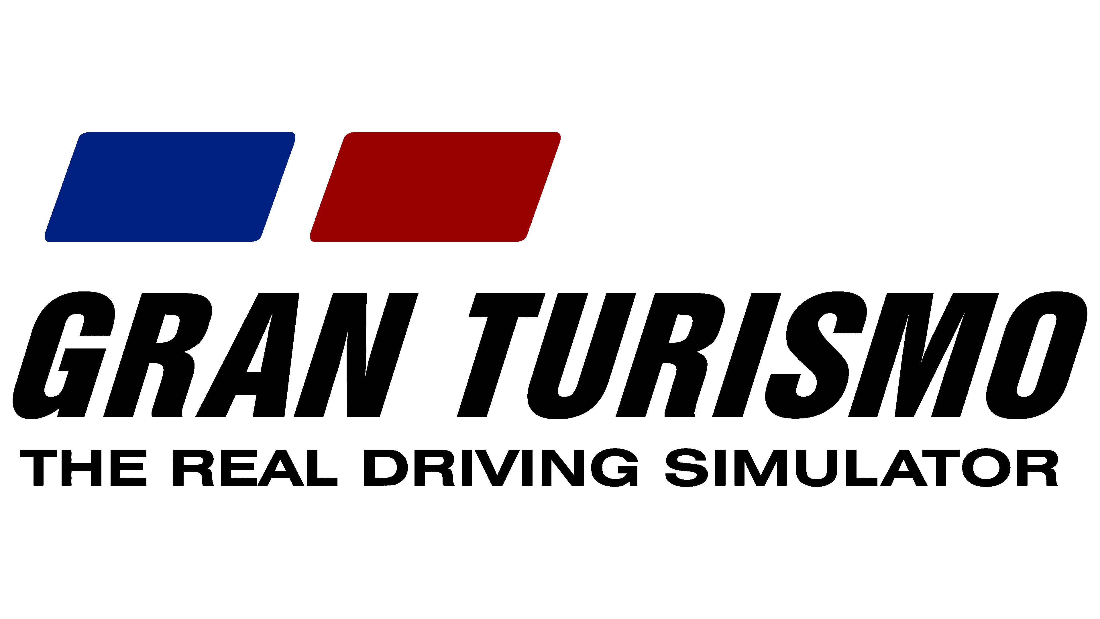
The debut emblem consists of stylized GT symbols, the abbreviation for the video game’s full name, Gran Turismo. The letters are scattered strokes in various configurations, from wide, straight lines to curved, narrowed ones. On the left, the designers placed an impromptu “G” in blue and, on the right, a “T” in bright scarlet.
The authors painted the franchise’s full name in black below them. Even below, they put the inscription “the real driving simulator” in grotesquely small print. The logo also has an abbreviated version that lacks graphic symbols. Two miniature rectangles replace them.
2009 – 2013
![]()
Since 2009, the emblem has taken on a glossy, three-dimensional appearance. It was first used for the Gran Turismo PSP. The 3D effect is created by the original design and the judicious combination of bright highlights and dark shadows. Moreover, the palette saturation has also changed: red and blue have become deeper, juicier, and more concentrated. The rest of the elements did not undergo adjustments: sans-serif letters, uppercase, and slightly right-leaning.
2013 – today
![]()
The developers returned the logo to a flat look and repainted it black. This version was first seen in Gran Turismo 6.
If you need to trace the movement of identity style from complex forms to simpler ones, you can see this in the GT racing simulator. Starting as a multi-structured composition with colorful graphics and stripped-down additions, it has evolved into a flat, monochrome version that emphasizes the seriousness of everything in a video game. In addition, the black-and-white logo does not distract from the process and sets the stage for fierce competition.
Font and Colors
The logo is rendered in a bold, italic typeface that is tightly condensed and assertive. The letterforms are reinforced, giving the text a sense of energy and determination that reflects the fast-paced nature of the game series. The type is visually close to Helvetica Neue LT Std 87 Heavy Condensed Oblique and HarvestItal Regular, but with specific differences, most notably the straight, uncurved leg of the letter “R,” which adds a stricter, more defined quality to the design.

The original color scheme was vivid, combining red, white, and blue on a classic black background. These shades conveyed emotion and high energy, connecting directly to the spirit of motorsport and the game’s focus on speed and realism. In later versions, the designers moved away from bright colors, opting for a monochrome palette based on black and its variations. This shift brought simplicity and refinement, giving the logo a more neutral and contemporary look. The updated style complements the game’s theme while remaining distinctive and recognizable.