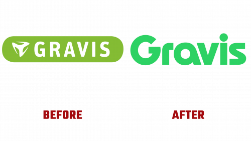
Gravis, Germany’s first retailer of Apple products founded in 1986, recently updated its corporate identity to better align with current market trends. This significant rebranding is part of the company’s strategy to stay ahead in the rapidly changing technological landscape.
The new Gravis logo, the centerpiece of the rebrand, features a new bold font and a fresh green hue. The green hue leans towards neon, giving the brand a modern and confident look. Unlike the previous look of the brand, which was something in-between, the new design looks more rooted in the present. It bears a subtle but interesting stylistic resemblance to the 1977 Apple logo, although the shape of individual symbols, such as the “a,” is noticeably different. The new typology contrasts with the older font-based FF Unit logo and seems more current and fresh.
As a complement to the Gravis logo, the Teodor serif font is used in various brand communications. While serif fonts are often associated with qualities such as traditionalism and stability that are not usually paired with technology-oriented brands, the unique combination of styles brought a fresh touch to the brand context. This adds to the versatility of the Gravis brand, which prides itself on selling Apple products and offering comprehensive repair, service, and consultation to its customers.
Since 2013, Gravis has been a subsidiary of the Freenet Group and has 38 offices in Germany with around 660 employees. The rebranding aims to strengthen the company’s market position by aligning with modern aesthetics and consumer expectations. The rebranding was carried out in collaboration with Berlin-based Studio LIT.
The new branding is designed to drive transformation and innovation, reflecting Gravis’ changing focus and expanding target audience. With the new identity, Gravis aims to adapt its age-old heritage to modern requirements while remaining true to its core offerings of Apple products, repairs, and specialist advice. Whether the new brand identity will resonate with its target audience and lead to market growth is yet to be seen. Nevertheless, the new Gravis logo and associated visual components represent a significant step forward in the development of the company’s brand.


