The Gravity Falls logo reflects the atmosphere of the eponymous town where mysterious events occur. It creates a sense of mystery and peculiarity since the series’s main characters constantly encounter paranormal phenomena. The intriguing emblem makes one wonder about the other secrets hidden in the depths of the animated universe.
Gravity Falls: Brand overview
| Founded: | June 15, 2012 – February 15, 2016 |
| Founder: | Disney Channel (2012–2014), Disney XD (2014–2016) |
| Headquarters: | United States |
Meaning and History
Alex Hirsch meticulously considered the concept of Gravity Falls: the central plot and all the details down to the idents. Therefore, the logo of the animation project is another mystery for the viewers to solve. The series contains many references to pop culture, making it interesting for children and adults. The emblem also connects with pop culture, as vintage Curt Teich & Co postcards inspire it. The creators decided to use the style and aesthetics of these postal cards to give Gravity Falls a unique atmosphere.
The logo’s origins trace back to Curt Otto Teich, who came to the U.S. from Germany to build a business in the offset printing industry. He invented a series of postcards called “Greetings From,” known for their bright and detailed illustrations. Each one contained a colorful landscape and a large inscription indicating the tourist place’s name. The letters had a reflection of nature or landmarks – the main feature of the company’s artistic style.
First, such postcards appeared in Germany (in 1895) and then entered the American market. This happened during an era when tourism was beginning to develop in the U.S., and people were taking more road trips. Herein lies a thematic connection with Gravity Falls, as its main characters help their cousin manage a tourist trap – the “Mystery Shack.”
What is Gravity Falls?
Gravity Falls is an animated series about the adventures of Dipper and Mabel while visiting their Great Uncle Stan. At first glance, the town where they spend the summer might seem quiet and calm. In reality, it’s filled with paranormal phenomena that the twins will have to confront. Strange creatures and mysterious events surround them, but luckily Dipper has a journal describing all the dangers. The series became popular due to its gripping plot, quality animation, and humor. It won several awards, including the Annual Primetime Creative Arts Emmy Awards.
2010
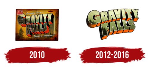
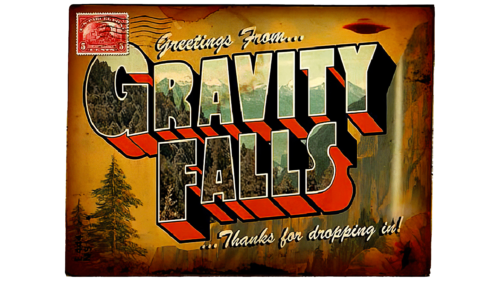
The early Gravity Falls logo was used in promotional materials and advertisements before the series premiere. It has a visual design reminiscent of an antique postcard, hence its rectangular shape and postage stamp in the upper left corner: a red quadrangle with white serrated edges and the number 5. The wavy lines are a postmark, meaning the postcard was purchased and sent to the recipient.
The three-dimensional phrase “GRAVITY FALLS” is centrally placed, divided into two lines, and arranged diagonally. The letters reflect snow-capped mountain peaks, a forest, and the sky, with the sides painted orange or black. The name of the animated series is complemented by handwritten white inscriptions “Greetings From…” (above) and “… Thanks for dropping in!” (below). This is a clear reference to the famous postcards of Curt Teich & Co.
The background features steep cliffs receding into the distance, coniferous trees, and a UFO frozen in the sky. All landscape elements have a sandy-yellow shade, which gives the drawing an air of mystery and creates a suspenseful atmosphere. This is how the artists portrayed the enigma of the town of Gravity Falls and hinted at the paranormal phenomena happening there.
2012 – 2016
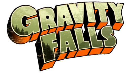
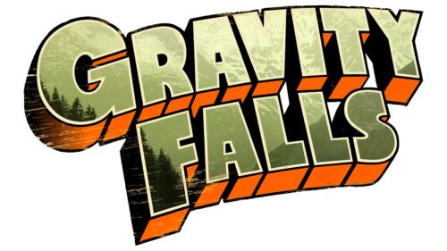
After the series launched, the logo was simplified, and its final version only retained the two-tiered “GRAVITY FALLS” inscription. Now it appears worn, covered with uneven light stripes. The letters reflect a marsh-colored sky, treetops, and mountains—a landscape that evokes a sense of anxious anticipation. The sides of the glyphs are mainly orange, but the left side is shaded, so it’s black. The phrase is arranged diagonally and slightly bent—it’s evident that the emblem belongs to a cartoon.
Font and Colors
The font of the logo is designed in the style of Curt Teich & Co. postcards to emphasize the mysterious nature of Gravity Falls. Individual letters resemble modified versions of Gill Sans MT Extra Bold, Tondu Beta, and Crocante. The inscription appears three-dimensional due to the added side faces.
The designers chose colors so that they harmoniously combined. Bright orange accents complement dark swampy, gray, and black shades. This hints that the atmosphere of the animated series is tense, but the main characters will surely find a way out of any dangerous situation.
Gravity Falls color codes
| Orange | Hex color: | #ff6000 |
|---|---|---|
| RGB: | 255 96 0 | |
| CMYK: | 0 62 100 0 | |
| Pantone: | PMS Orange 021 C |
| Moss Green | Hex color: | #9ba35e |
|---|---|---|
| RGB: | 155 163 94 | |
| CMYK: | 5 0 42 36 | |
| Pantone: | PMS 5777 C |
| Black | Hex color: | #000000 |
|---|---|---|
| RGB: | 0 0 0 | |
| CMYK: | 0 0 0 100 | |
| Pantone: | PMS Process Black C |


