


 Great Clips Logo PNG
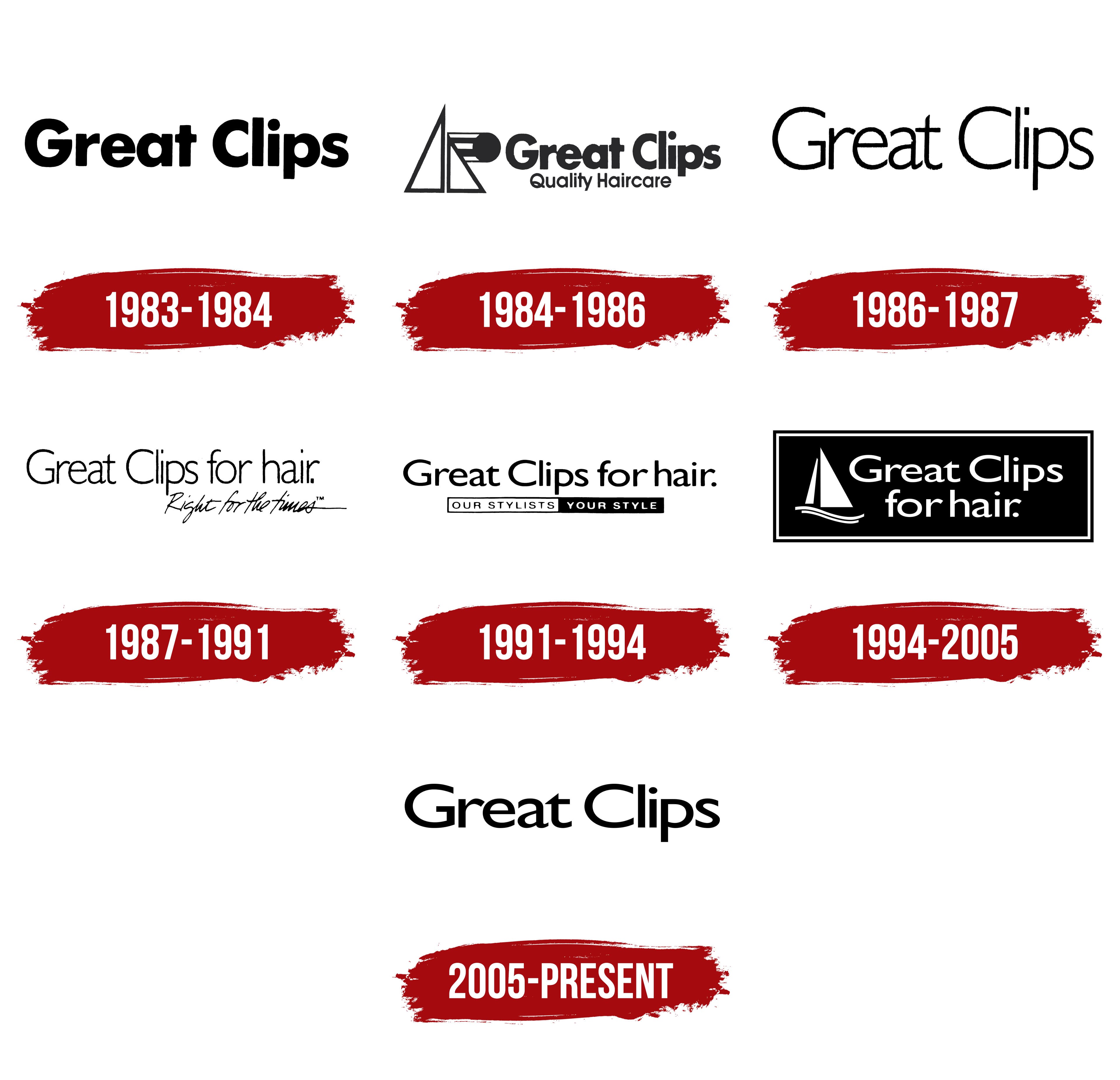
The Great Clips logo has undergone many changes over time. Each new rebranding stage transformed the logo, reflecting the brand’s evolution. This is why, at various points, creative and original emblems were introduced to the public. Some elements were preserved, while others replaced the previous ones, creating fresh designs.
Looking at the latest version of the logo, it’s clear this is one of the brightest and most stylish iterations. It successfully combines artistic motifs with elegance, and every detail is marked by remarkable originality. In addition, the logo conveys a strong sense of reliability and stability, which is also expressed in the identity. While the color scheme leans toward classic tones, there are clear touches of novelty that add modernity and relevance.
The elegant black letters, with graceful strokes and smooth, rounded lines, give the logo a polished look. These letters say, “stability and progress go hand in hand.” This design effectively highlights the brand’s philosophy, balancing tradition and innovation, making the logo memorable and recognizable.
Great Clips was founded in Minneapolis in 1982 by Ray Barton, David Rubenzer, and Steve Lemmon. Their model centered on affordable haircuts without appointments, at a time when many salons required booking. The first location opened in a suburban shopping center, and three more followed within the first year. Franchising began in 1983, giving the business a fast route into new US markets. The format remained focused on walk-in visits.
By 1988, the network had reached 150 salons across several states, with openings occurring at an unusually rapid pace. During the 1990s, expansion continued alongside investment in stylist training and common service standards. The 1,000th salon opened in 1997. In 2001, Great Clips introduced an online wait-time system, and the 2,000th location followed in 2003.
A loyalty program arrived in 2007, while the 3,000th salon opened in 2011. For its 30th anniversary in 2012, the company launched a mobile app with wait-time checks. Clip Notes followed in 2014, storing haircut preferences for access at any branch. An augmented-reality hairstyle preview was introduced in 2015.
The 4,000th salon opened in 2018. Website, app, and loyalty updates followed in 2019. During 2021, operations were adjusted around employee and customer safety. By its 40th anniversary in 2022, Great Clips had more than 4,400 locations in the United States and Canada. In 2023, the company continued expanding its network and funding stylist training and service updates.
Meaning and History
What is Great Clips?
This concept of fast and inexpensive haircuts was reimagined in North America by a well-known chain of barbershops. With thousands of locations across the U.S. and Canada, this chain serves people looking for a simple haircut without the hassle of high-end salons, offering a convenient, affordable approach to hair care. The company’s services do not require appointments, but online check-ins and fixed prices are available for customer convenience, explaining the chain’s success. This chain has become a popular destination for busy professionals, families, and students seeking affordable, high-quality haircuts. Although the brand is not focused on trendy or complex styles, it is known for providing consistent, neat haircuts by experienced stylists who work with various hair types and preferences.
1983 – 1984
The popular barbershop franchise introduced its first logo in 1983, although the salon opened in 1892. The emblem was characterized by simplicity and clarity: elegant black letters stood out brightly against a white background. The logo contained only two words: Great Clips. Notably, the logo’s text did not match the salon’s original name, Super Clips.
The logo was distinguished by its brevity and lack of design excesses. Each letter was similar in shape and size, giving the logo visual harmony. Both words were written in large capital letters, emphasizing their importance. Despite the absence of strict geometry, all elements, both consonants and vowels, had soft, rounded contours, creating a sense of smoothness and completeness. The first logo lacked underlining, graphic elements, or additional symbols; it was pure information presented in a beautiful, restrained design.
1984 – 1986
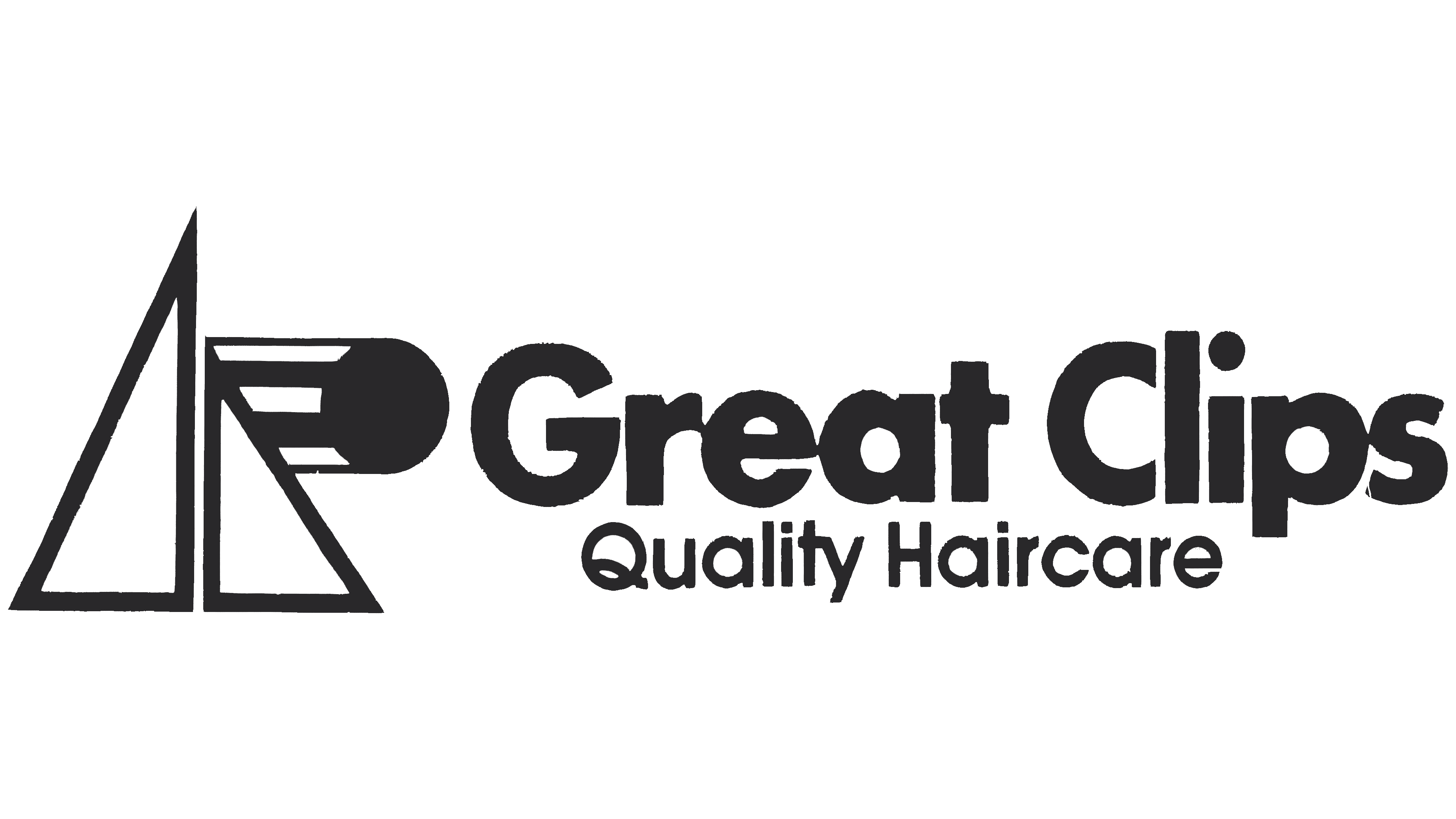
By mid-1984, trends had shifted, and the franchise’s logo underwent significant changes. It transformed into a more creative and expressive design with a unique style, original motifs, and clear aesthetic appeal. This logo no longer represented just a single salon but symbolized a network of barbershops that had expanded across many regions. The new identity introduced two text blocks featuring four words, identifying the successful and popular franchise.
As the network expanded, the logo also acquired new graphic elements. Alongside the name Great Clips, an image of a triangle and a sun was added to the left of the text blocks. Some interpret this element as a horizontal arrow, symbolizing the network’s dynamic growth. Some view Great Clips’ rapid expansion as directly related to its new logo. In this context, the sun can be perceived as a symbol of eternal brightness and ongoing success that accompanies the Great Clips franchise on its journey.
1986 – 1987
In the new version of the brand identity, strict graphics dominate, clearly visible in each letter of the two well-known words, Great Clips. Now, the text block is the only element of the logo, as all additional graphics have been removed. The sun and the triangle, which used to adorn the logo, disappeared mysteriously and quickly. Now, the only thing left on the logo is the franchise name, serving as the main and sole source of information. The classic black-and-white color scheme plays an important role, creating a visually harmonious combination of these contrasting shades.
The serifs on the letters and the medium thickness of each character give the logo a sense of globality and strength. This evokes the feeling that Great Clips is associated with reliability, which aligns with reality. As the end of 1987 approaches, a new stage in the franchise’s development begins, reflected in changes to the logo, which transforms once more and adopts a new look that matches the growth and success of the hair salon chain.
1987 – 1991
One of the most graphically interesting and element-filled versions is the logo used from 1987 to 1991. This logo retained only a few traditional accents that had already become familiar, but several innovative solutions complemented it. The text was highly informative, providing a clear, precise understanding of all the advantages of the Great Clips brand.
A time marker appeared on the logo, indicating the period’s relevance. Two text blocks are separated: the main information is at the top, while the italic text below highlights additional contextual meaning. As before, the logo is done in a classic black-and-white palette, emphasizing its professionalism and solidity. Special attention was given to typography. Three capital letters are highlighted in both text elements, giving the design structure and clarity. The logo reflects proportionality and harmonious geometric beauty, emphasizing the quality and stability of the written words.
1991 – 1994
Common motifs can be traced across different periods of the brand’s identity, yet each logo retains its own distinct identity. The logo, created in 1991 and presented to the public, deserves special attention. For the first time, secondary text elements were enclosed in a frame, which became a key design feature. The color scheme remained classic and restrained, adding elegance to the logo.
At the center of the logo are four words: Great Clips for Hair, two of which start with capital letters. The bold font gives the inscription a sense of solidity and weight, emphasizing the brand’s importance. Simple flourishes on the consonants add sophistication to the logo, making its overall appearance more elegant and refined.
Below the main block is a second text element, placed in a two-tone frame divided into two equal parts. The text is written in black letters on a white background, while the second half of the frame is in a contrasting color scheme. This combination visually emphasizes information about style and beauty, reflecting the brand’s direction. In this way, attention is drawn to Great Clips’ commitment to providing each customer with quality service and a personalized approach.
1994 – 2005
In 1994, Great Clips introduced an entirely new brand identity, which many found bold and unusual. This is true, as the new logo was designed on a rich black background, which is a daring move. All the words were written in white, with the main innovation being a ship depicted using four elements. Two triangles of different sizes, mirrored relative to each other, faced in opposite directions. Two wavy horizontal lines resembling ocean waves complemented them, forming the base of this design. The ship was slightly taller than the two text blocks, providing visual balance to the composition.
The white letters on the logo gained their uniqueness and elegance. They appeared light and even mobile, creating a sense of dynamism. The period at the end of the text emphasized the stability and high competitiveness of the Great Clips brand. Special attention should be given to the double-outline frame surrounding the logo, which highlights the central elements and gives the entire design a cohesive feel.
2005 – today
The modern Great Clips logo can confidently be called one of the most concise and simple. There is nothing unnecessary here, no extra details or drawings to distract. Everything is as clear as possible: two words, Great Clips, which take center stage and immediately convey the brand’s essence. Nothing more is needed, as the franchise has over 4,400 locations worldwide. The brand speaks for itself.
The minimalism of this emblem emphasizes not only the seriousness of the company but also its approach to business: haircuts without fuss, quick, and to the point. This makes Great Clips popular because people appreciate simplicity, accessibility, and clarity. This principle is exactly what the logo reflects.
The black letters on a white background emphasize a strict yet elegant style. With slightly elongated letters, the sans-serif font adds refinement and creates a sense of modernity. The vowels and consonants make it even more memorable and pleasing to the eye. Notably, the design has no periods or other elements, making the logo clean and easy to read.
This visual mark reflected the brand’s well-known status and its ability to attract attention without complex graphic solutions. The strength of the logo lies in its simplicity.