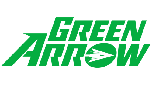
The Green Arrow logo directly points to the instrument of justice – the arrow. It is the legendary attribute of the superhero, aimed at establishing order in the world and punishing those guilty of disturbing it. The emblem’s palette connects it with the mysterious archer.
Green Arrow: Brand overview
| Founded: | November 1941 |
| Founder: | Mort Weisinger, George Papp |
Meaning and History
Mort Weisinger and George Papp developed Green Arrow to expand the DC Comics universe. He has several features not typically associated with superheroes:
- high social status (he is a wealthy businessman and owner of a company, in essence, an oppressor of people dependent on him);
- ancient weapon (a bow and arrows used in ancient times, not something fantastically modern and cool);
- the ability to appear in different images (he only occasionally dresses up as Robin Hood, a parallel initially traced).
The hero didn’t enjoy popularity for the first 25 years, so he was sometimes paired with another character. Despite the low fame, he still has his attributes – starting with motivation and ending with an emblem. It reflects his weapon of revenge – special arrows with various functions.
What is Green Arrow?
Green Arrow is the alias of a representative of the DC Comics universe, a superhero who plays the role of an archer and stands up against crime. According to the author’s idea, this is Oliver Jonas Queen, a wealthy businessman who stands up against injustice. His main weapon is a bow with arrows of several types for use in special situations. They have the functions of a flashbang grenade, tear gas, grappling hook, explosive mechanism, and adhesive tip. Mort Weisinger and George Papp created the character. His debut appearance took place in November 1941.
1941 – today
Despite its outward simplicity, the Green Arrow logo is multi-structured and conceptual. Using common graphic elements, it encapsulates the complex idea of opposition and struggle. Designers expressed this through straight lines, geometric shapes, and precise angles. They also utilized negative space by placing the superhero’s sign in it.
A wide ring serves as the framing. Outside the frame are three arrow tips overlaid on each other. However, looking closely, you can see one green arrow with the white letter “G” in the middle. Such a visual technique solves several tasks at once:
- represents the name of the fantasy character;
- indicates the type of weapon he uses;
- emphasizes the idea he fights for;
- demonstrates his determination.
Font and Colors
The Green Arrow logo has one letter mark. It’s “G,” stylized as an arrowhead. It is in uppercase and done in a unique font with no analogs, as it matches the triangle’s size.
The palette of the emblem consists of green. It’s the main color, as required by the idea incorporated into the superhero, as his name contains the word “Green.” A neutral shade is chosen for the emblem – not dark but not light, i.e., neutral, as the boundary between two sides of human nature. For contrast, it’s supplemented with white.
