The Grindr logo hints at a mystery. No one will know who is hiding under the mask until the user himself wants to reveal himself. The emblem indicates secret desires and the possibility of their realization. On the pages of a dating site, everyone is given the green light.
Grindr: Brand overview
| Founded: | March 25, 2009 |
| Founder: | Joel Simkhai |
| Headquarters: | West Hollywood, California, U.S. |
| Website: | grindr.com |
Meaning and History
The digital service immediately got a personal emblem since it required visual identification – a clear icon for presentation on the Play Market and App Store. But it was not the identity that became paramount for him, but the technique of location, because it is with its help that people are looking for each other. By posting their location data on a web resource, users gain access to other participants’ accounts. Moreover, there is a ranking according to distance: the service gives out, first of all, those who are nearby.
This principle is also used in the design of the interface. In the list below the corresponding emblem, images of nearby faces are displayed first. To find out how to reach the destination, interested persons tap on the photo, after which a map appears indicating the object and the distance to it.
But at the same time, the developers took care of the convenience for users. In addition to marking a location, the functionality contains the ability to block other people, choose convenient filter settings, support for video calls, and send photos.
What is Grindr?
Grindr is a digital social networking app for gay people.
2009 – 2016
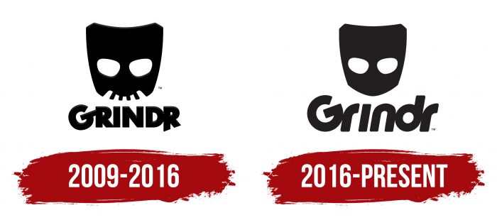
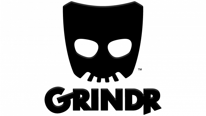
The mask on the Grindr app logo appeared immediately, but it had a frightening look. This impression was formed because of the black color and “teeth” that protruded from the upper jaw. It was divided diagonally into light and dark halves: graphite with a gradient and charcoal. At the bottom was the title in all caps. “G” sloped to the left. The last “R” was cut from the right side, which gave the legs different lengths. A poisonous yellow rectangle transitioning from a warm color spectrum to a cold one served as a background for all elements.
2016 – today
The Grindr logo is most recognizable in the United States, where the largest community members are registered. But if you take it as a whole, the program is already working in 195 countries of the world. The debut logo was not updated, despite the site’s development and the technical improvement of the utility. Therefore, she is the only one.
The logo is monochrome, with no details or design elements. It is composed of two fragments. The first is a graphic icon in the form of a theater mask in the shape of a shield with cut corners. Such a pentagon symbolizes protection, the closed nature of the Internet community, and limited access. The eye sockets are large, oval, located diagonally. Sometimes the icon is used on its own as a separate designation for the application.
The second element is text. It contains the application’s name, made in the classic form: with the first capital letter and the rest lowercase. Simultaneously, the “i” lacks a period, as if it were in uppercase. Moreover, the symbols are unconventional – with distinctive features. “G” is turned upwards and supplemented by a diagonal crossbar. The lowercase “r” is almost indistinguishable from the uppercase “I,” and the “n,” “d,” and “r” are concatenated together. In this case, the inscription has a slight slope to the right.
Grindr: Interesting Facts
Grindr, launched in 2009, stands out as a pioneering social networking app for the LGBTQ+ community, leveraging smartphone technology to connect users based on geographic proximity.
- Inception: Created as one of the first geosocial apps for gay men, Grindr introduced a novel way of making connections through GPS technology.
- Growth: The app quickly gained popularity, showing a clear demand within the LGBTQ+ community for new connecting platforms and inspiring similar apps.
- Worldwide Presence: Grindr is used in nearly 200 countries, helping people in crowded cities and smaller areas find community and support.
- Community Impact: Beyond facilitating meetups, Grindr has supported the LGBTQ+ rights movement and health initiatives, notably in HIV prevention.
- App Features: Grindr offers user profile customization, messaging, filters, and premium options like Grindr XTRA for enhanced features and ad removal.
- Cultural Impact: The app has influenced gay culture and media, featuring in various artistic and entertainment forms and sparking discussions.
- Privacy Efforts: Faced with privacy concerns, Grindr has taken steps to improve data security and user privacy, though it has been criticized.
- Ownership Transitions: In 2016, Grindr was sold to a Chinese gaming company and, due to data privacy concerns, acquired by a U.S. company in 2020.
- Inclusivity Efforts: Grindr has worked on becoming more inclusive, introducing features for transgender users and focusing on racial and ethnic inclusivity.
Grindr’s journey mirrors significant societal shifts in LGBTQ+ rights and digital interaction, emphasizing its dual role as an influencer and reflector of the community it serves.
Font and Colors
The developers of the logo opted for an individual typeface to accurately convey both programs’ content and the social network linked to them. The choice fell on a font from the Sans Serif category – with a rounded, streamlined shape, wide, with a dense arrangement of characters in the word “Grindr.”
The color scheme is monochrome. It usually consists of a combination of black (lettering) with white (background). But there are other variations – with a yellow mask and dark text.
FAQ
Who designed the Grindr logo?
Joel Simkhai and Scott Lewallen designed the Grindr logo. Scott Lewallen played a key role in creating it, focusing on a bold, edgy, and loud design. He wanted the logo to be distinctive and recognizable in the crowded app market. He helped develop the name and branding elements that define Grindr.
The logo has a bold, mask-like design, symbolizing mystery and intrigue. This design fits the app’s purpose as a social networking platform for the LGBTQ+ community. The mask represents anonymity and discovery, key aspects of the brand experience.
What is the meaning of Grindr?
Grindr is a location-based social networking and online dating app for gay, bisexual, and transgender people. Launched in 2009, it uses GPS technology to help users connect with others nearby through user profiles.
The brand aims to help men interested in same-sex relationships meet and interact. The app shows nearby users in a grid, letting people browse profiles and start conversations with interesting people.
The brand is popular for casual dating and hookups, as well as for finding long-term relationships and making friends. Its focus on location-based connections makes it popular in cities, where more users will likely be nearby.
The app includes features like chat messaging, photo sharing, and sending location information for arranging meetups. The brand greatly impacts the LGBTQ+ community, playing a key role in social connections.
What does the Grindr logo mean?
The logo has two main parts: a mask and an inscription. The mask represents a closed and secretive community. This reflects the discreet nature of the connections within the LGBTQ+ community, where privacy and anonymity matter. The mask shows the brand’s goal to provide a safe space for users to explore their identities and relationships without judgment or exposure.
The inscription spells out the app’s name. It hints at the type of connections the platform offers. The font and style suggest a modern and tech-savvy environment, matching the app’s role as a tool for meeting people.
What font does Grindr use?
The logo uses a unique grotesque font, streamlined, lowercase, and slightly italic. This font gives the brand a modern and sleek look, reflecting its tech-savvy nature. The letters are close together, creating a compact and cohesive appearance.
The grotesque font, known for its clean lines, makes the logo clear and approachable. The streamlined design makes it look smooth and efficient, suggesting the app is easy to use. Lowercase letters give it a casual and friendly vibe, making the brand feel more accessible. The slight italicization adds a sense of motion, implying progress and innovation.
This font choice helps the brand stand out and supports its mission to provide a user-friendly platform for connecting people.
Is there a Grindr app for straight?
No, there is no app for straight people. The app is designed for gay, transgender, bisexual, and curious individuals to connect and communicate. This community provides a safe and welcoming space for these groups.
The app’s primary audience is men who identify as gay, bisexual, or transgender. It also has a version for women in the LGBTQ+ community. This version allows women to use the platform and connect with others who share similar experiences and interests. Other dating apps are available for straight people.
What Color is Grindr?
The main brand colors are black, white, and yellow. These colors are important for the brand’s identity and make the app easily recognizable.
Black gives the logo a sense of sophistication and strength. It stands out against the other colors, making the logo noticeable. Black adds a serious and mature look to the app.
White balances the design. It provides a clean background that makes the text easy to read. White gives the app an open and inviting feel.
Yellow is the most prominent color in the logo. It brings energy, positivity, and warmth. Yellow is vibrant and catches the eye, creating a happy and friendly atmosphere.
Together, these three colors create a strong and appealing look for the brand.
