The spicy taste and bright combinations convey the Grubhub logo. The emblem promises delicious, fresh, hot dishes straight from the oven. Daily variety and instant delivery are encrypted in bright letters of the inscription.
Grubhub: Brand overview
| Founded: | 2004 |
| Founder: | Matt Maloney, Mike Evans |
| Headquarters: | Chicago, Illinois, U.S. |
| Website: | grubhub.com |
Meaning and History
Today, it is the largest company in delivering ready-made meals from restaurants, and it has almost no equal. However, since entering the specialized market for many years, it has constantly struggled with the competition, having experienced several sales, purchases, transitions, and mergers. The biggest one was with Seamless, which affected the team’s visual identity.
At first, it was an ordinary company of three individuals which replaced the paper menu. Two years later, two of them (Matt Maloney and Mike Evans) submitted their project to the Edward L. Kaplan New Venture Challenge, organized as part of the University of Chicago Booth School of Business, and received strong financial support. For all its existence, the company had only two logos.
What is Grubhub?
It is a major online food delivery platform where you can order any dish online from a suggested list of local restaurants. Just Eat Takeaway owns it. It was founded in 2004 by entrepreneurs Matt Maloney and Mike Evans. It is headquartered in Chicago, Illinois.
2004 – 2011
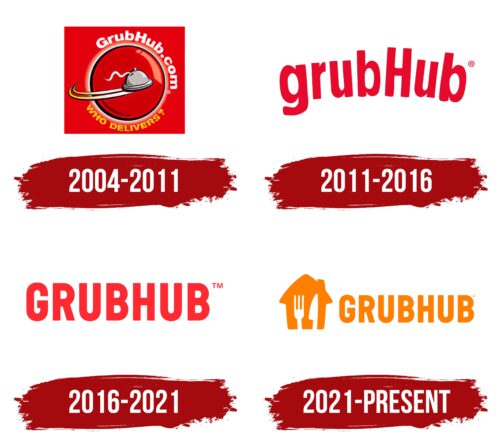
The debut logo was square. In addition to the main elements indicating the type of activity of the service, it also contained an electronic address because, at first, it existed only in the Internet space. On a red background, a globe was depicted with black and white edging so that the surrounding inscriptions could be read. In the middle was a dish covered with a lamb, from which a thin stream of steam came out. She was wavy and talked about how food reaches customers freshly cooked and delivered hot. Two crescent-shaped stripes testified to high speed – traces from a saucer flying forward.
2011 – 2016
This version of personal symbols came out in 2004. The business founders emphasized the information component, so they abandoned graphic elements. A laconic inscription with the company name appeared on the emblem. This is not only self-promotion but also a traditional sign found in catering establishments.
The debut version includes a catchy “GrubHub” lettering with an uppercase “H” emphasized. The rest of the characters are lowercase. The letters are ranged in height: the legs “b” do not exceed “H” in length. Despite the arched shape, the characters in the word are well-read since they have free inter-letter space.
2016 – 2021
As a result of a redesign carried out in 2016, the company name became horizontally flat. Ad studio Wolff Olins, entrusted with the visual style, has removed the arched arch and crimson palette. Since then, the logo has been adorned with a direct inscription of scarlet color – one of the lighter shades of red.
2021 – today
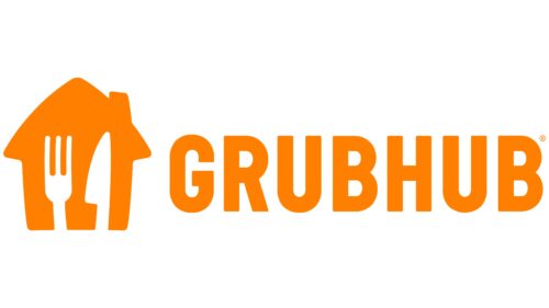
After the redesigned logo, it featured an orange house with a gable roof and a chimney, similar to the Just Eat Takeaway logo. This emphasizes the connection between the two companies – parent and subsidiary. In the negative space of the improvised wall, cutlery is visible – a knife and a fork. They hint at the company’s line of business: food and its delivery to your home or office. To the right of the icon is the name of the service, done in smooth grotesque. The letters are large and tall.
Grubhub: Interesting Facts
Grubhub, starting in 2004, changed how we order food from local restaurants online and via mobile.
- Beginning: Founded in Chicago by Matt Maloney and Mike Evans, Grubhub solved the hassle of storing paper menus and allowed people to order food online. It quickly grew across the U.S.
- Online Ordering: One of the first to let customers order food online for delivery or pickup, setting a trend in the food industry.
- Joining Forces with Seamless: In 2013, Grubhub and Seamless merged, making Grubhub even bigger and solidifying its lead in the food delivery world.
- Going Public: Grubhub went public in 2014, demonstrating its success and the promise of the online food delivery market.
- More Services: Grubhub began offering delivery services to restaurants without their delivery service, widening customer choices and helping restaurants grow.
- Tech Forward: Always innovating, Grubhub introduced order tracking, estimated delivery times, and integration with various devices to improve the customer experience.
- Helping Restaurants: During tough times like the COVID-19 pandemic, Grubhub supported local restaurants with reduced fees, marketing, and relief funds.
- Acquired by Just Eat Takeaway: In 2020, Just Eat Takeaway, a global food ordering company, bought Grubhub for $7.3 billion, creating a massive food delivery entity.
- Giving Back: Grubhub has run donation drives, letting customers round up their orders to donate to charity and showing its community spirit.
- Cultural Shift: Grubhub has made it easier and more convenient to explore a variety of foods, which are especially popular among millennials and city dwellers. It is changing how we think about dining and food delivery.
From a simple solution to paper menu clutter to becoming a leading force in online food delivery, Grubhub’s journey shows its innovative spirit and significant role in how we enjoy restaurant meals at home.
Font and Colors
From its launch to the present, the service has remained faithful to its concept—advertising itself, directly reflected in the logo. As a result, all variants of Grubhub’s visual identity are associated with the name. If it was curly at the beginning of a career, now it is an even stricter word with no design excesses. The emphasis is on informational content.
Verbal expression plays an important role in this site for ordering food via the Internet and by phone with targeted delivery. Therefore, the designers have concentrated on typefaces. The food ordering website uses GT Eesti Display Bold for headings and Graphik for body text. The emblem’s inscription is made in chopped grotesque—smooth sans serif symbols from the Sans Serif category.
Everything is much simpler in terms of colors because there are only two. Initially, the logo contained a dark shade of red and then moved on to a light one. As the management noted, red is good for the appetite, so it is used as a background in photographs of dishes.
FAQ
Did Uber buy Grubhub?
Uber Technologies Inc. did not buy Grubhub. In 2020, Uber made a $6.5 billion all-stock bid for the company to expand its food delivery services. Despite the efforts of Uber’s CEO, Dara Khosrowshahi, the deal did not go through.
Instead, Grubhub was acquired by Just Eat Takeaway.com NV, a European food delivery company. This all-stock transaction was announced in June 2020. Just Eat Takeaway.com NV’s offer appealed more to Grubhub’s board and shareholders, leading to a successful acquisition.
The merger created one of the largest food delivery companies globally, significantly expanding Just Eat Takeaway.com’s presence in the United States. This move aimed to compete with other major players in the food delivery market, such as Uber Eats and DoorDash.
Why is Grubhub unique?
The company is unique in the food delivery market for several reasons. One key factor is its wide selection of partner restaurants. The brand has partnered with many local eateries, popular chains, and exclusive dining spots. This variety offers customers various dining options, from neighborhood favorites to well-known national brands.
Grubhub’s loyalty programs and promotions attract and retain customers. Programs like Grubhub+ offer benefits such as unlimited free delivery and exclusive deals, adding value for frequent users and encouraging repeat business.
The brand’s approach to customer service sets it apart. It strongly emphasizes addressing customer needs and resolving issues quickly. This commitment to high-quality service helps build trust and loyalty among its users.
What font is the Grubhub logo?
The logo uses the Barlow Semi Condensed font, which is sleek and clean and gives it a modern and recognizable look. It also fits well with the brand’s image.
Most of the capital letters in the logo are rounded, adding a friendly feel. The letter “H” has right angles, providing a structured look. This mix of rounded and angular elements creates a unique visual contrast.
The Barlow Semi Condensed font reflects the brand’s focus on simplicity and clarity. It is easy to read and modern, aligning with Grubhub’s commitment to user-friendly service. This font choice helps reinforce the brand’s identity and makes it easily recognizable to customers.
Did Grubhub change its logo?
Yes, the company changed its logo recently, in 2021. The new logo features an orange house with a gable roof. Inside the house are a fork and knife, showing that the service is related to food delivery. This design represents the brand’s function.
The logo combines the feeling of home comfort with food delivery. The orange color stands out and gives a warm, inviting feel. The utensils in the house icon clearly show the brand’s purpose. This change gives their branding a modern and engaging look.
