


![]() Grand Theft Auto Logo PNG
Grand Theft Auto Logo PNG
The GTA logo represents the network of roads on which the players’ cars fly. The many plot twists reflected in the emblem make the series attractive for regular use. The sign shows that it will not be boring inside.
The history of Grand Theft Auto began in Edinburgh at DMA Design, founded in 1987 by David Jones. After Lemmings in 1991, the studio shifted focus. By the mid-1990s, Race’n’Chase introduced a concept centered on crime in an open city.
In 1997, BMG Interactive released Grand Theft Auto for PC and PlayStation. The top-down format and violent mechanics triggered criticism from the media and retail chains. Some stores refused distribution, which increased visibility and supported sales.
In 1998, Take-Two Interactive acquired BMG Interactive. DMA Design became Rockstar North, while Rockstar Games was formed under Sam Houser and Dan Houser, who shaped the series direction.
In 2001, Grand Theft Auto III moved the franchise into 3D. Liberty City introduced traffic systems, pedestrians with routines, radio stations, and nonlinear missions. Competing titles like Driver offered more limited interaction models.
Vice City followed in 2002 with a setting inspired by 1980s Miami. In 2004, San Andreas expanded the scale to three cities. In 2005, hidden content known as “Hot Coffee” led to lawsuits and a temporary Adults Only rating from the ESRB, forcing a re-release.
In 2008, Grand Theft Auto IV launched with a budget of nearly $100 million. Day-one revenue reached $310 million and exceeded $500 million in a week. Rockstar used RAGE and Euphoria to improve physics and character animation.
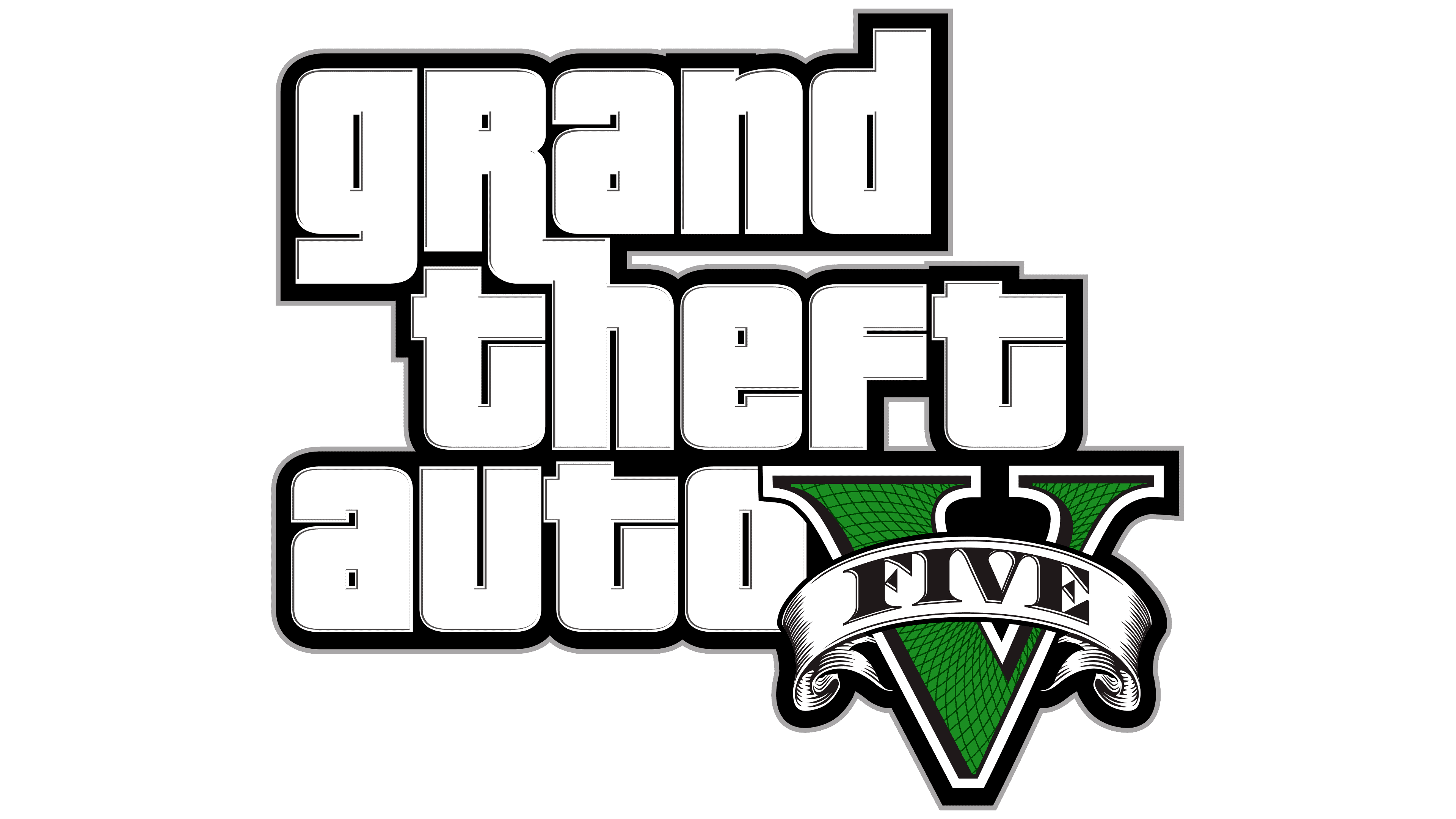
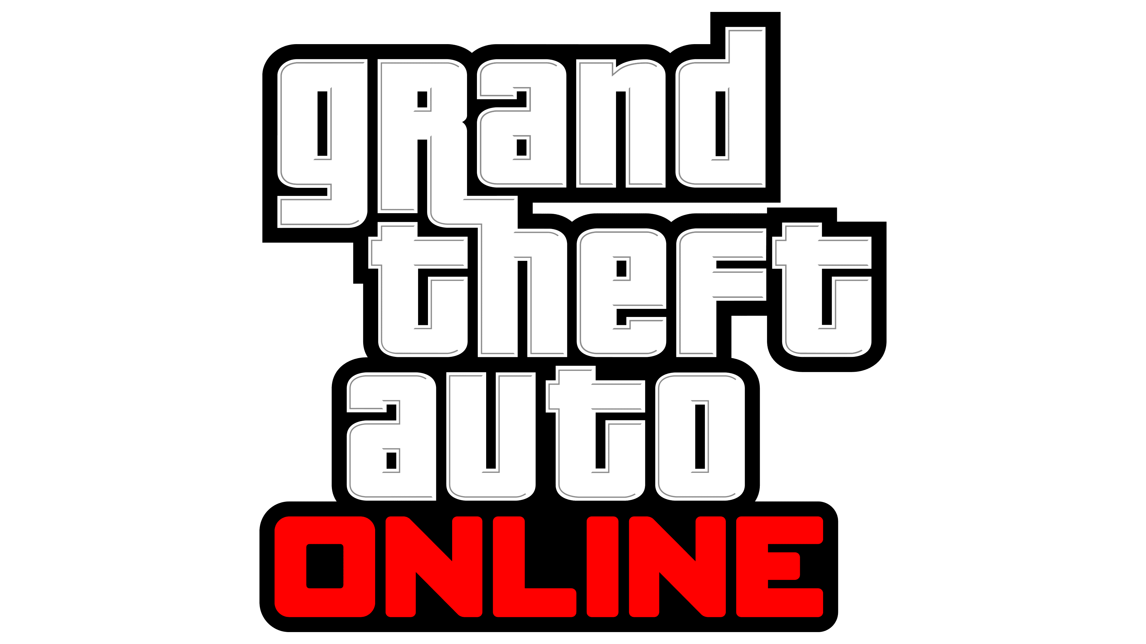
On 17 September 2013, Grand Theft Auto V generated about $1 billion in three days. The game introduced three playable protagonists and a detailed version of Los Angeles. By 2024, sales exceeded 200 million copies, making it the third-best-selling game behind Minecraft and Tetris. GTA Online, launched in October 2013, evolved into a separate platform with регуляр updates and a large active audience.
Meaning and History
![]()
A common element of all GTA emblems is the “Grand Theft Auto” lettering. Since 2001, her style has remained unchanged: the designers made minor edits, adjusting the outline’s thickness.
What is GTA?
GTA is an abbreviation for the video game series Grand Theft Auto, an action-adventure series with seven main parts and four expansions. David Jones, Mike Dailly, Aaron Garbut, Leslie Benzies, Sam Houser, and Dan Houser were involved in their development. The series was published by Rockstar Games, with the first installment released in 1997.
1997 – 1999
![]()
The game series title is written in stylized italics on the debut logo. Above and below are the words “GRAND” and “AUTO.” Three five-pointed stars complement each other. The word “THEFT” is in the middle, to the left of a bright two-tone flame. The palette is also fiery: the letters have a slight yellow-orange gradient. The lettering looks impressive, thanks to its wide black bezel.
1999 – 2001
![]()
In 1999, the logo designers used the abbreviated name GTA. The abbreviation is placed inside a rounded rectangle. Uppercase “G” and “T” are combined with a lowercase “a,” which is not inferior to them in size. Below is the inscription “GRAND THEFT AUTO.”
2001 – 2008
![]()
A new trademark was registered for the release of Grand Theft Auto III. The designers removed the abbreviation and returned to the classic structure, placing the words from the series name one under the other. At the same time, they mixed letters in different cases but made them equal in size.
2008 – 2013
![]()
In 2008, the inscription acquired an inner light gray outline. The outer black lines are thinner than in the previous version.
2013 – today
![]()
The gray outline has disappeared in the latest version of the logo, making it look flat. Everything else is unchanged.
Font and Colors
The GTA branding is a stylized “Grand Theft Auto” lettering. It looks powerful and impressive thanks to the special lettering. The words are arranged in three lines, although there is a horizontal version.
The font used by the logo designers is a variation of Pricedown Black. The color scheme is monochrome, with white letters outlined in black and separated by black lines from the same white background. This starkly contrasts the vibrant yellow-orange palette of the logo adopted in 1997.