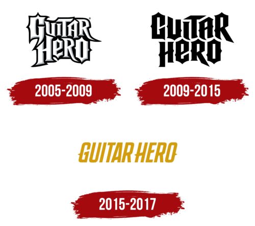
Initially, the Guitar Hero logo reflected the video game’s affiliation with heavy metal; hence it was spiky and prickly. But as the song database expanded, the spikes pointing in all directions were increasingly smoothed out until the emblem turned into a legible attribute of the brand identity with smooth elements. It became universal and suitable for all music genres.
Guitar Hero: Brand overview
| Founded: | November 8, 2005 – 2017 |
| Founder: | RedOctane, Harmonix Music Systems and Activision |
| Headquarters: | United States |
Guitar Hero is a media franchise based on a music-themed video game with a guitar controller. It includes several rhythm video games, various sequels, expansions, and other thematic products. The base release started in 2005. It was developed by Harmonix and published by RedOctane. The latest version appeared in 2015. The game consists of 30 covers of legendary songs from 10 generations of rock with several bonus tracks. The gameplay resembles Guitar Freaks.
Meaning and History
The music rhythm video game, similar to Guitar Freaks, unexpectedly gained the attention of users and the trust of critics. Appearing at the end of 2005, it became a real hit, receiving various continuations. Its gameplay is very original. It’s based on musical hearing and on a guitar controller. Players must press the corresponding buttons on it to hit the notes displayed on the screen. For the first years, the playlist included heavy metal and hard rock repertoire, so the developers chose a logo that harmonized with them, which featured:
- Monochrome colors;
- Spikes sticking out in different directions;
- Massive letters in a block style;
- Extended sharp legs.
As the game’s platforms and its musical directions expanded, the emblem gradually evolved, becoming softer and less aggressive. For this, designers shortened the spikes, rounded the corners, and minimized sharp projections.
What is Guitar Hero?
Guitar Hero is a music-themed video game that is operated through a guitar controller. The gamer presses buttons on it in time with the notes appearing on the display. The first version was released in 2005, and the latest – in 2015. They cover 30 iconic rock songs from the 1960s to 2005. The game’s first developer was Harmonix, along with its publisher, RedOctane. Initially, it was launched in North America for PlayStation 2, but then it expanded both in terms of territories and digital platforms.
2005 – 2009
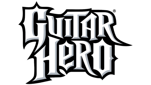
The Guitar Hero logo is text-based, but each letter in it is an example of gothic-style graphics. They have elongated stripes, sharp angles, and many spikes that point in different directions. There are also black shadows, turning the outer line into a bold frame. The emblem includes gray color: it effectively highlights the signs, transforming them into three-dimensional objects. Such a combination conveys the stability and authority of the game developers and its close association with hard rock and heavy metal. The two-level inscription is arranged as if the upper word is integrated into the lower one. Both are figurative and done in a font resembling the Nightmare Hero typeface.
2009 – 2015
After expanding the repertoire of musical tracks, the creators decided to move away from the limited association with heavy metal only. They used songs from other genres; hence, they made the logo less aggressive and not so spiky. The sharpness of the lines became less expressive; the prickly projections were shortened, and the shadows disappeared. Moreover, the designers separated the upper and lower lines, so they are now visually unconnected – there is a small but free space between them. The letters were painted in black.
2015 – 2017
In this version of the Guitar Hero emblem, there is a very distant similarity to the Gothic style. The font is more Old English, with small spike-like projections on the legs. In particular, they are present in the “G,” “H,” and “O.” The letters are smooth, italic, uppercase, and semi-bold, with smooth transitions on rounded parts. The name of the video game is regrouped into one row and has a narrow space between words, so it looks like a whole text. The dark palette has given way to a mustard one, more calm and life-affirming.
Fonts and Colors
In the text logos of Guitar Hero, the inscriptions are made in fonts that resemble Nightmare Hero and Tungsten SemiBold with minor modifications. Depending on the style, the letters are either gothically prickly or modernized under smooth italics. But for the most part, the design is custom, Hero Bold.
The color palette also does not boast a rich diversity. Bright splashes in it are absent because it conveys the character of heavy metal and hard rock. And with them, black-and-white monochrome perfectly matches. Later, the colors were enriched with mustard yellow, symbolizing life force.
Guitar Hero color codes
| Goldenrod | Hex color: | #d39d10 |
|---|---|---|
| RGB: | 211 157 16 | |
| CMYK: | 0 26 92 17 | |
| Pantone: | PMS 124 C |


