


![]() Hallmark Channel Logo PNG
Hallmark Channel Logo PNG
Royal dignity and impeccable manners are evident in the channel’s emblem. The Hallmark Channel logo alludes to the education and training of people in purity, holiness, and observance of the most valuable and unshakable laws.
The Hallmark Channel, a family-owned company, started. It has been around since 1992, the day the two religious networks merged. But it began operating under its current name in 2001. Many U.S. cable providers broadcast it: it is now available in more than 70 percent of households. It broadcasts in two languages: English and Spanish. The brand’s direct owner is Crown Media Holdings, a subsidiary of Hallmark Channel.
The history of the Hallmark Channel dates back to 1984, when one of its predecessors, ACTS, was launched. The second, VISN, was launched in 1984. Both television networks featured religious content. The airtime was filled with sermons combined with entertainment content. After the merger, ACTS and VISN retained their independence, although they began using the same repeater. At first, their union was known as VISN-ACTS. A little later, in 1993, it was called Faith & Values Channel.
In the latter half of the 1990s, it was renamed Odyssey Network, but that didn’t help the channel become popular. Eventually, it was forced to find new partners, namely Hallmark Entertainment (today’s Sonar Entertainment Corporation) and The Jim Henson Company. The deals were finalized in 1998. Two years later, all the shares were in Hallmark’s hands and were transferred to its Crown Media Holdings division. The final rebranding took place in 2001: the Odyssey Network was replaced by the Hallmark Channel.
Meaning and History
![]()
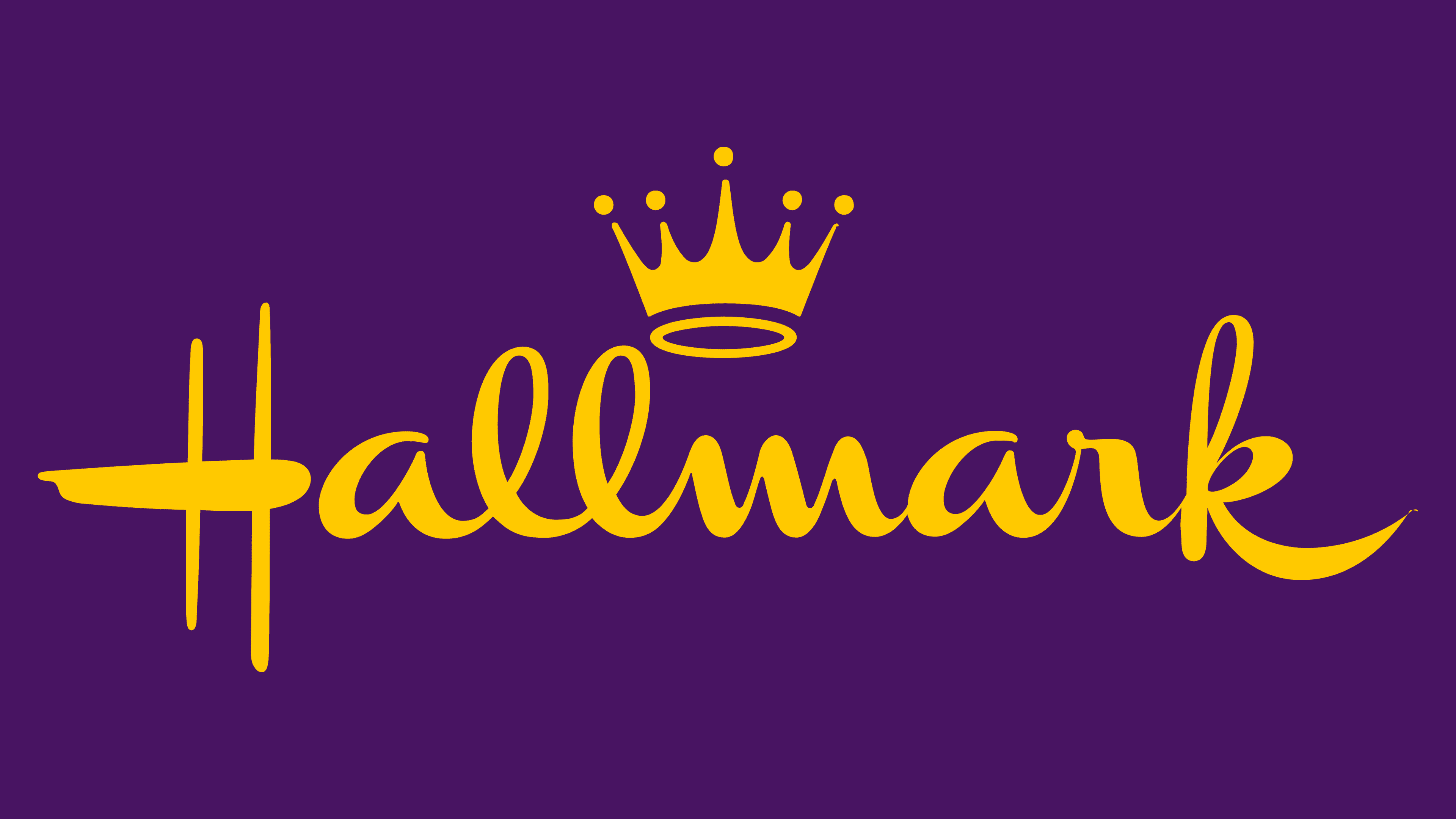
Constant renaming and ownership changes were reflected in the channel’s identity. It now uses the classic “crown” symbol, dating back to 1949. Designer Andrew Szoeke created this for Hallmark Channel, the greeting card channel industry.
The “crowned” channel broadcasts society’s current mood to viewers, supports family life, and brings joy. So he placed himself first among his competitors by hoisting a hand-drawn crown over his handwritten name. Refined rays with dots at the ends look elegant, offering customers a royal, modern, and fresh feel. No wonder this television service was chosen by about 70% of US households.
1984 – 1988
![]()
In the first half of the 1980s, Baptists founded the American Christian Television System. The religious network was non-profit until 1988 and operated for 8 years before the formation of the Faith & Values Channel. Its logo contained the acronym “ACTS,” which was difficult to read because the letters were misaligned. It was essentially a primitive black monogram. The top of the “C” came from the right diagonal of “A,” and their common bottom line connected to the “T.” At the same time, the horizontal bar of the “T” was at the same height as the top of the “S”: together, they formed one long bar.
1988 – 1993
![]()
In mid-1988, the Vision Interfaith Satellite Network was launched. An interfaith group created it to broadcast religious programs. The logo matched the network’s concept. It depicted a globe with a grid of parallels and meridians. It symbolized the channel’s global goals of becoming known worldwide and uniting social groups from different religions. The man on the globe conventionally represented a believer. His silhouette consisted of a triangular “arrow” pointing downward and a small circular head. The sides of the triangle looked like hands spread out in different directions during prayer. The fact that the human figure was larger than the globe spoke to the paramount importance of people.
1993 – 1996
![]()
At the end of 1992, ACTS and VISN formed the VISN-ACTS channel. The following year, it was renamed the Faith & Values Channel. This name became the basis for the new logo. The first two words were on the top line and separated by a small square icon with a spiral pattern. The rest of the inscription was at the bottom. It consisted of bold capital letters but took up little space because the designers used a small, sans-serif font. For FAITH and VALUES, on the other hand, a large triangular serif typeface was chosen. The abstract pattern that replaced the “&” symbol stood out against the black text in its gray color.
1996 – 2001
![]()
In 1995, Liberty Media Corporation bought half of the Faith & Values Channel and began to change its concept. A year later, it underwent its biggest rebranding since its founding: it became the Odyssey Network, though it was more commonly referred to simply as Odyssey. In the late 1990s, it had new owners, including Hallmark Entertainment. The change in management did not affect the logo. The channel continued to use the graphic mark adopted in 1996. It was a huge white-and-blue spiral framed in a square. The first word of the network’s name was at the top, and the second was at the bottom. They were united by a common font: a bold grotesque with many angles.
2001 – 2010
![]()
In 2001, the channel fully owned Hallmark and was renamed after its sole owner. The parent company gave the TV brand its name and logo, and the brand’s history dates back to 1949. The original version was created by the Hungarian emigrant Andrew Szoeke, the author of the ancient calligraphic signatures for American Airlines and Macy’s, used in the early 20th century. Hallmark Channel executives (J. C. Hall and Jeannette Lee) saw one of his designs on a New York street while walking past a Bergdorf storefront. They decided that this man should design their new corporate logo.
The result was not long in coming: just a year later, the exquisite inscription inside the crown adorned Hallmark merchandise. The final version with a horizontal orientation came a little later when artists Audrey Wilkinson and Jim Sturdivan adapted the image for different purposes. They reduced the crown and moved it beyond the wordmark. This version (with minor modifications) became the Hallmark Channel logo in 2001. Only the word “CHANNEL” was added to it, underlined by a long stripe.
2010 – 2022
![]()
After a little tweaking, the bottom line was removed. The letters in “CHANNEL” became larger, and the distance between them was reduced.
2022 – today
![]()
The redesign made slight changes to the Hallmark Channel logo because it doesn’t plan to remove the brand’s signature crown over the name in the handwriting-like font. Modernization touched the second row. The developers of the emblem increased the inter-character spacing and reduced the inscription height, so it is lower than in the previous version. The stitching is centered, starting under the first “a” and ending under the second.
Font and Colors
The Hallmark crown is the old symbol that has come to signify impeccable quality. It is associated with prestige and power, which gives the brand a high status in customers’ eyes. It is similar to a brand that is usually stamped on jewelry to verify the purity or fineness of the metal. The crown has been a classic Hallmark corporate style since 1949, when the company owner registered the Andrew Szoeke emblem. And in 2001, it was inherited by the television station and has remained its main graphic sign ever since.
The calligraphic inscription “Hallmark” has no analogs. Audrey Wilkinson and Jim Sturdivan can be credited with its invention, as they finalized the original version of the logo. Of course, other designers then tweaked the touches, but all these changes were minor. But for the word “CHANNEL,” the standard sans bold serif font is used. It has a lot in common with the free typeface Karla Bold, created by Jonathan Pinhorn.

The color scheme is very simple: the brand name and the crown, consisting of a ring and a “blot” with five prongs, are all black. The background in the basic version is white.