


 Halo Beauty Logo PNG
The Halo Beauty logo symbolizes health, radiance, and self-care, reflecting the brand’s core mission to help people achieve beauty and well-being from within. The emblem’s design conveys purity and naturalness, highlighting the company’s commitment to using high-quality and natural ingredients.
Halo Beauty began in 2018 as a supplement brand created by Tati Westbrook, a beauty influencer with a long background in online cosmetics content. On February 28, 2018, she introduced the company to an audience of more than 5 million subscribers on YouTube. The first product, Hair, Skin & Nails Booster, was designed to support appearance from the inside with daily vitamins.
The launch drew quick attention across the beauty community. Some viewers were interested in the “beauty from within” concept. In contrast, others questioned whether supplements could make a visible difference for hair, skin, and nails. Even with that debate, demand rose fast. Halo Beauty soon faced shortages and shipping delays, and Westbrook addressed these problems directly with her audience.
Later in 2018, the company released Kiwi Seed Booster, designed to support skin and digestion. In 2019, it added Body Booster, focused on general wellness and metabolism. That year also drew criticism from some dermatologists and nutrition experts over certain ingredients, prompting the brand to explain its formulas in greater detail and to provide customers with more information about the scientific basis for them.
In 2020, Halo Beauty worked on delivery, customer service, and a redesigned website with clearer product pages and a larger FAQ section. In 2021, the brand expanded international shipping and introduced Sleep Booster. In 2022, it invested in research and development, released Immune Booster, and began working with outside laboratories on clinical testing. By 2023, Halo Beauty had secured a place in the beauty and wellness supplement market.
Meaning and History
What is Halo Beauty?
Led by influential beauty blogger Tati Westbrook, Halo Beauty specializes in developing and selling high-quality beauty supplements designed to improve skin, hair, and overall health. Launched in February 2018, the brand has built a reputation as a household brand in North America.
2018 – today
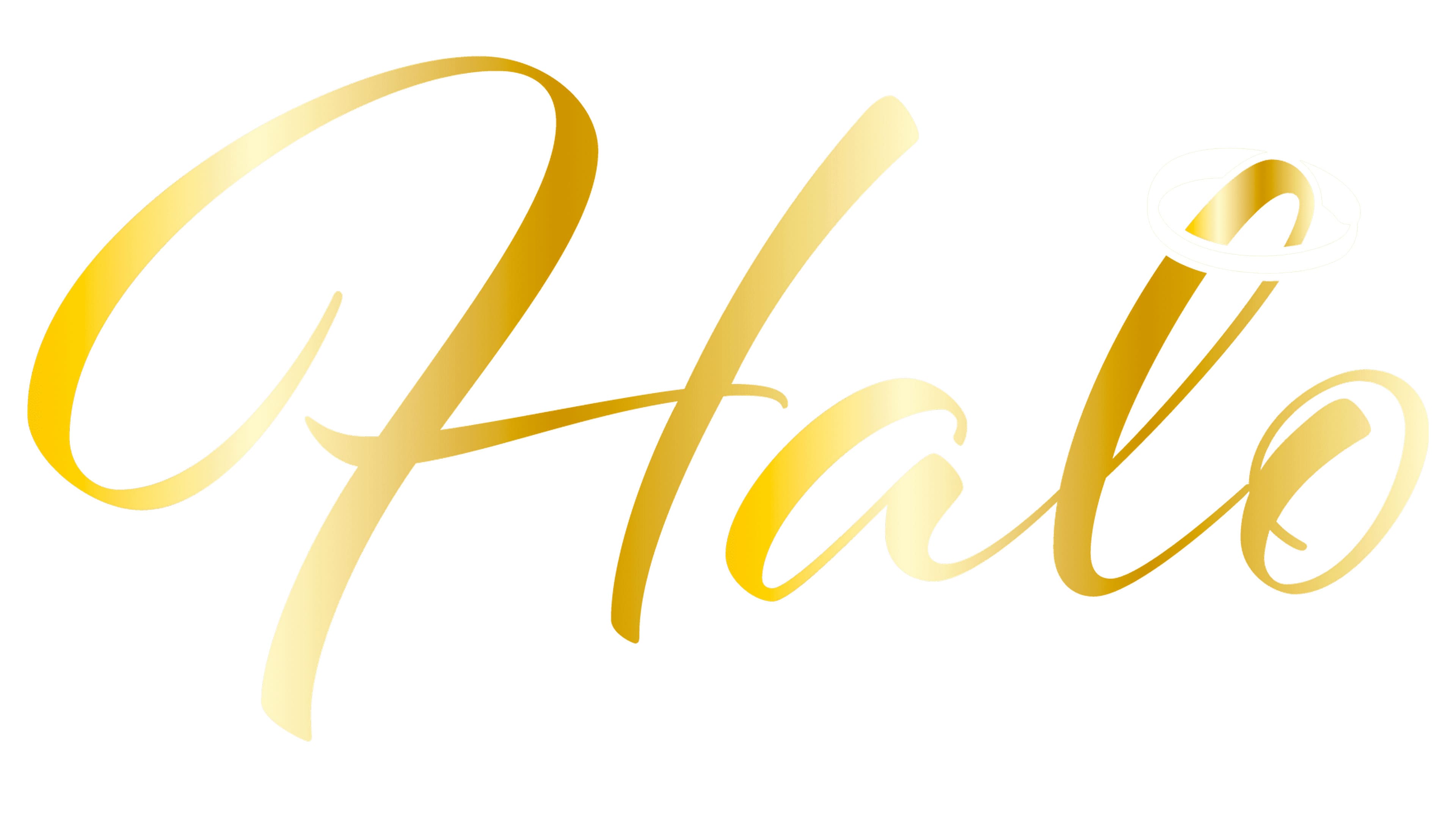
The Halo Beauty logo reflects the brand’s commitment to elegance and perfection. The entire inscription is handwritten, with smooth, curved lines that create a sense of lightness and grace. The letters resemble ribbons coated in a soft golden sheen, symbolizing luxury and the products’ premium quality. This complements the brand’s name, as the word “Halo” represents purity, light, and sanctity.
The letter “H,” with its prominent and graceful curve, resembles an elegant calligrapher’s stroke. This feature adds a unique and expressive character, making the letter stand out. The overall inscription feels cohesive despite the slight separation of elements, and the semi-connected font style makes it visually light and harmonious. The rounded lines of the letters, free of corners or sharp edges, enhance the effect of sophistication and softness.
The color palette is based on a golden hue ranging from rich to soft tones, creating a shimmering effect. This choice emphasizes the brand’s premium status, evoking associations of warmth, refinement, and quality. The visual design is free from excessive details, making it stylish and modern while remaining easy to perceive.
An interesting detail is the thin halo above the letter “o.” This symbolic element directly references the name Halo, adding a finishing touch to the design. It visually balances the text and reinforces the association with purity and sanctity.
The brand name is associated with flawless and radiant beauty, reflecting the company’s values. The letters in the logo are crafted to appear smooth and “glowing,” aligning with the brand’s core concept of creating products that enhance natural beauty.
The Halo Beauty emblem is visually appealing and symbolically conveys the brand’s essence. Its minimalism and refinement make the design visually pleasing and perfectly align with the brand’s overall aesthetic.