


![]() Halo Logo PNG
Halo Logo PNG
The Halo logo conveys an inhuman quality, as if it were appearing in our reality from a distant world. From the emblem breathes cold. The sign warns: Beware, do not let the monsters enter; they do not wish us well.
Halo’s history began in May 1991, when Alex Seropian and Jason Jones founded Bungie. Early projects for Macintosh, including Marathon and Myth, built its reputation. In January 1999, Halo was presented at Macworld Expo as a strategy game, with Steve Jobs demonstrating it.
Later in 1999, financial losses from Myth II forced Bungie to seek a partnership with Take-Two Interactive. On June 19, 2000, Microsoft acquired Bungie. Rights to Myth and Oni went to Take-Two, while Microsoft retained Halo. The project shifted from strategy to a first-person shooter for Xbox.
On November 15, 2001, Halo: Combat Evolved launched alongside the Xbox, selling over 6.5 million copies and setting a benchmark for console shooters. Competitors such as Sony (with the PlayStation 2) and Nintendo responded to the PlayStation 2’s rapid success. On November 9, 2004, Halo 2 introduced full online multiplayer via Xbox Live, generating over $125 million on release day. The series influenced the growth of esports, including Major League Gaming’s early tournaments.
Halo 3 launched on September 25, 2007, earning $170 million in its first 24 hours. Soon after, Bungie became independent again, while Microsoft retained the franchise and formed 343 Industries to continue development. Bungie released Halo 3: ODST in 2009 and Halo: Reach in 2010 before moving to Destiny with Activision.
On November 6, 2012, 343 Industries released Halo 4. In 2014, Halo: The Master Chief Collection launched with technical issues. Halo 5: Guardians followed in October 2015. In December 2021, Halo Infinite introduced free-to-play multiplayer. In October 2024, 343 Industries rebranded as Halo Studios and announced a transition to Unreal Engine 5.
Meaning and History
![]()
Microsoft Studios published all Halo shooters (and one strategy game). Microsoft, with which the company is affiliated, owns the rights to the media franchise and its logos. Several new versions of these emerge with the release of video games. Moreover, they all display the series name in the same font.
What is Halo?
Halo is the highest-grossing media franchise in video game history. It is based on a series of twisted shooters in which users can take part in an interstellar war.
2001 – 2004
![]()
The first two parts used an emblem with an uneven inscription “HALO.” The letters had shadows and a gradient, with the white top blending into the blue bottom. All symbols had unusual serifs, and inside the open “O” was a small circle with a dash.
2004 – 2007
![]()
This logo was seen in the second part of Halo. As in all other cases, it contained the franchise’s name, written in a special thin font. The letters were asymmetrical: the right vertical line “H” was missing the top, while “A” and “O” fragments were removed in different parts. At the same time, all glyphs were decorated with serifs, even “O,” from which a short and thin line stretched sideways. For the inscription, a blue gradient with dark shadows was used. Light contours created a feeling of “icing.”
2007 – 2010
![]()
When Halo 3 came out, the logo changed. The word turned blue, but the designers again used the gradient effect to create a transition between several shades.
2009
![]()
In the spin-off game Halo Wars, the logo has become very pale and has lost its original brightness. At the same time, a gradient was used, with a translucent and blurry white bottom transitioning into a faded blue top. As for the font, it hasn’t changed much. Only in this version, unlike the Halo 3 emblem, do the light outlines make the protrusions appear thinner.
2010 – 2012
![]()
For the shooter Halo: Reach, a black graphic was developed in which the roughness and angularity disappeared, except for the “L,” which has one sharp serif. The shape of the letter “A” has changed.
2010 – 2013
![]()
In 2010, the designers returned to the original design, making “A” much the same as it was initially. The “O” has the edge jagging again, and the “L” has smoothed corners, and the serifs have disappeared. The lettering has turned blue again with a gradient.
2013
![]()
In 2013, the logo for the game Halo: Spartan Assault was introduced for Windows Phone and Windows 8. It did not have the usual gradient because the designers used only two shades of gray: light for the main part of the letters and dark for the shadow areas. The boundaries between them were even and geometrically clear. The emblem’s font remains unchanged despite the transition to a flat 2D format.
2014
![]()
The Halo: The Master Chief Collection, released in 2014, also featured the logo, but it was light blue with a gradient and flecks in different shades. Light highlights created a glossy sheen, as if the letters’ surface were perfectly smooth and glowing from within.
2014 – 2016
![]()
In 2014, another redesign of the Halo logo took place. As before, the main and only element was the title of the video game series. The font has remained largely unchanged: the media franchise has retained its usual inscription design. The developers experimented a little with the palette, choosing a different shade of blue and adding a gray gradient.
2015 – today
![]()
In 2015, the Halo logo was introduced and is still used on most franchise-related merchandise; it is also featured on the franchise’s official website. This is one of the most neutral versions, judged by its color scheme. Here, each letter is outlined in a clear gray outline. The upper half of the inscription is predominantly white, while the lower half transitions to a light gray gradient. Some blackouts enhance the 3D effect.
2016 – 2019
![]()
Halo Wars 2 and Halo Infinite PC games have a new emblem with a cleaner design. This time, the creators of the graphic sign combined two colors: white and silver. Each letter has a black outline that resembles a shadow because of its uneven thickness. The three-dimensional effect did not disappear but rather intensified.
2019 – 2021
![]()
Halo: The Master Chief Collection had a new logo in 2019. The old blue inscription was replaced by the same inscription but in gold. The designers combined several different shades to make the symbol look voluminous. This time, the top was darker, and the bottom and right sides of the letters were lighter. As before, the “O” had a circle in the center.
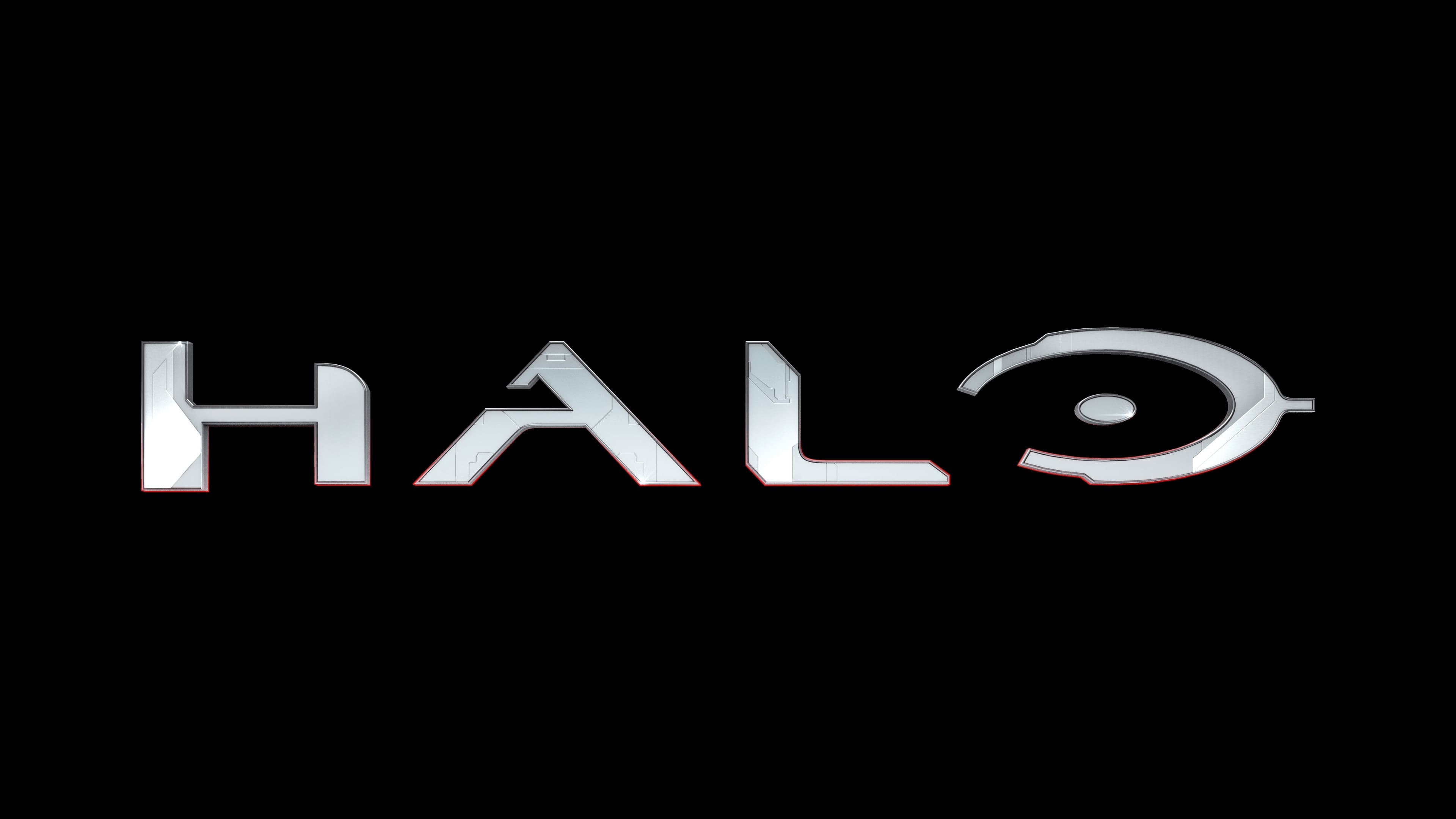
2021 – today
![]()
With the release of Halo Infinite, a new logo was introduced featuring a traditional-style inscription. It uses the same font as before and the already familiar blue palette with a gradient. We can say that this is a modern rethinking of the classics. The colors here are very delicate, and the transition of shades is smooth, although there are separate shadows with clearly defined boundaries.
Font and Colors
The Halo video game emblem consists of single lettering, so the design is based on typography. Due to its distinctive design, the text does not appear printed but drawn: each letter looks like a self-contained symbol, making it easy to recognize Halo among other shooters.
The logo was created from scratch, and only then did Will Turnbow develop the Halo font family based on it, two styles of 113 characters each. He did this after he couldn’t find the original typeface to add his name to the game title.
The color scheme is varied, featuring black, gray, blue, light blue, and silver. Almost every version has a gradient that gives the lettering a three-dimensional effect.