Established in 1979, Hanbury is an architecture and planning firm based in Norfolk, VA. The firm has grown from a 40-person operation in one office to a 160-person practice across eight offices. This growth includes shifting to employee ownership and expanding its focus to civic, community, science facilities, interior design, urban planning, preservation, and lab planning. The firm introduced a new brand identity designed by Base Design in Geneva, Switzerland, to reflect these changes.
The new identity aligns internal developments with external perceptions, emphasizing Hanbury’s unique process-oriented approach and commitment to delivering innovative solutions.
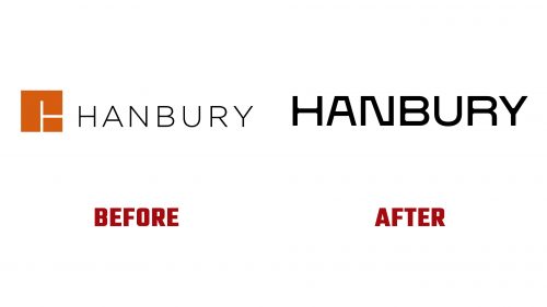
The new logo moves away from the old monogram and sans serif combination, which leads to confusion. It features a modern geometric construction with a wordmark incorporating 45-degree negative ink traps and varying widths and lengths for some letters. This introduces the concept of “stretch” throughout the brand identity.
The wordmark is designed to stretch horizontally while maintaining its geometric integrity. This custom typeface can expand without losing its sharp, angular joints, providing a visual metaphor for the firm’s flexibility. Rounded characters, such as “G,” “O,” and “S,” contrast with the angular design, ensuring readability even when stretched.
A notable element of the new identity is the “H” monogram. Its counter spaces feature generous curves as the stems flow into the crossbar. This monogram integrates well into the visual system through animation on the website, creating an interactive experience as users scroll.
The refreshed color palette includes shades of blue and gray, representing stability and professionalism, with vibrant accent colors highlighting innovation and creativity. These colors are used consistently across all brand materials.
Typography plays a crucial role in the new brand identity. The custom typeface used for the wordmark extends to other textual elements, maintaining a unified appearance. Clean, sans-serif fonts for body text ensure readability and complement the modern logo aesthetic.
The brand system incorporates motion graphics and dynamic UX elements. Images transition smoothly, reflecting Hanbury’s continuous motion and commitment to progress. These elements enhance the visual appeal and create an immersive experience for users.
The rebrand includes patterns and graphical elements based on grid, square, and cube motifs. These elements symbolize precision, structure, and scalability, core values of Hanbury’s approach. The use of geometric shapes throughout brand materials ties the visual identity together.
The new brand identity captures Hanbury’s mission and values. The modern geometric logo, dynamic typography, and cohesive visual system contribute to a strong brand presence. This rebrand enhances market position and underscores a commitment to innovation and excellence. Hanbury is well-positioned to continue its growth, offering cutting-edge solutions and maintaining a clear perspective on its unique approach in the industry.


