The legendary animation studio used a logo that conveyed an atmosphere of joy and fun. Today, the Hanna Barbera logo evokes nostalgia among adult viewers and reminds them of the variety of cartoons created by this company. It serves as a distinctive symbol, uniting the history and heritage of the brand.
Hanna-Barbera: Brand overview
| Founded: | July 7, 1957 |
| Founder: | William Hanna, Joseph Barbera, George Sidney |
| Headquarters: | California, U.S. |
Meaning and History
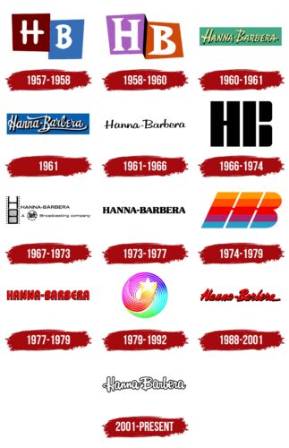
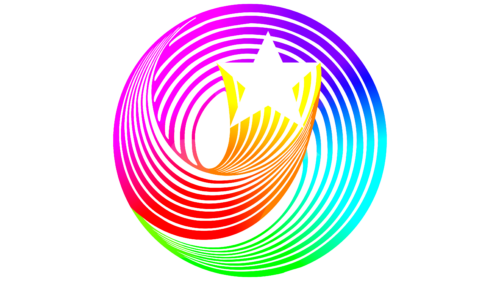
The studio’s name, Hanna-Barbera, derives from its founders’ surnames: William Hanna and Joseph Barbera. It is presented in most logos in the full version and as an abbreviation. Only the American graphic designer Saul Bass created a unique emblem for the company with a star, which was used from 1979 until the early 1990s.
What is Hanna Barbera?
Hanna-Barbera is a legendary animation studio that operated from 1957 to 2001. The brand with this name still exists but is used only to protect copyrights on previously created cartoons: The Smurfs, Popeye the Sailor, The Flintstones, Scooby-Doo, and other animation masterpieces.
1957 – 1958
The Hanna Barbera company was originally called H-B Enterprises; its original logo contains “H” and “B.” Each is located in a rectangle: “H” in a burgundy one, “B” in blue. Both glyphs are white and uppercase. The font is uneven, with large protrusions. This emblem only appeared in The Ruff and Reddy Show.
1958 – 1960
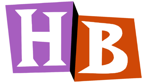
The designers enlarged the letters and decorated them with triangular serifs. Now “H” is located in a lilac rectangle, and “B” is in a dark orange one. A wide black stripe is drawn between the multicolored bases, serving as a visual divider and creating a 3D effect.
1960 – 1961
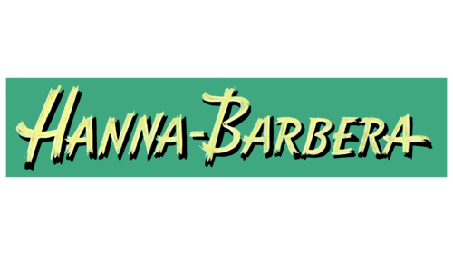
In 1959, the studio was renamed Hanna-Barbera Productions, Inc. Thus, the phrase “HANNA-BARBERA,” colored in yellow and placed on a green background, appeared on its logo. The designers used a small caps font, meaning all the glyphs are uppercase, but they have been reduced to the size of lowercase letters, leaving only the initial “H” and “B” large. The inscription is drawn because the letters are uneven strokes with blurred ends. The right-hand black shadows make the image volumetric.
1961
This version’s white inscription with black outlines contrasts with a blue background. The font has become handwritten, and only the first “H” and “B” are uppercase. They are decorated with decorative loops. From “B,” a long horizontal stripe extends to the right, underlining the word “Barbera.” The lowercase “e” is shaped like the Greek “ε.”
1961 – 1966
A new wordmark was introduced on January 30, 1961. Now a bold font similar to Billabong is used. It imitates calligraphic handwriting and looks like the inscription was made by hand. The brand name is colored in black and no longer has a bright background – at least in the official version of the emblem.
1966 – 1974
The company returned to the two-letter logo, making it black, strict, and massive. It consists of rectangles, between which there is an equal narrow distance. A short horizontal line connects the first two shapes. This is “H”. As for “B,” it has no horizontal elements: it is formed by only three vertical stripes.
1967 – 1973
On the left is a stylized film strip stretched from top to bottom. On the right is the phrase “HANNA-BARBERA” and the inscription “A Taft Broadcasting company,” where the word “Taft” is enlarged and placed in a ring. All elements are black and white.
1973 – 1977
The name of the animation studio is formatted in bold type with rounded serifs. The asymmetrical shape of the letters creates a sensation of smooth sliding. The inscription color is rich black.
1974 – 1979
This is a revised version of the 1966 logo. It differs from the original by having fewer geometric figures. Now there are only two quadrangles, and the letter “B” is formed by two elongated ovals, which are interconnected. The vertical parts of the emblem are tilted to the right and have small crossbars. The logo is colored in five shades: sandy, orange, red, purple, and blue.
1977 – 1979
On September 10, 1977, an emblem with the red inscription “HANNA-BARBERA” debuted. It uses the ITC Bauhaus typeface, which was created two years earlier. Of course, the designers significantly altered the font to adapt it to the studio’s animation style.
1979 – 1992
This is one of the most well-known Hanna Barbera logos. It contains a white five-pointed star from which a trail of thin lines spirals out. Its creator, Saul Bass, used a gradient of bright colors (yellow, red, pink, blue, light blue, and green) to convey the positive atmosphere of the cartoons.
1988 – 2001
Iraj Paran returned the brand name to the logo and made it red. He chose a custom handwritten font with bold, right-leaning letters. Because of the black outlines, the inscription seems to hang in space.
2001 – today
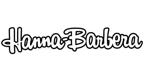
In 2001, the company became part of Warner Bros. Animation. It stopped releasing new cartoons, but the Hanna-Barbera brand still exists. And it has an emblem: a white name with black outlines. The handwritten letters have a right-hand tilt.
Font and Colors
After 2001, the logo was designed in a font similar to a modified Billabong. It mimics uneven handwriting. The prevailing color is white, and black is only used for outlines. This classic combination makes the emblem balanced.
Hanna-Barbera color codes
| Black | Hex color: | #000000 |
|---|---|---|
| RGB: | 0 0 0 | |
| CMYK: | 0 0 0 100 | |
| Pantone: | PMS Process Black C |
