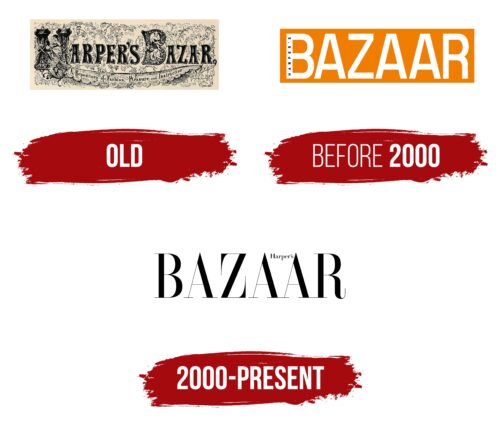
The Harper’s Bazaar logo company does not merely serve a decorative function; rather, it encapsulates the brand’s commitment to providing luxurious, timeless fashion content with a touch of sophistication.
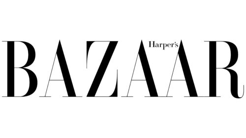
Harper’s Bazaar emblem prominently features the distinguished Didot font, demonstrating its immediate association with the magazine’s branding. This typographical emblem represents a trademark example of visual identity becoming synonymous with the brand.
The emblem, with its distinct Didot typography, was brought to life in 1934 by Alexey Brodovitch. Serving as the art director of the magazine at the time, Brodovitch was the creative mind behind the magazine’s aesthetic composition and visual appeal.
This premier publication is identified within the luxury market segment for its choice of a refined serif font. This choice effectively amplifies the logo magazine’s chic, ageless, and deluxe appeal. The chosen Didot typeface has morphed into a symbol closely associated with the magazine and is also preferred by many leaders in the realm of fashion media.
Using a sophisticated black color for the logo adds a layer of elegance and intellectual style to the brand.
Harper’s Bazaar: Brand overview
| Founded: | November 2, 1867 |
| Founder: | Hearst Magazines |
| Headquarters: | New York City, United States |
| Website: | harpersbazaar.com |
Magazine, first published in New York City on November 2, 1867, under the weekly title Harper’s Bazar, has evolved into a significant presence in the fashion world. It’s now a monthly women’s fashion magazine that has shaped and chronicled the world of style for over a century.
The magazine began as a weekly publication aimed at middle and upper-class women, offering advice on fashion, beauty, and lifestyle. It soon established itself as a trusted source for women who sought to keep up with the latest trends. Over time, this pioneering publication transitioned into a monthly format, amplifying its influence and reach across the globe.
Meaning and History
The brand’s corporate identity is rooted in its long-standing tradition of delivering high-quality content in a luxurious, aspirational format. Its mission is to inspire readers with a rich blend of fashion, beauty, and culture, positioning itself as an authority in the fashion world. The magazine is renowned for its sophisticated and avant-garde visual style, frequently featuring cutting-edge fashion photography and in-depth interviews with leading fashion figures.
Harper’s Bazaar’s branding reflects its timeless elegance and dedication to the art of style. The distinct logo, emblazoned in a classic, clean font, signifies its legacy and authority in the fashion realm. It’s more than just a magazine—it’s a symbol of high fashion and class.
The brand has been successful in maintaining its status as a tastemaker while also evolving to stay relevant in the ever-changing fashion industry. Its dynamic identity allows it to be a beacon for fashion enthusiasts worldwide, continually offering a fresh perspective on style while honoring its rich history.
What is Harper’s Bazaar?
Harper’s Bazaar is a long-standing American women’s fashion magazine, first published on November 2, 1867. It is owned and operated by Hearst Magazines and is headquartered in New York City, United States. Over its long history, Harper’s Bazaar has established itself as an authority in fashion, beauty, and popular culture. The magazine is known for its sophisticated tone and high-end design, regularly featuring the work of renowned photographers, designers, and writers. It provides its readers with the latest trends in fashion, beauty advice, profiles of prominent figures in fashion and entertainment, and insightful articles on contemporary life and culture.
Old
before 2000
2000 – today
Harper’s Bazaar color codes
| Black | Hex color: | #000000 |
|---|---|---|
| RGB: | 0 0 0 | |
| CMYK: | 0 0 0 100 | |
| Pantone: | PMS Process Black C |


