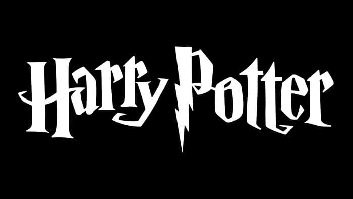
Fans of the story about “The Boy Who Lived” are well aware of what the Harry Potter logo looks like. It serves as the franchise’s calling card, adorning book covers, and film introductions and creating an intriguing atmosphere. It evokes thoughts of magic and the Middle Ages.
Harry Potter: Brand overview
Today, in the civilized world, there is hardly anyone who doesn’t know who Harry Potter is. The name of this fictional character became well-known in 1997 when the first book by English writer J.K. Rowling about an unusual school of magic, its teachers, and students was released. Now, the image of the boy in glasses with a magic wand in his hand and the unique spelling of his name is as recognizable as the logos of McDonald’s or Adidas.
Meaning and History
The first Harry Potter book was published on July 26, 1997. Rowling later admitted that she had offered the manuscript to many publishers for several years but was always rejected. The story about magic and strange characters seemed uninteresting to readers.
But after the first part was released, the book immediately became a bestseller. Seven books have been released, and ten films have been made about the Potter series (8 based on the books plus spin-offs and sequels). The books and films have been translated into 80 languages, with nearly 700 million copies sold – making it the most-read literary work in history. The number of film views is even impossible to count accurately – box office receipts amounted to almost 2 billion dollars.
The “Harry Potter” trademark was patented in 1997 for book design.
What is Harry Potter?
Harry Potter is a series of fantasy novels about a young wizard who must save the world. The inspiring story spawned a global media franchise, including games, movies, cartoons, theme parks, and much more. J.K. Rowling wrote a series of fantasy books for children and began publishing in 1997.
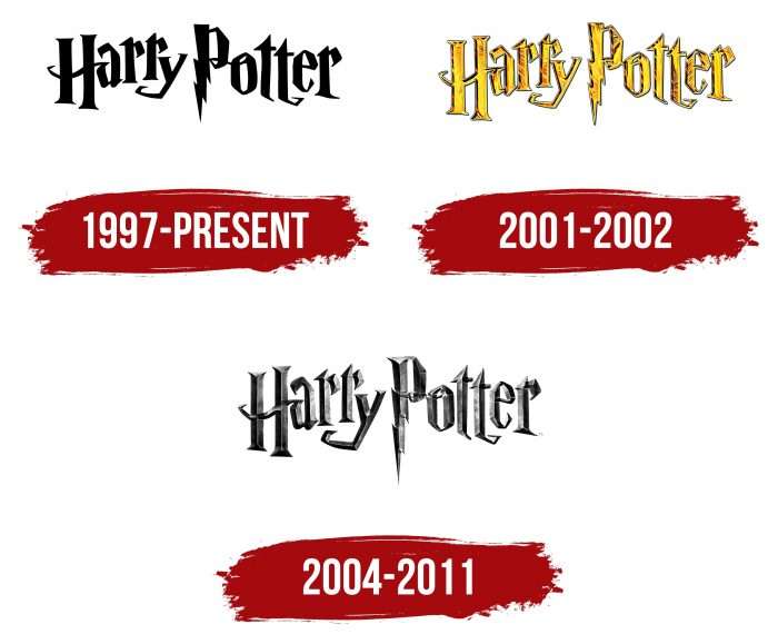
1997 – today
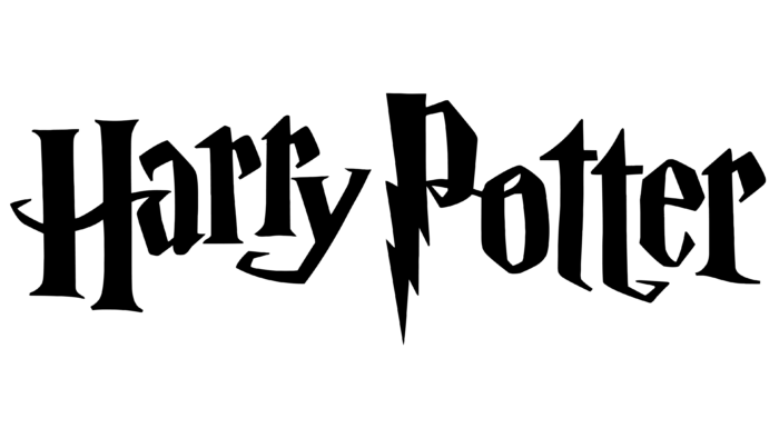
In the first English edition, the book’s title was designed quite minimally – the hero’s name was written in the gothic font Cochin Bold with a slightly staggered arrangement of letters.
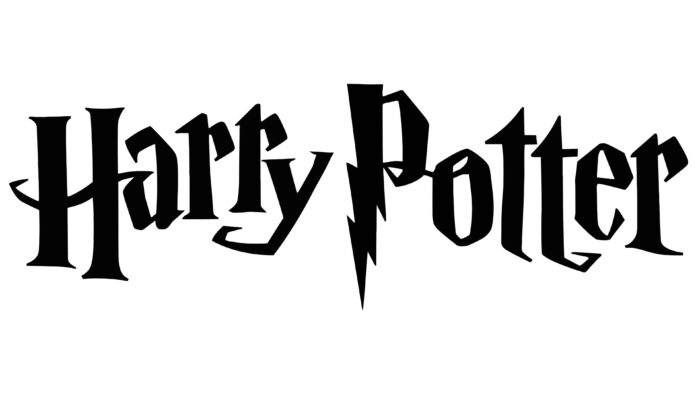
After the first success in Europe, the book was reissued in the USA – then a special spelling of the letter P appeared – a zigzag lightning bolt was added to the bottom of it, symbolizing the magical power emanating from the magic wand. Another association is the scar on Harry Potter’s forehead, which he received from the dark wizard Voldemort at age 1. The color of the letters on the emblem is black.
At the same time, a short emblem was created. It consists of the recognizable letters H and P, surrounded by a dashed oval and a flying ball with wings. Everything is executed in gold color.
2001 – 2002
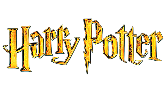
In 2001, with the first film’s release, the logo changed color to gold with shadows, creating the impression of volume. The effect of crumpled foil is also used.
2004 – 2011
The logo changed color again – to gray-silver with chaotically arranged black shadows. This gave the words a special mystery and eeriness and emphasized the gloomy atmosphere of the 3rd part of the film. This decision was made by the film’s director, Alfonso Cuarón. At the bottom right, the TM symbol was added – a sign that the trademark is officially registered and protected. Subsequently, the entire Potter filmography was made with this logo.
Harry Potter: Interesting Facts
The Harry Potter series by J.K. Rowling is a huge favorite around the world, mixing magic with adventure.
- How It Started: J.K. Rowling got the idea for Harry Potter on a train ride in 1990. She imagined Harry and the wizarding world all at once.
- Helping Others: Rowling has given a lot of her money to help with charity, like helping kids and fighting against inequality.
- Tough Beginnings: The first Harry Potter book was turned down by many publishers. But then a publisher’s daughter read it, loved it, and they decided to publish it.
- Super Popular Books: The Harry Potter books have sold over 500 million copies worldwide and are among the best-selling books ever.
- A Whole World: Rowling created a detailed world with its history, sports like Quidditch, and magic system.
- Movies: They turned the books into eight movies that many people loved and made a lot of money.
- Theme Parks: There are Harry Potter theme parks where you can feel like you’re in the story, visiting places like Hogwarts and Diagon Alley.
- Lots of Stuff: There are many Harry Potter things now, like video games, toys, a play, and even more movies about the wizarding world.
- Got Kids Reading: Harry Potter helped make reading popular again for kids and teenagers, with stories everyone can enjoy.
- More to Explore: Rowling also made a website where fans can learn more about Harry Potter’s world, with stories about characters, magical creatures, and more.
Harry Potter has had a big impact, encouraging reading and inspiring people with its stories about bravery, friendship, and the power of good. It’s a world that keeps growing and bringing in new fans.
Font and Colors
Since 2011, the letters have changed color and minor proportion again. Today, white letters on a black background and black-on-white, yellow, gold, and silver inscriptions are relevant. As the label owners state, the color palette is not a unique part of the logo. The Cochin Bold font was slightly modified – the letters became a bit wider, and the sharp angles were softened – and since then, it has received the individual name “Harry Potter.”
The “Harry Potter” logo will forever remain in history in its unique spelling, and the book’s author promises five more parts.
The Harry Potter inscription looks recognizable. Designers used long curved serifs, broken strokes, and jumping letters to convey the mood of the magical world. In the personalized font, there’s a triangular upper letter “t,” a capital “P” with a zigzag lightning bolt, and an asymmetrical “H” with vertical lines resembling columns of different heights.
Although there were previously brighter versions, a simple black-and-white logo is used: the inscription was first stylized as gold and then silver. Designers tried to convey the shine and texture of precious materials using gradients. However, the metal imitation did not take hold, and the developers returned to the black-and-white version.
Harry Potter color codes
| Black | Hex color: | #000000 |
|---|---|---|
| RGB: | 0 0 0 | |
| CMYK: | 0 0 0 100 | |
| Pantone: | PMS Process Black C |
