Havells: Brand overview
Havells, an Indian company known for its electrical equipment, was founded in 1958 by Kimat Ray Gupta in New Delhi, India. Initially, the company specialized in selling electrical products. Since then, Havells has become one of India’s leading brands in the manufacture of household electrical products, including switchgear, electric fans, and home appliances.
The company’s product range goes beyond consumer electronics. It also manufactures various industrial and domestic cables, motors, air conditioners, and lighting fixtures, thus showcasing its diverse capabilities in the field of electrical equipment.
Headquartered in Noida, India, Havells maintains a strong presence in the country and has manufacturing facilities across the country. More than 15,000 employees are involved in the company’s manufacturing activities.
Havells’s portfolio also includes globally recognized brands such as Crabtree, Standard, Promptec, and Sylvania, acquired through strategic mergers and acquisitions. The company is listed on the National Stock Exchange (NSE) and the Bombay Stock Exchange (BSE) in India and has annual revenues of over $1.5 billion.
QRG Group, a holding company owned by the founding family, retains a majority stake in Havells. The company’s products reach consumers through an extensive distribution network of 135,000 outlets and 4,500 dealers in India.
In competing in the Indian electrical market, Havells is up against established competitors such as Anchor, Legrand, and Schneider Electric, maintaining its status as one of the major players in the industry.
Meaning and History
What is Havells?
Havells India Limited, founded in 1958 by Haveli Ram Gandhi, is a leading electrical equipment manufacturing company based in Noida, Uttar Pradesh, India. The company was acquired by its distributor, Kimat Rai Gupta, spurring its global expansion. As a giant in the electrical sector, Havells offers a wide range of products, including fans, lighting, wiring products, cables, and home appliances.
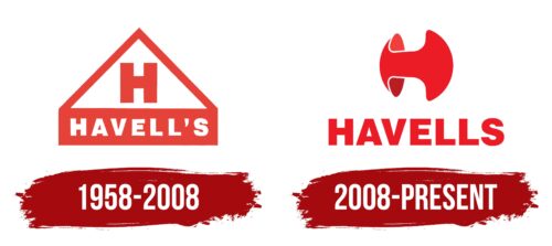
1958 – 2008
2008 – today
The Havells logo uses the color red, which in India is associated with energy, sensuality, purity, well-being, and vitality. The brand name is written in a confident font reminiscent of Swiss 721 Std Black or Helvetica, symbolizing determination and authority. Above it is a stylized letter “H,” resembling a double-sided arrow with rounded ends.
The red color is reminiscent of chili in Indian cuisine – spicy and full of life. The powerful font rises like an experienced captain leading a ship. The arrow-shaped “H” makes you think of directions and choices as if the company knows exactly where it’s headed. The rounded ends of the arrow are as if to say, “We’re friendly and approachable, but we’re businesslike.”
Havells color codes
| Pigment Red | Hex color: | #ec1c27 |
|---|---|---|
| RGB: | 236 28 39 | |
| CMYK: | 0 88 83 7 | |
| Pantone: | PMS Bright Red C |


