


 Hearthstone Logo PNG
The Hearthstone logo promises endless turns and labyrinths. The emblem represents maps, a compass, a spyglass, and everything a real adventurer needs. Whichever direction the player chooses, a field with a new mission awaits him.
In 2008, a small unit inside Blizzard Entertainment formed under the name Team 5. With fewer than fifteen people, it was the smallest team in the company, tasked with building a digital card game. Early reactions inside the studio were skeptical. Designers Ben Brode and Eric Dodds handled most gameplay and balance decisions.
The concept centered on a tavern setting in the Warcraft universe, featuring characters such as Jaina Proudmoore and Gul’dan as class heroes. The tone contrasted with the darker style of Blizzard’s larger titles, such as World of Warcraft and Diablo. Blizzard announced
“Hearthstone: Heroes of Warcraft” in March 2013 at PAX East. The closed beta began on August 26, 2013, in North America, and on September 4, 2013, in Europe, reaching over 1 million testers by November. The open beta started on January 21, 2014, followed by the full release on March 11, 2014, making it Blizzard’s first fully free-to-play game.
An iPad version launched in April 2014 with cross-platform play. By September, the player base exceeded 20 million. Blizzard released the first solo adventure, Curse of Naxxramas, in July 2014, followed by the Goblins vs Gnomes expansion in December, establishing a regular release cycle.
By 2015, the audience had reached 40 million users, growing to 50 million by April 2016 alongside the introduction of Standard and Wild formats. Revenue approached $40 million per month by August 2017. The game competed with titles like Magic: The Gathering Arena and later responded to trends such as Teamfight Tactics by adding Battlegrounds in 2020. By November 2018, registered users had surpassed 100 million.
Meaning and History
Hearthstone is now a whole esports discipline. The developer regularly holds championships, where the winners of qualifying tournaments are admitted. What started as a computer game for Windows, Android, and iOS became the basis for the competition and was recognized as a sport.
Ben Brode and Eric Dodds have worked hard on Hearthstone. From the beginning, they served as chief game designers, so the game’s logo is, in a way, their credit. It is very similar in style to the World of Warcraft icon, featuring orange lettering with two enlarged letters.
What is Hearthstone?
Hearthstone is a video game created in 2014, based on the Warcraft universe. Players battle each other with virtual collectible cards featuring characters, weapons, and spells from Warcraft. Hearthstone has become an esports discipline, bringing fame to its developer, Blizzard Entertainment.
2013 – 2016

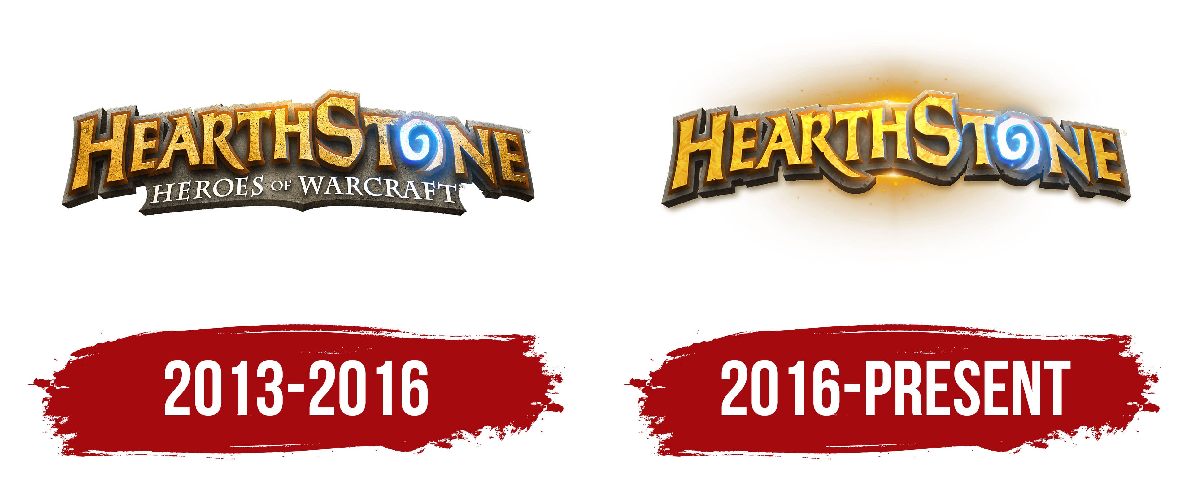
The first version of the emblem was quite dark. The designers enveloped the word “HEARTHSTONE” in gray shadows, leaving only one bright element: a blue “O” shaped like a spiral rune. To make her light more believable, they added highlights to the remaining letters. The color scheme was a gradient: the closer to “O,” the lighter it was.
At the bottom, on a brown plaque, was the second half of the game’s name: HEROES OF WARCRAFT. It was lost against the background of the main inscription because it used thin white letters and took up little space.
2016 – today
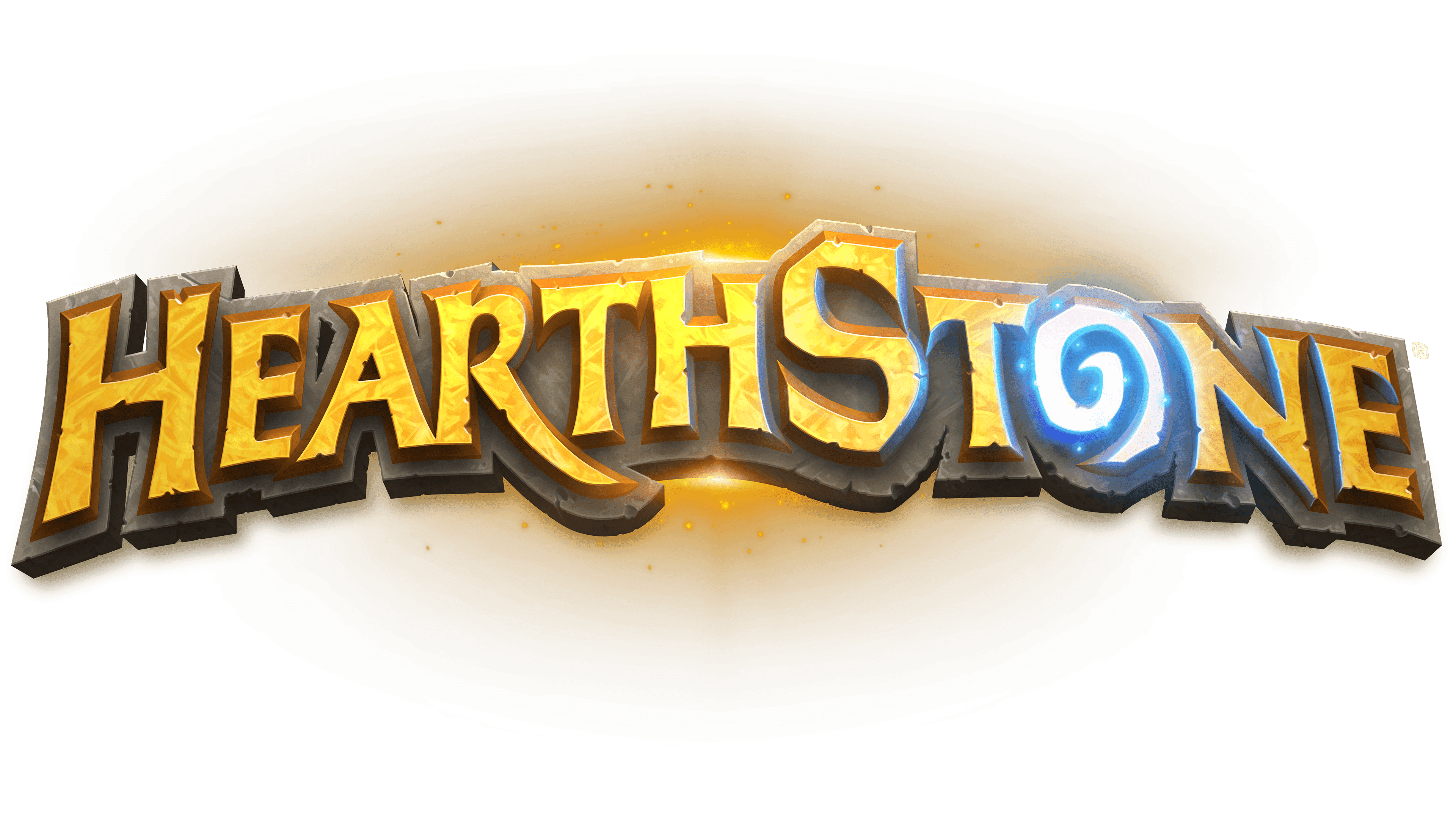
In 2016, the designers removed the bottom of the logo, leaving only the word “HEARTHSTONE.” There were new details, including an extended “R” leg to balance the image. The shadows dissipated in the bright sun’s rays rising behind the inscription.
The emblem’s most recognizable element is the letter “O,” an oval with a white-and-blue spiral twisted counterclockwise. World of Warcraft has an item with a similar pattern; by the way, it is also called Hearthstone. This rune lets the gamer instantly return to their home location, usually to a safe place near the inn or another pre-selected spot. So the Hearthstone logo is very symbolic.
Font and Colors
The designers didn’t use standard fonts and drew the inscription from scratch. All letters are capitalized, but the first “H” and the seventh “S” are slightly higher than the rest, just like the “W” and “C” on the similar World of Warcraft icon. The word is arched and decorated with short serifs.
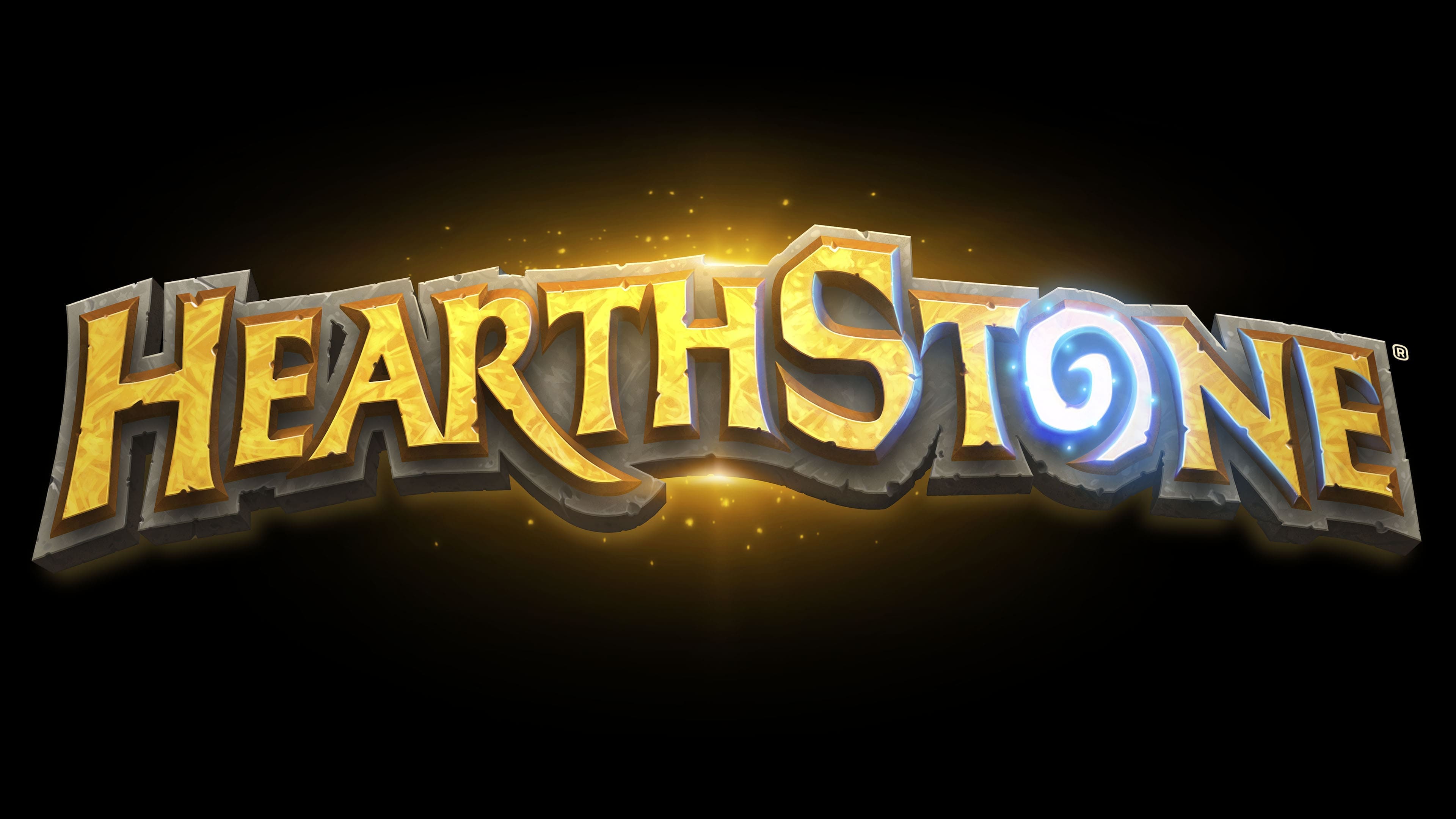
The letters look as if they were carved from stone. This is indicated by the “scratched” texture and orange gradient. The volumetric frame creates a 3D effect. The color distribution is uneven, with transitions between dark and light shades. Despite this, the main palette is not very diverse: orange, brown, and blue. Other colors, such as white, gray, and yellow, complement the overall idea and appear only in small amounts.