


![]() HEB Logo PNG
HEB Logo PNG
“We’ve got everything you’re looking for,” says the HEB logo. Active work, an impressive list of goods, friendliness, and the speed of service are encoded in supermarket emblems. The letters exude freshness and a desire to improve the world around us.
Meaning and History
At the head of H-E-B has always been the Butt family. First, Florence opened a small grocery store in 1905, for which she donated the first floor of her house. When her son returned from the war, he took over the family business, but he only managed to increase the number of outlets in 1927. A few years later, the department stores were called H-E-B – after the initials Howard Edward Butt. C.C. Butt Grocery Store, established by Florence, was incorporated and renamed to match the new branding.
Early H-E-B marketing campaigns attracted many customers because Howard organized giveaways ranging from coins and chickens to money, mink coats, and cars. Such advertising was used in the early 1930s. In the 1950s, the chain had its bakeries, drugstores, butchers, and fishmongers. However, it did not sell alcoholic beverages because Howard was a Baptist.
As of 2021, the company had more than 340 locations. They are operated by the billionaire Charles Clarence Butt, who became president in 1971. The well-known philanthropist uses the family business to donate 5% of the proceeds to charity.
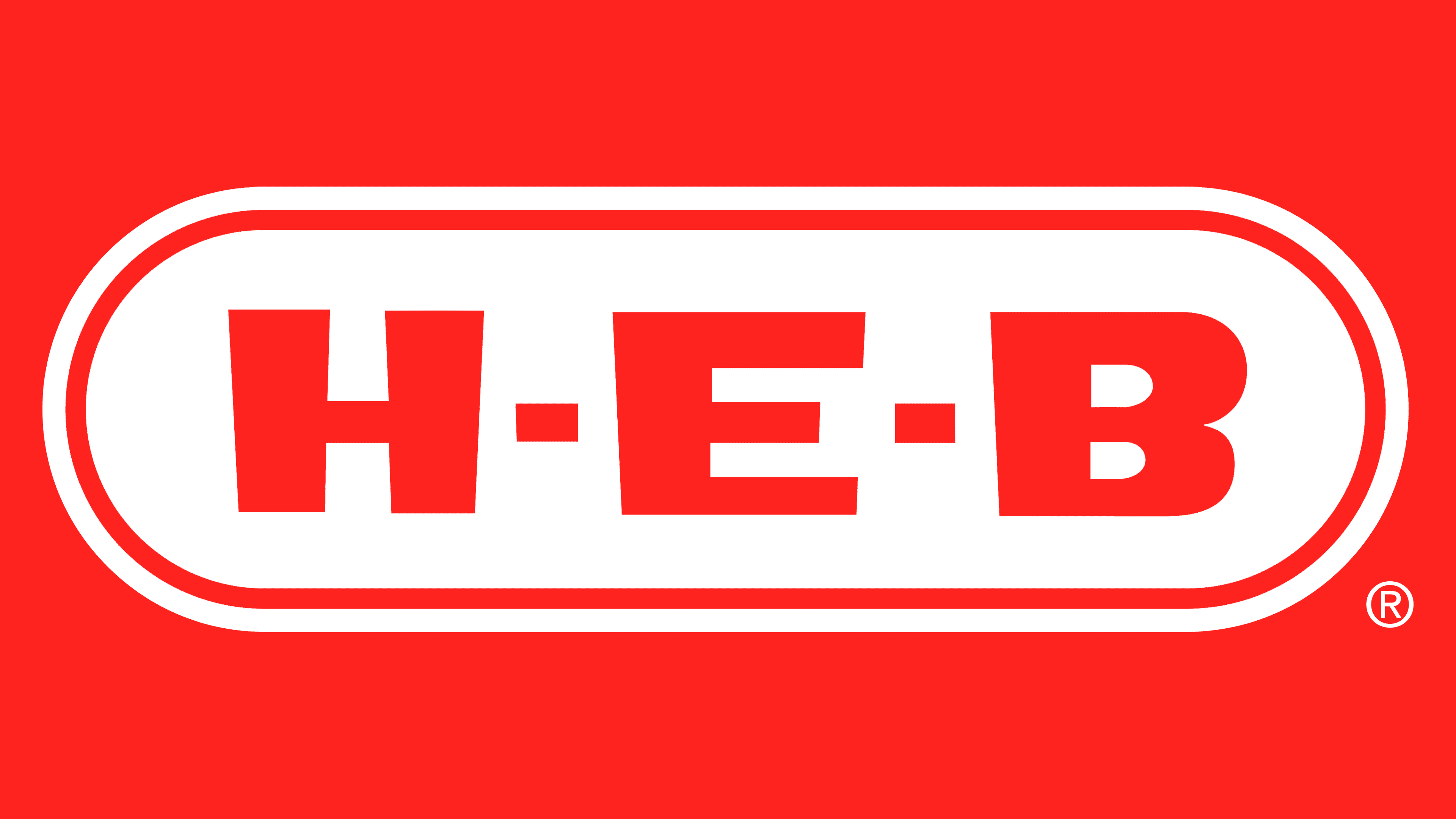
All H-E-B supermarkets share a common identity based on a recognizable logo. It is a wordmark rendered as a red sign with white lettering. In the center is the network’s actual name, and judging by the old-fashioned typeface, the design was invented a long time ago, or modern graphic artists stylized it to fit a bygone era.
The word “H-E-B” is set within a rectangle with rounded corners, resembling an oval. Its interior is entirely red, and two thin white-and-red lines are drawn along the edge. Despite the two-part outline, the visual sign appears very simple and is 2D. Designers do not add fashionable gradients nowadays, so the symbol is available in only one version.
Font and Colors
More than one generation of shoppers is familiar with the H-E-B sign. It can be found in all major supermarket chains. Although it may seem outdated, it has an important advantage: a consistent logo makes stores recognizable and sets them apart from competitors.
The letters in the “H-E-B” lettering have a non-standard design because their top are wider than their bottoms. The side strokes of the “H” are not strictly vertical but at an angle, and they are directed in different directions. The bottom horizontal line “E” is shorter than the top line but longer than the middle line. The “B” is also asymmetrical: its halves are the same shape but differ in size. The font looks like a bold grotesque, although it is more like a set of individual glyphs.
The color combination of red and white is used to attract attention. Moreover, red encourages shopping, while white symbolizes light and purity, evoking subconscious trust in the supermarket chain.