Hella: Brand overview
HELLA, a German company known for manufacturing automotive parts and accessories, has particular expertise in lighting and electronics. The company was founded in 1899 by Sally Windmuller in Lippstadt, Germany, and remains headquartered today.
As one of the world’s leading suppliers of automotive lighting, HELLA offers a wide range of headlights, signal lamps, and interior lamps. The company also manufactures electronic components such as sensors, actuators, and parts for energy management systems.
HELLA serves major automakers worldwide, including such respected brands as BMW, Mercedes, Volkswagen, General Motors, Ford, and Toyota. With more than 36,000 employees, the company operates in more than 125 regions around the world, demonstrating its broad reach.
The company’s activities are divided into three main divisions – Lighting, Electronics, and Life Cycle Solutions. Listed on the Frankfurt Stock Exchange, HELLA reports impressive annual sales of around 6.5 billion euros.
Beginning in the 1970s, HELLA began expanding outside of Germany, and today, international sales account for more than 90% of the company’s total sales. HELLA collaborates with automakers on key innovations such as adaptive front lighting and matrix LED systems.
HELLA’s main competitors in the global automotive components market are such well-known companies as Osram, Bosch, Denso, and BorgWarner. Despite this competitive environment, HELLA maintains its leading position in the industry.
Meaning and History
What is Hella?
In 1899, Sally Windmüller set out to light up the world by founding Westfälische Metall-Industrie Aktien-Gesellschaft (WMI). The company initially manufactured horns, candles, and kerosene lamps for carriages, but in 1908, it made a revolutionary breakthrough with acetylene headlights under the Hella brand. In 1923, ownership of the company passed to the Ludenscheider-Hueck family, and in 1986, its official name was changed to Hella. Today, more than a century later, Hella continues to fulfill its mission of distributing light around the world, operating from its headquarters in Lippstadt, Germany.
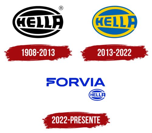
1908 – 2013
2013 – 2022
2022 – today
After Hella merged with Faurecia, they began operating under the umbrella brand FORVIA. This new name is reflected in the logo used from 2022. The typeface epitomizes innovation and dynamism, especially the wavy “F,” which looks like a modified “S.” The old logo featuring the word “HELLA” inside a “burger” and an oval ring has been reduced and placed in the lower right corner. It is now completely blue, as is the entire emblem. The designers chose this color because it was already present in the corporate identity of both companies and served as a cohesive element.
The wavy letter “F” reminds of a steep turn on a roller coaster, making you think of fun and excitement. The blue color is reminiscent of favorite jeans – comfortable, reliable, and fit for everyone. The old “HELLA” logo in the corner is a nod to the past, kind of like an old sticker on a new laptop.
Hella color codes
| Medium Blue | Hex color: | #0024d3 |
|---|---|---|
| RGB: | 0 36 211 | |
| CMYK: | 100 83 0 17 | |
| Pantone: | PMS Blue 072 C |
