Heritage of Pride links itself and its activities to the fight against discrimination against people of different orientations. Its spiritual focus stems from the Stonewell Riots of 1969, a series of spontaneous demonstrations by gay people against the police. Founded in 1984 as a voluntary organization, Heritage of Pride sees its mission in creating a future free of discrimination. Her modern work was built based on all the past mistakes made by the unorganized movement. All NYC Pride list events have been thoughtfully and professionally prepared by the brand, inspiring, educating, and celebrating the diverse LGBTQIA+ Pride community. With the help of a new identity, the organization represented its significance not only in its city but throughout the world.
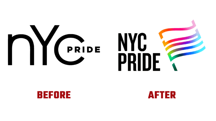
A new positioning was created, which became the basis of visualization as a meaningful reflection of goals and experiences. The result is a spectacular reflection of the desire to inspire and empower every individual and member of the community to carry their love by living their truth proudly. At the same time, the visualization speaks of the roots of the movement, the power of protest and annual celebration, concluded in unity and protection.
The main visual symbol of the brand has become a sign created taking into account cultural and spiritual features – a flag, the image of which reflects the history of the movement in a modern style. The Pride flag is a universal symbol of the community, security, and allied foundations. This element – the central figure of the whole identity very accurately conveys the spirit and effective activity of the organization. The emblem has an inscription in the form of the abbreviation NYC, executed like a decoration using an adaptive color gradient. This color scheme achieves the necessary visual flexibility, simplicity, appeal of storytelling, and inclusiveness, which is important for dividing the community into various subgroups.
The meaningful symbol is effectively supported by the well-chosen Monotype Knockout and Gotham fonts from Hoefler & Co., the use of which is a tribute to the hometown. Their visualization echoes the eclectic typography of the 19th century, which was widely used on posters of that time. With their help, the brand successfully creates a friendly atmosphere and openness, reflecting a modern take on the style of inscriptions that can only be found in New York. The quintessence of these images, elemental forms, has become the most accurate expression of the wide range of voices that take place in the new identity.


