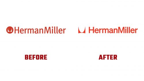
New York design studio Order has created a nostalgic new brand identity for Herman Miller, reflecting the American design brand’s mid-century modern heritage. This rebrand honors the company’s rich history while bringing it into the 21st century, focusing on timeless design elements and modernist aesthetics.
The previous branding, updated in the late 1990s, featured the “computer-friendly” FF Meta font alongside the company’s enduring “M” logo from 1946, set within a red circle. Order’s task was to modernize this identity while staying true to the brand’s legacy. The studio drew inspiration from the modernist branding that graphic designer John Massey introduced in the late 1960s.
The updated logo features a Helvetica-style typeface reminiscent of the one used by Massey. The iconic “M” symbol has been freed from its circular backdrop, allowing it to be used more flexibly as a graphic design element rather than just a trademark.
The wordmark is now styled in the Söhne typeface by Klim Type Foundry, a modern homage to Helvetica that reflects a return to the brand’s roots. Removing the circle around the “M” symbol allows it to integrate seamlessly with other brand elements, such as typography and photography. This change enhances the symbol’s versatility and celebrates its simplest form. The new design system introduces an expanded color palette, providing more flexibility and vibrancy to the brand’s visual identity.
Mid-century modern aesthetics informed the order’s approach to rebranding John Massey’s original designs. The studio aimed to create a flexible and cohesive identity that could scale across various mediums, from mobile phone screens to physical spaces like retail stores and showrooms.
The expanded color palette and the flexible use of the “M” symbol and typography allow the company to play with individual elements of its identity. This flexibility ensures the brand can adapt to different contexts while maintaining a consistent visual language. The new identity can be applied across various mediums, such as tote bags, catalogs, and the sides of trucks, creating a bold and recognizable presence.
The updated visual identity of Herman Miller celebrates both its storied past and its innovative future. The rebrand underscores the company’s commitment to timeless design principles and modernist aesthetics, ensuring its identity remains relevant and impactful.
The rebrand comes at a significant moment as Herman Miller celebrated its 100th birthday last year. Since its founding in 1905, the company has collaborated with some of the most important designers of the day, including Isamu Noguchi, Charles and Ray Eames, Yves Béhar, and London Studio Industrial Facility. This rebrand pays homage to this legacy while positioning the company for future success.
The new logo is a testament to the company’s enduring commitment to design excellence and innovation. The elements’ clean angles and careful positioning create a balanced and smooth appearance, contributing to the overall aesthetics.
The updated identity captures the essence of Herman Miller’s journey and the boundless opportunities ahead. The design emphasizes the company’s commitment to continuous growth and innovation, symbolizing a new era of development. The new visual identity aligns with the company’s goals, emphasizing its readiness to adapt and thrive in a rapidly changing design landscape.
The new logo and identity represent Herman Miller’s dedication to driving positive, transformative change in the design industry. The company is set to continue its mission of providing cutting-edge design solutions, contributing to the advancement of the industry, and improving communities worldwide. The rebrand by Order Design Studio ensures that Herman Miller remains at the forefront of design innovation, maintaining its legacy while embracing the future.


