The original History logo broadcasts to viewers a love for history, which was initially indifferent. But this is more than just events that happened in the past. This is a whole world – life in all its manifestations when even an individual impulse or personal attitude to what is happening can be considered history.
History: Brand overview
| Founded: | 1 January 1995 |
| Founder: | A&E Networks |
| Headquarters: | New York City, New York, U.S. |
| Website: | history.com |
Meaning and History
This television network was initially conceived as a historical one, explicitly stated by its original name – The History Channel. However, following disapproving comments from critics regarding its “non-expert” content intended for the general segment of viewers, it transitioned into reality TV. Naturally, the rebranding reflected the entire identity, including the logo.
However, the designers retained the original style of the emblem – the capital “H,” derived from the channel’s name. They just reinterpreted it, adding new semantic shades and abandoning excessive seriousness. Therefore, starting in 2008, the logo doesn’t convey a sense of businesslike, strictness, and practicalness. Instead, it emanates colorfulness, joy, and liveliness.
What is History?
History is a subscription-based channel from the USA that gained widespread popularity and became the flagship. It was founded in 1995 and initially covered numerous historical issues, offering viewers documentaries, scientific and social films, and news. In 2008, it switched to various reality shows. Its owner is the broadcasting company A&E Networks.
1994 (pre-launch)
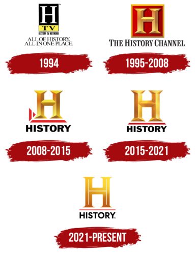
The History logo depicts a large “H.” The single letter is capitalized and located in the center of a vertical rectangle, occupying three-quarters of its space. At the bottom, there’s a yellow segment with the classic abbreviation of the word “television.” The inscription “TV” is painted black, thus clearly visible against the light background. The rectangle stands on the phrase “History TV Networks,” executed with thin glyphs without serifs. Below it, the channel’s slogan is “All Of History. All In One Place”. It is divided into two lines and centered.
1995 – 2008
The emblem has a dual structure: a picture plus text. Graphically, they are separated from each other, remaining conceptually connected. The upper part contains an even square with a large “H.” A golden frame borders it and has a solid fill with red color. But in reality, in the early years, the background was not always red:
- Blue was used for documentaries;
- Green for biographical materials;
- Purple indicated sitcoms;
- Yellow for reality shows;
- Orange for short content.
The iconic glyph in 3D design with serifs remained unchanged in the logo. It is three-dimensional, with lines running in the middle of the legs and the crossbar. They visually enlarge the letter. At the bottom is the full name of the channel, typed in a black semi-bold font in uppercase.
2008 – 2015
Following the rebranding, designers significantly simplified the logo to match the concise name, as only the word “History” was left from the phrase “The History Channel.” It is located at the bottom, set in a slab serif typeface, and centered. Above it is the volumetric “H.” The letter remained three-dimensional and gradient but lost its frame and background. Now under it is just a plain white space without a border, except for the red geometric figure at the bottom left. It consists of a miniature triangle and a vertical trapezoid. A similar line is under the glyph.
2015 – 2021
The tendency to simplify the visual identity was retained, so the History logo became even more minimalist. This added cleanliness and smoothness to it. Designers transformed the texture of the single “H,” turning it into a very wide glyph with shadows and a golden gradient. The triangle and trapezoid disappeared, but the underline was preserved, becoming a steady pedestal for the letter. The developers also kept the name.
2021 – today
Transitioning into the era of visual simplicity, the television channel’s logo lost its volume completely. Now it features a flat “H” of a goldish color with gradient transitions. Shadows, light flares, and thin white lines running in the center of the legs and the crossbar make it expressive. Visually, they repeat the glyph shape and look like a letter in a letter without serifs. Designers also changed the font of the lower inscription, narrowed the red line, and removed its diagonal cuts at the edges.
Font and Colors
Several types of typefaces have been used in the History logo. Depending on the year the emblem was introduced, the name of the TV channel is set in Franklin Gothic Bold or Centra No. 2 Bold. The corporate color palette is also diverse and consists of red, black, and several shades of gold. White serves as the neutral background.


