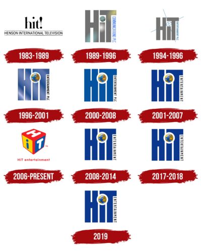
HIT Entertainment logo is 3D. But this was not always the case because the volume is noted only in the modern version. Older versions were conventional – flat and two-dimensional. The designers have interestingly played with the abbreviation of the phrase Henson International Television: they placed one letter on a cube turned sideways. Moreover, each of the three visible sides has an individual color.
HIT Entertainment: Brand overview
| Founded: | 1982 |
| Founder: | Jim Henson, Peter Orton, Sophie Turner Laing |
| Headquarters: | London, England; New York and California, U.S. |
HIT Entertainment is an entertainment company formed by three co-founders, including Peter Orton, Jim Henson, and Sophie T. Laing. It belongs to The Jim Henson Company, an international distribution division. Its main specialization is the distribution of children’s content, particularly television series for toddlers and teenagers. The time of the appearance of the service is 1982. The current owner is Mattel Television. Head offices are located in London, New York, and Los Angeles.
After establishing HIT Entertainment in 1982 by three partners, this company quietly existed for seven years, after which Jim Henson decided to sell it to The Walt Disney Company. But Peter Orton was against such a move, so he took over the leadership and began to manage alone. This happened in 1989. Since then, the studio has gone all the way into entertainment content for kids, offering a variety of TV series.
Meaning and History
The new television studio kept the previous image in mind and always tried to maintain it at the proper level so as not to lose its recognizability. The inscription was the basis of her identity for a long time, and now graphics prevail. This change took place in 2006.
What is HIT Entertainment?
HIT Entertainment is an American-British television company that was founded in 1982 and is currently owned by Mattel Television. It was founded by Jim Henson, Sophie T. Laing, and Peter Orton, who later took over the leadership. The studio is engaged in the distribution of children’s entertainment content.
1983 – 1989
At first, the visual identity of the TV company was textual. The base was an abbreviation for the full name of Henson International Television – “hit,” which was quite suitable for a company associated with entertainment content. The letters were lowercase, printed, and classic. The serifs appeared as miniature extensions at the ends, and at the end of the word, there was a bold exclamation mark. The dot above the “i” was very high. Beneath the abbreviation was the unabbreviated name, typed in one line in thin capital grotesque and separated by two black stripes.
1989 – 1996
After the rebranding, the company has a new logo. It was made in a completely different style, although it contained text. This period marked the beginning of the era of massive block letters. The glyphs consisted of broad lines of dark gray. The “H” and “T” were uppercase and tall, and the lowercase “i” occupied modestly between them. It was located under the head “T” and was complemented by a large dot, divided into four segments by two thin blue stripes. On the right was the phrase “HIT Communications PLC.” This inscription was vertical.
1994 – 1996
This emblem had limited circulation: it was used for only two years. The designers made the legs of the letters a little thinner, but the character spacing remained the same, so the inscription was dense. The new name of the television company, HIT Entertainment PLC, was used in the logo. The vertical inscription took place on the right side of the “T” and was located directly under her hat. An oval replaced the bold dot above the “i.” It was placed diagonally and was empty inside. In the center of it, two long thin stripes crossed, which went beyond the word “HiT” and crossed it out.
1996 – 2001
Monochrome disappeared in the emblem, and color appeared. The developers used very wide blue letters. The place of the dot over the “i” was taken by a colorful globe, which demonstrated the international status of the television company. For the globe to fit comfortably into the space under the high “T,” the designers cut off a fragment of its hat, and the adjacent “H” made a recess in the leg. In addition, they added highlights and repainted the full name of the studio in black.
2000 – 2008
In the version of these years, two-dimensional graphics prevailed. The developers have removed light reflections from the emblem, making the image simple, light, and flat so that it is better combined with displays and with any media. The color of the letters has been changed to deep blue.
2001 – 2007, 2008 – 2014, 2017 – 2018, 2019
This logo appeared periodically and, from time to time, fell out of sight of the audience. It was identical to the previous version. The word “PLC” just disappeared from it, giving way to the inscription “HIT Entertainment.” The company’s renaming took place in 2001 as part of a rebranding after the transition to Lyrick Studios.
2006 – today
The logo that was designed for the DVD is still used in parallel. Now it is the official symbol of the TV company and is intended for its presentation in advertising. It depicts a cube placed edge first. The three visible sides are marked with the letters “H,” “i,” and “T.” The first and last glyphs are uppercase and white, and the middle one is lowercase and blue. The background colors are red, blue, and yellow. Beneath the shadow of the 3D cube is the name of the studio, with the word “entertainment” in lowercase.
In the course of evolution, the palette of this logo varied interestingly. So, from the standard black and white version, it first turned into gray, then into blue, and finally into multi-colored. Some versions were used in parallel and featured on different broadcasts, causing confusion in HIT Entertainment’s visual identity story. Numerous changes in identity are associated with frequent name changes.
Font and Colors
For the inscriptions in all logos (except the first one), the designers chose smooth sans-serif letters – massive, even, and tall. But at the same time, they have no analogs because they are not written but drawn by individual order. The main colors of the emblem are black, blue, grey, white, red, and yellow.
HIT Entertainment color codes
| Pigment Red | Hex color: | #f21f25 |
|---|---|---|
| RGB: | 242 31 37 | |
| CMYK: | 0 87 85 5 | |
| Pantone: | PMS Bright Red C |
| Gold | Hex color: | #fdd400 |
|---|---|---|
| RGB: | 253 212 0 | |
| CMYK: | 0 16 100 1 | |
| Pantone: | PMS 109 C |
| Medium Sapphire | Hex color: | #0059aa |
|---|---|---|
| RGB: | 0 89 170 | |
| CMYK: | 100 48 0 33 | |
| Pantone: | PMS 2945 C |


