


 Hofstra Pride Logo PNG
Athletes from Hofstra University are easily recognized by their mascots, adopted in the early 1980s. A lion and a lioness crown the Hofstra Pride logo, symbolizing pride, unity, and the team’s close bond.
Athletics at Hofstra University began in the 1930s, after the school opened in 1935. Football appeared in 1937, while lacrosse and basketball developed in parallel. From 1950 to 1974, Howdy Myers led both sports, recording 141 football wins and 216 lacrosse wins, and was inducted into the National Lacrosse Hall of Fame in 1973.
Basketball in the 1950s and 1960s produced key players. William Thieben averaged 26.9 points from 1953 to 1956 and won the Haggerty Award. In 1976–77, Rich Laurel averaged 30.3 points per game and was drafted by the Portland Trail Blazers. Those same seasons brought Hofstra’s first two NCAA Division I Tournament appearances. In 1977, wrestler Nick Gallo won an NCAA title at 126 pounds.
In 1994, Jay Wright arrived from Villanova. Early seasons were difficult, but the program improved with the arrival of guard Speedy Claxton. In 1999, Hofstra returned to the NCAA Tournament after a 22-year absence. Titles in the America East Conference followed in 2000 and 2001 before Wright left for Villanova.
In 2001, Hofstra joined the Colonial Athletic Association and adopted the Pride nickname. In 2006, lacrosse won 17 straight games, while soccer and volleyball took conference titles. Wrestler Chris Weidman earned All-American honors in 2006 and 2007.
In December 2009, the university ended football after 72 years due to costs and falling attendance. Funding shifted to a medical school. In 2026, men’s basketball, led by coach Claxton, won the Colonial Athletic Association and returned to the NCAA Tournament.
Meaning and History
What is Hofstra Pride?
Hofstra Pride comprises 21 student teams participating in the intercollegiate program on behalf of Hofstra University. Based in Hempstead, New York, the teams are part of the Colonial Athletic Association and compete in NCAA Division I. The most successful teams in this athletic department are baseball, wrestling, and basketball.
1988 – 2001

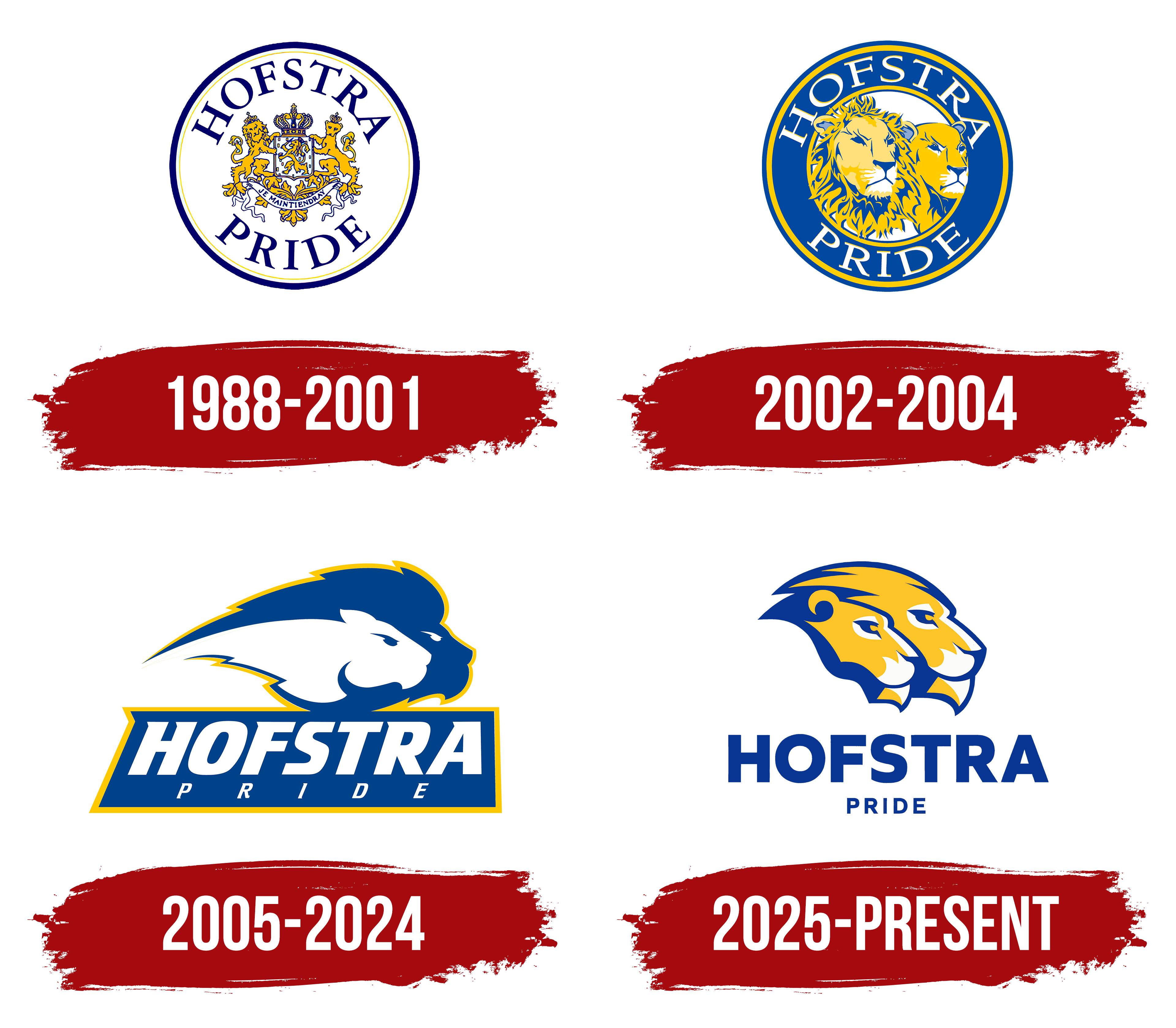
The lion pair in the Hofstra Pride athletic emblem used from 1988 to 2001 continued the university’s heraldic tradition. Pride linked school pride with a pride of lions, connecting fans’ feelings about the university to the animals on its coat of arms. In 1988, one of the two lions flanking the shield was replaced with a lioness to honor equality between men and women.
The Hofstra Pride represents Hofstra University in Hempstead on Long Island. The institution opened in 1935 and was named for William S. Hofstra. His Dutch roots informed the early athletic nickname Flying Dutchmen and the university seal. Pride gradually entered the athletic vocabulary. In 1989, the organization supporting the teams became The Pride Club, expressing alumni and fan pride in the university. The lion family later became the basis of a shared athletic identity.
The seal was adopted in December 1937. Dutch-born art instructor Constant van de Wall and trustee Dr. Smith developed it. With permission from the Dutch crown, they based it on the coat of arms of the House of Orange-Nassau. The crown, shield, lions, and motto connected the young institution to Hofstra’s heritage. The heraldic lion held a sword and a bundle of seven arrows representing the seven Dutch provinces. The university interpreted the French motto “Je maintiendray” on the ribbon as a pledge to stand firm.
The athletic version used from 1988 to 2001 retained the seal’s arrangement. A navy outer border and a thin gold inner line surrounded a white circle. HOFSTRA appeared at the top, while PRIDE curved along the bottom. Uppercase serif letters reinforced the resemblance to a university seal.
Inside were a small shield, a crown, a lion and lioness serving as shield supporters, foliage, and a ribbon bearing the motto. Blue lines separated the many gold details. The heraldic foundation connected the Dutch origins of the university’s name to the new meaning assigned to the lion pair.
2002 – 2004

In the Hofstra Pride emblem used from 2001 to 2004, the lion pair replaced the coat of arms. The circular shape and lettering around the perimeter remained, but the crown, shield, sword, arrows, and motto were removed. Large animal heads with detailed faces and a carefully rendered mane now filled nearly the entire interior.
The lion appeared on the left, with the lioness on the right and slightly behind him. Gold areas contrasted with blue shadows and white patches around the mouths. Sharp boundaries between colors created depth. A navy ring edged with gold lines framed the pair, with HOFSTRA PRIDE spelled out in white.
The lion theme continued through the costumed mascots. In the summer of 2001, a university group led by James M. Shuart developed Kate Pride and Willie Pride. Kate the lioness and Willie the lion jointly represented the men’s and women’s teams. Their names honored benefactors Kate and William Hofstra, whose estate provided the foundation for the institution.
2005 – 2024

Following Hofstra’s 2005 update, Pride became the official name for all athletic teams. The new emblem, developed by Powell New York, was unveiled on July 11 after a year of work on the university’s identity. Students, alumni, faculty, staff, and team supporters participated in the discussions. A shared name and symbol were intended to unify the teams’ branding. The earlier seal was retained for documents, commencement ceremonies, and other official occasions.
The lion pair preserved the connection to the university’s heraldic past. The circular frame disappeared, and simplified shapes replaced the detailed faces. Two elongated profiles face right and overlap. The blue silhouette of the lion, with his large mane, surrounds the white head of the lioness. Long, pointed strands of mane extend to the left, while small contrasting areas define the eyes, noses, and mouths. The university associated the animals’ coordinated pose with teamwork, mutual support, and the pride’s shared purpose.
A gold outer line connects the heads to a panel beneath them. Large white HOFSTRA lettering appears on a blue background with a gold border. The slanted uppercase letters have heavy strokes, short projections, and angular endings. The panel’s left side follows their slant, giving it a trapezoidal shape. Smaller, widely spaced PRIDE lettering sits below the university name.
The set allowed the lion pair to appear beside the name or on its own. In versions for individual teams, the sport name occupied the lower line. The shared illustration remained unchanged as the text varied, giving the teams a consistent identity.
2025 – today
Hofstra’s 2025 update redrew the lion pair while retaining it as the athletic symbol. Upright letters replaced the slanted university name. Agency MBLM developed a set of team marks as part of a university-wide identity project. The work accompanied preparations for Hofstra’s centennial in 2035. Working with the university team, the designers studied the institution’s history and conducted interviews and discussions with its community. Shared colors and consistent lettering connected the athletic identity to the broader university identity.
In the new version, the lioness occupies the foreground on the left, while the maned lion rises on the right. Both profiles face right and merge into a single silhouette. The heads are now gold, with blue outlines and white areas around the eyes and mouths. Short, angular tufts replace the long horizontal mane, and the lower portions of the heads taper to compact points. The university interprets the joined profiles as a symbol of unity, courage, and strong team bonds.
The blue panel was removed. Blue HOFSTRA lettering now sits beneath the animals, with smaller PRIDE lettering below. The 2025–26 guide specifies Quiet Sans Extra Bold for the university name and Quiet Sans Bold for the lower line identifying the team or sport. Upright sans-serif letters replace the previous slanted wordmark.
Color standards specify Hofstra Blue as Pantone 661 C (#003594) and Hofstra Gold as Pantone 123 C (#FFC72C). White remains the third color. A standalone lion pair, a wordmark, and single-color versions accompany the full emblem. Heavy outlined lettering was developed for game uniforms.
New Kate and Willie costumes preceded the logo revisions in the fall of 2024. The marketing and communications division, led by Terry Coniglio, coordinated the project. Phoenix Design created drawings of the animals with athletic builds. After several rounds of approval for sketches and materials, Olympus Mascots produced the costumes. The mascots received uniforms that matched Hofstra’s team apparel, plus footwear for different events. They debuted at Fall Fest, a celebration for students’ families and alumni.