The Hokkaido Air System logo reflects the geographic and cultural essence of Hokkaido, Japan’s northernmost prefecture, renowned for its distinctive natural beauty. The design encapsulates the region’s spirit, illustrating the airline’s commitment to serving Hokkaido’s residents and connecting them with the rest of Japan. The emblem represents a promise to explore and discover, inviting passengers to experience Hokkaido’s rich heritage and pristine environments.
Hokkaido Air System: Brand overview
Hokkaido Air System was established in 1997 to provide regional air transportation on the northern Japanese island of Hokkaido. The airline began operations in 1998, offering turboprop flights connecting the city of Sapporo to other destinations in Hokkaido.
In the following decade, it expanded its presence in Hokkaido and incorporated small jets into its operations to provide routes to Tokyo. The airline has played a critical role in bridging the gap between Hokkaido’s population centers and serving tourists traveling to and from Hokkaido’s ski resorts and Tokyo.
However, the recent shrinking local population and airport closures have hurt airline service demand. This led Hokkaido Air System to discontinue several regional flights that no longer made economic sense.
The airline operates only two routes, from Sapporo to Tokyo’s Haneda Airport and Shiretoko Airport. A modest fleet of three airplanes supports this.
Although Hokkaido Air System has provided valuable air service for a quarter century, the airline now stands at a crossroads as Japan’s regional market shrinks. The airline will likely continue to adapt its business model, fleet, and network to meet the changing market dynamics in northern Japan.
Meaning and History
What is Hokkaido Air System?
It is a regional airline based in Sapporo, Japan. It operates flights throughout Hokkaido, connecting small towns and remote areas with the island’s major urban centers. The airline provides Hokkaido residents and tourists with essential air transportation. Its fleet consists of small aircraft suitable for regional routes. The company supports the local economy and tourism by offering regional transportation.
1997 – 2002
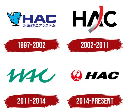
From 1997 to 2002, Hokkaido Air System used a visual symbol emblematic of its initial stage in the aviation market. The company’s logo was designed as a charming bird-plane, symbolizing the carrier’s mascot. This fledgling bird, representing the airline’s birth and early steps in the industry, visually soared upward into the skies, breaking away from the ground. This image was filled with symbolism of learning and the airline’s aspiration to master the airspace, similar to a bird learning to fly.
The logo included large blue letters NAC, interpreted as Hokkaido Airport in Chitose, reflecting the airline’s geographic connection to this airport. Another service at the airport had already used the abbreviation HAS, leading to the selection of the closely sounding alternative NAC for the airline’s name.
Below the English name of the company is its Chinese equivalent, highlighting its international presence and focus on the Asian market. Elements of animation style combined with blue colors give the logo a friendly and welcoming appearance, making it memorable and appealing to a broad audience, including families with children.
2002 – 2011
The new logo design features bold, black letters that convey power and confidence. This design choice is linked to the company’s expansion of its network of serviced airports, highlighting its growth and development. The bold letters suggest stability and reliability, which are essential for airlines aiming to strengthen trust among passengers and partners.
A futuristic metallic line replacing the horizontal bar in the letter “A” represents an upward trajectory reminiscent of the company’s dynamic and ambitious nature. This upward line visually resembles ascending airplanes, emphasizing the airline’s commitment to innovation and continual development.
The new logo incorporates principles of modern service and quick flights, which are key elements of the company’s offerings.
2011 – 2014
In 2011, after leaving JAL Group, the company changed its emblem radically, signaling a new beginning and a revised corporate strategy. The new logo features green, traditionally associated with growth, rebirth, and innovation. The choice of green reflects the company’s commitment to development and adapting to new market conditions.
The logo’s letters are in uppercase with sharp glyphs, giving them a dynamic and modern appearance. The shape of the letters resembles the motion of a jet ascending and then descending, reflecting the ups and downs that any airline experiences during its development. The design includes elements reminiscent of aircraft takeoff trajectories, emphasizing the company’s connection to the aviation industry and its core activities.
The new logo’s green color represents renewal and the company’s desire to grow, explore new horizons, and seize opportunities. It highlights the company’s environmental awareness and commitment to more sustainable development, which is increasingly important today.
2014 – today
The Hokkaido Air System (HAS) logo features a bold, italicized black “HAS” next to Japan Airlines’ emblem, a crane known as Tsurumaru. Inspired by samurai crests, the crane represents Japanese culture and symbolizes steadfastness and loyalty. The crane’s wings form a circle with a graceful head on a long neck at the center. The white letters “JAL” are on the bird’s chest.
This logo combines the “HAS” acronym with the Japan Airlines emblem, reinforcing Hokkaido Air System’s identity and connection to its parent company. The Tsurumaru symbol enhances the logo’s cultural significance. The circular shape of the crane symbolizes unity and integrity, reflecting the company’s commitment to comprehensive service and customer satisfaction.
The bold, italicized “HAS” in black conveys strength and reliability. The Tsurumaru emblem adds depth and respect for tradition. The crane, a symbol of loyalty and steadfastness, underscores the company’s dedication to its customers and its roots in Japanese heritage.
The circular wings signify completeness and unity, suggesting a holistic approach to service and operations. This imagery aligns with the airline’s mission to provide thorough and satisfactory service to passengers. The modern “HAS” abbreviation and the traditional Tsurumaru emblem create a balanced and meaningful logo, blending contemporary branding with cultural heritage.


