The Home Depot logo is like a parcel knocking on the home of users. The box is full of pleasant surprises and gifts. The emblem promises the joy of new things. The sign contains pleasant emotions and vivid impressions.
Home Depot: Brand overview
| Founded: | February 6, 1978 |
| Founder: | Bernard Marcus, Arthur Blank, Ron Brill, Pat Farrah, Ken Langone |
| Headquarters: | Atlanta, Georgia, U.S. |
| Website: | homedepot.com |
Home Depot is the largest home delivery retailer in the United States. She specializes in building products, tools, and home products. Her first store was founded in 1978 in Marietta, Georgia. Now it is an extensive structure with a legal headquarters in Atlanta and retail outlets in the United States and Canada (in 10 provinces), Mexico (in 31 states). A large number of big-box stores are subordinate to her. It also owns The Home Depot Pro (formerly Interline Brands), with 70 distribution centers nationwide. The company’s founders are Bernard Marcus, Arthur Blank, Ron Brill, Pat Farrah, and Kenneth Langone.
A group of entrepreneurs decided to jointly build a supermarket that would be much larger than the competition. Its main task is to accommodate household goods, as well as everything related to construction and renovation. Investment banker Ken Langone helped get the start-up capital needed for Marcus and Blank.
The first two stores opened in 1979. They were built on rented space in hypermarkets. Over time, the trading floor began to grow, covering neighboring territories. So, in 1981, she moved from Georgia to Florida, establishing her stores in Fort Lauderdale and Hollywood. Three years later, the commercial structure already included 19 stores, but this did not suit the owners – they tried to conquer neighboring markets.
In the second half of 1984, Home Depot bought the Bowater Home Center from Bowater Inc. for $ 40 million. This had a serious impact on trading income, with the figures dropping 42 percent. But then the company overcame the problem, and in 1989 it owned the largest chain of construction, furniture, and household stores in the United States, ahead of Lowe’s.
Meaning and History
At the moment, it is a widely branched and well-thought-out structure, which has not only retail outlets. She owns several brands, home delivery logistics organizations, warehouses, and 90 distribution centers. The number of its stores has long crossed the 2,000 marks. The corporate emblem became very popular and began to be recognized everywhere. And they all work under the same logo, which appeared in the year of opening.
What is Home Depot?
Home Depot is a company that sells home improvement products. It operates a chain of stores in the United States, Mexico, and Canada, where customers can purchase building materials, plumbing fixtures, lighting devices, gardening supplies, and various tools. The stores also offer vehicle rental and refueling services.
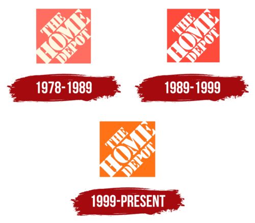
1978 – 1989
The corporate identity is very simple, both in form and in content. Home Depot strives to emphasize exactly this – that with it, everything comes easy and simple. The basis of the logo is an orange square. It is large because it contains the full name of the chain of stores. In one version of the logo, the inscription occupies three rows because it is applied together with the word “THE.” In another version, it has two lines.
The letters are in uppercase. They are stenciled with serifs. Moreover, the words do not go horizontally but diagonally – from corner to corner, with a slope to the left. As one of the company’s founders (Bernard Marcus) noted, this shape and color of the emblem did not appear by chance because the first sign was painted on a pumpkin-colored square circus canvas.
1989 – 1999
On this logo, all elements remained the same as in the previous version, but with one difference. It lies in color. So, the designers added brightness so that both the background and the inscriptions were catchy, stood out more clearly, and were visible even from afar. Therefore, the pastel palette has left the identity.
1999 – today
The background square is back to orange. To be more precise – pumpkin. After all, the first corporate logo was once applied to the canvas of just such a shade. The diagonal rows are retained, as are the stencil serif glyphs.
Home Depot: Interesting Facts
The Home Depot started in 1978 and is now the biggest home improvement store in the world, with lots of stores in North America. Its stores are big, warehouse-like, and have an orange logo.
- Origin: Bernie Marcus and Arthur Blank opened the first Home Depot in Atlanta, Georgia, aiming to be a one-stop shop for DIY fans and professionals, offering a huge selection of home improvement items at good prices.
- Early Days: The first two stores opened in 1979 in Atlanta. They were huge and had a massive range of products.
- Business Approach: Home Depot changed the home improvement industry with great customer service, knowledgeable staff, and many products, making DIY projects easier for everyone.
- Growth: Starting with a couple of stores, it has thousands in the U.S., Canada, and Mexico, making it the biggest in its sector.
- Orange Color: The orange color was chosen because it stands out and connects to the construction world. It’s now a key part of their brand.
- Environment: Home Depot cares about the environment. It sells eco-friendly products, tries to use less energy, and focuses on sustainable supplies.
- Helping Communities: Since 2002, The Home Depot Foundation has supported community projects, especially for veterans, and helps out during disasters.
- Using Technology: Home Depot is ahead in using tech to help customers shop, offering online shopping, mobile apps, and tools like augmented reality to see products at home before buying.
- Staff Knowledge: The staff knows a lot because they’re often tradespeople. The company makes sure they’re well-trained to help customers with their projects.
- For Kids: They have free monthly workshops to make things like toy cars or birdhouses, teaching them about DIY and offering fun family time.
Home Depot is popular for its focus on customer service, helping communities, and bringing new ideas to retail. Its journey from a small business to a global company shows the founders’ vision and the hard work of its team.
Font and Colors
For its logo, the company chose a simple typeface – clear, stencil, flat, located at an angle of 45 degrees. It’s called Stencil. Unlike other similar chains, Home Depot opted for a classic font over a custom one. It is part of the standard Microsoft Office series of typefaces.
The emblem has only one original color – PMS 165 bright orange, which is combined with white. The background is painted; first, the inscription is the second.
Home Depot color codes
| Pumpkin | Hex color: | #ff7216 |
|---|---|---|
| RGB: | 227 212 173 | |
| CMYK: | 0 4 20 7 | |
| Pantone: | PMS Bright Orange C |
