


![]() Hootsuite Logo PNG
Hootsuite Logo PNG
A smart application, the Hootsuite logo evokes such associations. All functions of the program are thought out to the smallest detail. The emblem promises that exploring the application’s capabilities is enough, and managing your social media account will feel like a fun adventure.
Ryan Holmes grew up on an isolated farm in British Columbia and later founded Invoke, a Vancouver digital agency. By 2008, the agency was managing many client social accounts, with separate logins and manual posting across platforms. In 2008, Holmes, Dario Meli, David Tedman, and the Invoke team began building a dashboard for social media work. Seven agency employees moved to the project, and on November 28, 2008, the first version launched as BrightKit, focused on Twitter management.
The tool found users fast. In February 2009, with more than 100,000 users, Holmes ran a $500 naming contest. Matt Nathan suggested Hootsuite, combining Owly, the owl logo, with the French phrase “tout de suite.” In November 2009, Hootsuite added Facebook, LinkedIn, and Twitter Lists, then released an iPhone app. In January 2010, it split from Invoke Media after raising $2 million from Blumberg Capital and Hearst Interactive Media.
By 2010, Hootsuite had more than one million users. In 2012, OMERS Ventures invested $20 million, and Hootsuite acquired Seesmic. In August 2013, Hootsuite raised $165 million from Insight Venture Partners, Accel Partners, and OMERS, becoming Canada’s first SaaS unicorn.
Growth later slowed. In 2015, Holmes cut 10% of staff and replaced much of the executive team. By 2017, the company reported positive cash flow. Holmes left the CEO role in 2019. Hootsuite bought Sparkcentral in 2021, agreed to acquire Talkwalker in 2024, cut 20% of staff in 2025, and Holmes returned as CEO in early 2026.
Meaning and History
![]()
The users themselves chose the service’s name. Ryan Holmes motivated them with a cash award, promising $500 to the competition winner. He believes the best version was formed from the French phrase “tout de suite,” which means “right now.” The person who suggested it used the owl icon on the BrightKit dashboard as inspiration. He noticed the connection between the words “Owly” and “Hootsuite” and received the grand prize for resourcefulness.
The renaming took place in 2009. Simultaneously, the platform added support for other social networks and began to operate as an independent company. It left Invoke Media and was incorporated as Hootsuite Media, Inc. From that moment on, her independent path began in online brand management. The service logo changed due to external factors. It reflected the company’s desire to outpace competitors, even in areas such as visual identity.
What is Hootsuite?
Hootsuite is a service that lets you manage multiple accounts across different social networks at once. It looks like a control panel, opens in a browser, and has a wide range of functions. The platform was developed by Hootsuite Media, Inc., named after the owl in the logo. Matt Nathan suggested combining the word “Owly” with the French pun “tout de suite.”
2008 – 2014
![]()
The first logo was not used in 2008 because neither it nor Hootsuite existed at the time. It came into use a year later, immediately after the program was renamed. However, we must admit that the owl appeared during BrightKit, a funny emblem that once adorned the Twitter dashboard.
This bird was and remains the platform’s main mascot. Until 2014, she was portrayed in a cartoon style, with large dark gray ears, a light gray wing, and an orange beak resembling a snowman’s nose. The body of an owl was shaped like a drop. For credibility, the artists added a black shadow that created a three-dimensional effect.
The “Hootsuite” lettering also looked three-dimensional, but for a different reason. The designers used a linear gradient. The name was divided into orange “hoot” and gray “suite.”
2014 – 2022
![]()
Vigilante’s agency representatives, marketers, designers, and writers, including Dee Anna McPherson (VP of Marketing) and Ryan Holmes, have teamed up to create a new look for the platform. They kept the Owly mascot but significantly reworked it, making it minimalist and monochrome. The owl now consists of the simplest geometric shapes, mostly circles and triangles. It has no wings, and its beak is connected to its eyes.
The word “Hootsuite” has also changed. First, the developers chose a different font, which was rounder than the first. Second, they converted the “H” to uppercase and repainted both parts of the lettering black.
The social media management system has a recognizable symbol and mascot, an owl. The logo’s main element reflects the brand’s friendliness and simplicity. Over the years, it has changed only once, and then “cosmetically.” The designers have updated the style a bit, following Twitter’s lead, giving Larry the Bird a modern look.
The program’s name was written in lowercase letters on the first logo. The font was reminiscent of Supra Condensed Medium, created in 2013 by the typographer Gert Wiescher. However, many details vary, so we can discuss an individual typeface designed to order.
The second word mark used a font similar to Graublau Sans Bold. The original grotesque was released in 2012 and published by the FDI Type Foundry. Another analog is Mute Bold from Indian Type Foundry. The Hootsuite design team changed some glyphs, including removing the left half of the horizontal stroke from the “t” and rounding off the letter’s top.
![]()
The palette used to be more varied than it is now. It included a light brown color and several shades of orange and gray. The current logo is all black and white: the inscription and the owl. It became so after the 2014 redesign.
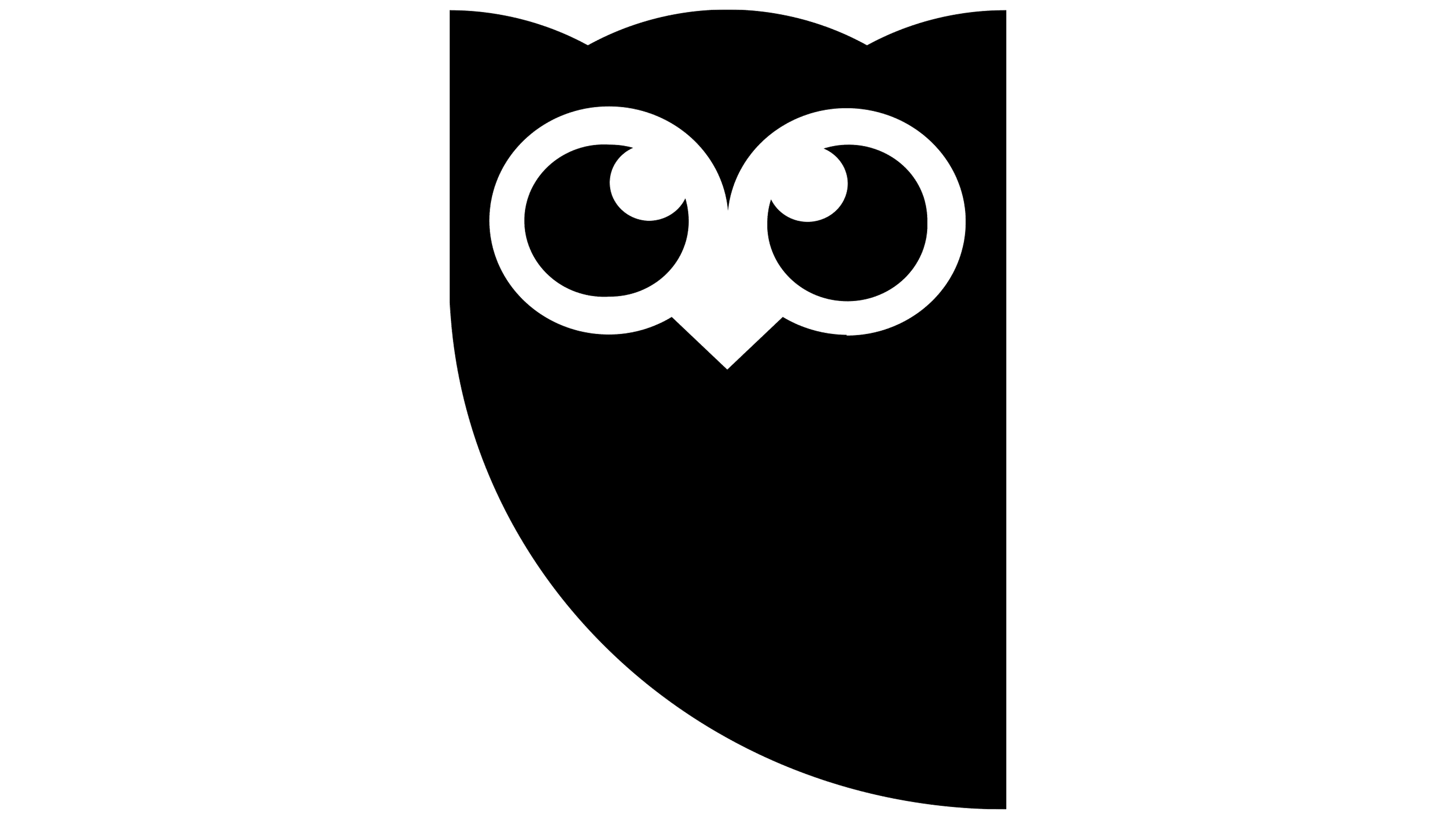
2022 – today
![]()
Since 2022, the Hootsuite logo has retained its core concept while changing visually. That is, both the owl and the name remained, but in a radically different form. Now, the feathered predator looks like a caricature. It has no corners or geometric shapes; the lines flow smoothly from level to level. The artists removed the bird’s body, focusing on the head. They enlarged it and depicted it in a new style. The owl looks like a cap with a mask and two antennas. After all, sharp and long ears are unusually directed in different directions, which forms such an impression. The eyes of the feathered predator have become huge, taking up a third of the space. The beak is made double. The authors changed the font, using individual glyphs instead of the standard ones. The letters are now low, thin, and graceful, and the “u” is complemented by a sharp inner element. The notches are still missing.
Font and Colors
All three Hootsuite emblems use the grotesque. The first resembles a slightly modified version of the Ashemore Cond Medium font. The second is associated with the Myriad Pro SemiCondensed Bold but with a half-cut crossbar at the “t.” The modern logo uses Manfred Klein’s DoradoHeadline Regular, which echoes some of the LCT Picon Extended Bold.
The color palette also varied, shifting from neutral black to multicolored. In the debut version, yellow and gray predominated; in the current one, coral. The second logo was completely black, which made it look businesslike and strict.
FAQ
What is the meaning of Hootsuite?
Hootsuite is a social media management platform that helps businesses, brands, and individuals efficiently manage their social media activities.
The platform allows users to discover, create, and share interesting content. It supports text, images, and videos, making it easy to create a variety of posts. It works with major networks such as Facebook, Twitter, Instagram, LinkedIn, and YouTube. Hootsuite provides tools to monitor social media mentions, keywords, and trends.
The platform offers detailed analytics and reports to measure social media performance. It supports team collaboration, allowing multiple users to collaborate on social media strategies. Hootsuite integrates with various third-party tools, including CRM and content management systems, providing a seamless workflow for users. Overall, it is a versatile tool that supports all aspects of social media management.
What is the slogan of Hootsuite?
Hootsuite’s slogan is “Go fast, be flexible.” It demonstrates the platform’s commitment to helping users adapt quickly to the pace of social media development.
“Go Fast” emphasizes the need for speed. The platform allows users to efficiently schedule and publish posts across multiple social networks. This ensures content is distributed at the best time and keeps up with the rapid pace of updates.
“Be flexible” emphasizes adaptability. Hootsuite provides tools to track mentions, trends, and keywords in real-time. This helps users stay up to date and respond quickly to changes and interactions. Adjusting strategies based on analytics and performance metrics is critical to effective social media management.
Why did Hootsuite change its logo?
Six years after Owly’s first design debuted, the company changed its logo to modernize the brand and fit into the evolving world of social media.
The original Owly was playful and light-hearted, reflecting the early days of social networking, when it was focused on fun and casual communication. As social media has become a critical tool for business, the brand needed a logo that reflected this shift. The new Owly is darker and more serious, symbolizing the brand’s growth and maturity. The updated logo indicates that the company is evolving with the industry, offering a more professional set of social media management tools. A darker, more sophisticated Owly suits businesses looking for robust social media solutions.
Does Hootsuite still exist?
Yes, Hootsuite still exists and is a major player in the social media management space. It was one of the first platforms to establish a strong presence and reputation. It offers a range of social media management tools, making it a popular choice for businesses and individuals.
Forbes Advisors ranked Hootsuite as the third-best social media management tool, showing its continued relevance and effectiveness. The platform offers features such as content scheduling, social media monitoring, analytics, and team collaboration that help users manage their social media presence.
What can Hootsuite manage?
Hootsuite manages accounts across various social media platforms, providing a centralized hub for social media activities. It supports LinkedIn, Facebook, Twitter, Foursquare, Google+, and WordPress blogs, allowing users to post content, interact with followers, and track activity from one place.
Hootsuite integrates with platforms such as Get Satisfaction, Edocr, Storify, Slideshare, MailChimp, Flickr, Evernote, Tumblr, Instagram, StumbleUpon, Reddit, and Vimeo via third-party apps. This expands its functionality beyond traditional social networks.
Hootsuite helps users optimize their social media experience by allowing them to schedule posts, track engagement, and respond to comments across platforms. This ensures a constant presence and effective management of social media activities. These comprehensive management capabilities make Hootsuite a popular choice among social media professionals.