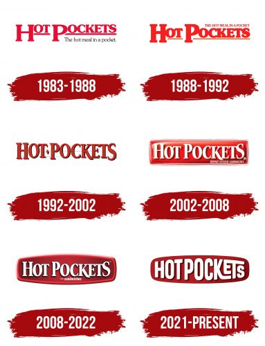
The Hot Pockets logo is associated with a hot dish cooked in the microwave. The emblem emphasizes the shape of the packaging and the freshness of the products designed for quick preparation. The logo’s color scheme uses warm tones, highlighting the theme of ready-to-eat meals.
Hot Pockets: Brand overview
Brothers Paul and David Merage established Chef America Inc. in 1983 in Chatsworth, California, marking the beginning of Hot Pockets’ history. With their background in the food sector, the Merage brothers set out to develop a food product that would satisfy the demands of contemporary American living while being easy to prepare and quick to make.
The product’s original inspiration came from seeing how popular street-side Belgian waffles with various fillings were. The Merage brothers were inspired by this idea and decided to develop a product that blended the flavor of freshly prepared meals with the convenience of frozen cuisine.
Product development took a year or so. The brothers tried various dough recipes and fillings to find the ideal fusion of flavor and texture. A crucial development milestone was the invention of a unique microwave cover that allowed the product to heat uniformly and preserve a crispy crust.
The first versions were introduced to the public in 1983 and marketed as “Tastywich.” The three filling combinations were ham and cheese, chicken pizza, and beef and beans. The product’s flavor and ease of use quickly helped it become well-known.
Following a triumphant debut, the Merage brothers rebranded the product in 1984, a name that more accurately captured the essence of the product and was easier for customers to remember. This choice was a wise marketing strategy that increased brand awareness.
Chef America Inc. aggressively increased the variety of flavors throughout the 1980s by introducing new filling alternatives to accommodate a variety of consumer preferences. Additionally, the business made advertising investments that aided in raising brand awareness across the country.
The 1990s saw the product’s emergence as a staple of American cuisine. It was particularly well-liked by young professionals and students, who appreciated how easily and quickly it could be prepared. To meet the increased demand for healthier fast food options, the company continued to develop and launch new product varieties like Lean Pockets, a lower-fat version.
Chef America Inc. introduced a new product line in 1996 called Croissant Pockets. This line featured puff pastry and was a more sophisticated take on the original. This action aimed to attract customers looking for more upscale frozen food options by broadening the target group.
By the late 1990s, this product had become one of the most well-known brands in the frozen food industry in the US.
A pivotal moment happened in 2002 when Nestlé paid $2.6 billion to acquire Chef America Inc. Through this acquisition, one of the biggest food producers in the world’s resources and distribution network were made available to the brand, ushering in a new era in its growth.
Nestlé continued adding new flavors and forms to the lineup after the acquisition. The company improved recipe and ingredient quality to adapt to consumers’ shifting demands for more natural and healthful products.
The brand responded to evolving dietary preferences in the 2010s by launching whole-grain dough alternatives and fillings with more natural ingredients. Additionally, the company aggressively expanded its social media presence, drawing in a younger audience with humor and pop culture references.
2013, the product underwent a redesign in honor of the company’s 30th anniversary. The company changed the formula to enhance the flavor and quality of the ingredients. More upscale filling alternatives, like Angus Beef and Hickory Ham, were added to the menu to attract customers looking for superior goods, even in the frozen food segment.
The company introduced a smaller variant, “Snackers,” 2014 to cater to people searching for snack options.
The firm debuted a breakfast collection of products meant for breakfast in 2015. This opened the door for the brand to join the market for morning meals and offered alternatives to eggs, bacon, and other classic breakfast items.
When the company launched a line of products in 2016 that used only natural ingredients and lacked artificial flavors and colors, it took a big step toward better eating.
In 2018, the company introduced a new ad campaign, “Irresistibly Hot,” aimed at Generation Z and millennials. Bright, funny ads and a strong social media presence were part of the campaign, which helped modernize the brand’s image and draw in a younger audience.
In 2019, the product unveiled redesigned packaging highlighting its nutritional value and high-quality ingredients. This was a component of the plan to present the brand as a premium product in the frozen food category.
A new product range was debuted in 2020 under “Premium Pepperoni Pizza.” Real mozzarella cheese and premium pepperoni were among the higher-quality ingredients in developing this product. This invention aimed to satisfy consumer demand for more upscale frozen food selections.
In 2021, the brand introduced a range made with croissant dough and carried on with recipe advancements. This choice drew in customers seeking frozen snack products with more complex flavors. Popular combos like beef taco and ham and cheese were among the flavors offered in the new collection.
Rapper Snoop Dogg starred in a commercial campaign introduced in the same year. The campaign aimed to revitalize the brand’s image and draw a younger audience with funny video clips and social media activities.
In 2022, the producer concentrated on growing its product portfolio by adding healthier and lower-calorie options. In response to the growing demand for healthy fast food options, new Lean Pockets options with higher protein and lower carbohydrate content were launched.
A new product line was launched in 2023 to cater to the expanding market of customers who are plant-based eaters. This range of products, titled “Plant-Based Pockets,” offered multiple choices for plant-based meat alternatives. The goods are made without any components derived from animals, although they are meant to taste and feel quite similar to the original product.
The brand kept expanding its online presence in terms of marketing. The company ran interactive online campaigns, such as social media challenges and virtual cooking seminars.
Meaning and History
What is Hot Pockets?
It is a popular brand of microwaveable sandwiches made in the USA. These portable snacks contain a crispy crust filled with various savory ingredients such as meats, cheeses, and vegetables. They come in various flavors, catering to different tastes and dietary preferences. They are designed to be quick and easy to prepare and are usually ready to eat in just a few minutes in the microwave. Sandwiches have become a staple in many American households, especially popular with students, busy professionals, and anyone looking for a quick snack or meal. Over time, the brand has expanded its product line to include breakfast options, low-calorie varieties, and options with premium ingredients while maintaining its position as a well-known name in the frozen food department in grocery stores nationwide.
1983 – 1988
The first version of the company’s logo included the brand name and slogan. The red letters hinted at the need for heating before consumption, while the brand name directly indicated the essence of the product—convenient meals in the form of dough pockets with fillings inside.
The brand’s popularity was based on its simplicity, compactness, and ease of preparation, also reflected in the red lettering. The initial letters of the words were highlighted and slightly lowered, symbolizing the legs of a microwave. The line underlining the name resembled a dough base heated in an oven.
The thin black font of the slogan “The hot meal in a pocket” clearly conveyed the product’s essence, leaving no doubt about its purpose.
1988 – 1992
As Hot Pockets grew in popularity, the logo changed. The font became bolder and fiery, emphasizing the brand’s expansion. The slogan was moved to the top of the logo, enhancing its visual impact. The spaces beneath the initial letters added a sense of lightness, symbolizing the product’s ease of use. The line in the emblem hinted at the crispy crust, a distinctive feature of the snack.
1992 – 2002
Due to the expansion of the product line, the company has updated its branding. The new logo features a bold font with a black shadow, giving the text depth and dynamism. The letters have become more uniform, creating a sense of stability. A red diamond separates the name, and the background is adorned with three light stripes resembling a microwave grill. This design enhances the association with the cooking process, where each letter represents a separate “pocket” that gets toasted to a crispy texture.
2002 – 2008
With the acquisition of the brand by Nestlé, the logo changed once again. It was now designed in a shape resembling a pocket, emphasizing the product’s uniqueness. The red color enhanced the association with a hot dish, while the emblem’s 3D appearance resembled a microwave button, hinting at the cooking process. The text retained its original font but was changed to white, symbolizing dough and frozen products made from fresh ingredients. A small explanatory note was added in place of the previous slogan, indicating its association with the category of stuffed sandwiches.
2008 – 2022
The recipe change led to an update of the Hot Pockets logo. The emblem became wider, resembling the shape of a pocket, emphasizing the highlighted edges symbolizing the outer layer of the dough. A dark red gradient added depth and indicated the variety of fillings, unified by the key characteristic of being microwaveable. The white letters became sharper and more legible, focusing on the word “sandwiches” to reflect the product’s essence.
2021 – today
When the brand was just beginning to gain popularity, it was especially important to emphasize the convenience and speed of preparing the product and its rich flavor. The designers who worked on the logo captured these values in the visual image, contributing to the brand’s successful market entry.
The “Hot Pockets” emblem vividly expresses the essence of the product and the company’s commitment to convenience and simplicity of use. The logo is a rich red, associated with warmth, energy, and appetite. This color choice was intentional—it evokes a sense of hunger, perfectly aligning with a brand that offers hot snacks.
The central element of the visual mark is the “HOT POCKETS” text, which occupies nearly the entire space within an oval shape. This arrangement is reminiscent of the product itself: the filling, tightly wrapped in dough, fills the pocket, creating a sense of richness and completeness. The font features smooth, soft lines, symbolizing the balanced flavor and ease of preparation—key characteristics of the brand’s products.
An interesting feature of the logo is the reduction in the size of the letter “E” in the word “POCKETS.” This design choice was made to maintain balance and symmetry in the text, creating the impression that the word is “packed,” just like the product in its wrapper. This element adds a sense of dynamism and playfulness, making the logo more appealing and memorable.

