


 Houston Cougars Logo PNG
The Houston Cougars logo is a modern depiction of the University of Houston’s 1952 sports teams, executed in a minimalist style. The simple yet attention-grabbing monogram reflects the game’s brilliance and the efficiency of its tactics.
The University of Houston was founded in 1927, with athletics taking shape soon after. The first varsity football team appeared in 1946, and instructor John Bender, who had coached at Washington State, adopted the Cougars nickname.
Men’s basketball rose under Guy Lewis, who led the program from 1956 to 1986 and recorded 592 wins. In 1964, he recruited Don Chaney and Elvin Hayes, breaking regional barriers. On January 20, 1968, Houston defeated UCLA 71:69 at the Astrodome in a nationally televised game, later called the “Game of the Century.”
A second peak came in the early 1980s. Hakeem Olajuwon joined in 1981, forming Phi Slama Jama with Clyde Drexler and others. In 1983, Houston reached the NCAA final but lost to NC State 52:54 on a last-second play. In 1984, the team lost the final again, this time to Georgetown. Olajuwon and Drexler later won the 1995 NBA title with the Houston Rockets.
The golf program, led by Dave Williams, won 16 NCAA titles between 1956 and 1985. Football peaked in 2015 under Tom Herman with a 13:1 record, a win over Temple for the American Athletic Conference title, and a Peach Bowl victory against Florida State.
In 2023, the university joined the Big 12 Conference. The basketball team won back-to-back regular seasons in 2024 and 2025 and reached the national championship game in 2025 against the University of Houston.
Meaning and History

What are the Houston Cougars?
The Houston Cougars are the University of Houston’s sports program in Texas, comprising 17 student teams. The association is part of the NCAA and competes in Division I. It is a member of the American Athletic Conference and competes in the Football Bowl Subdivision. Starting in 2023, athletes will also compete in the Big 12 Conference.
1951 – 1962
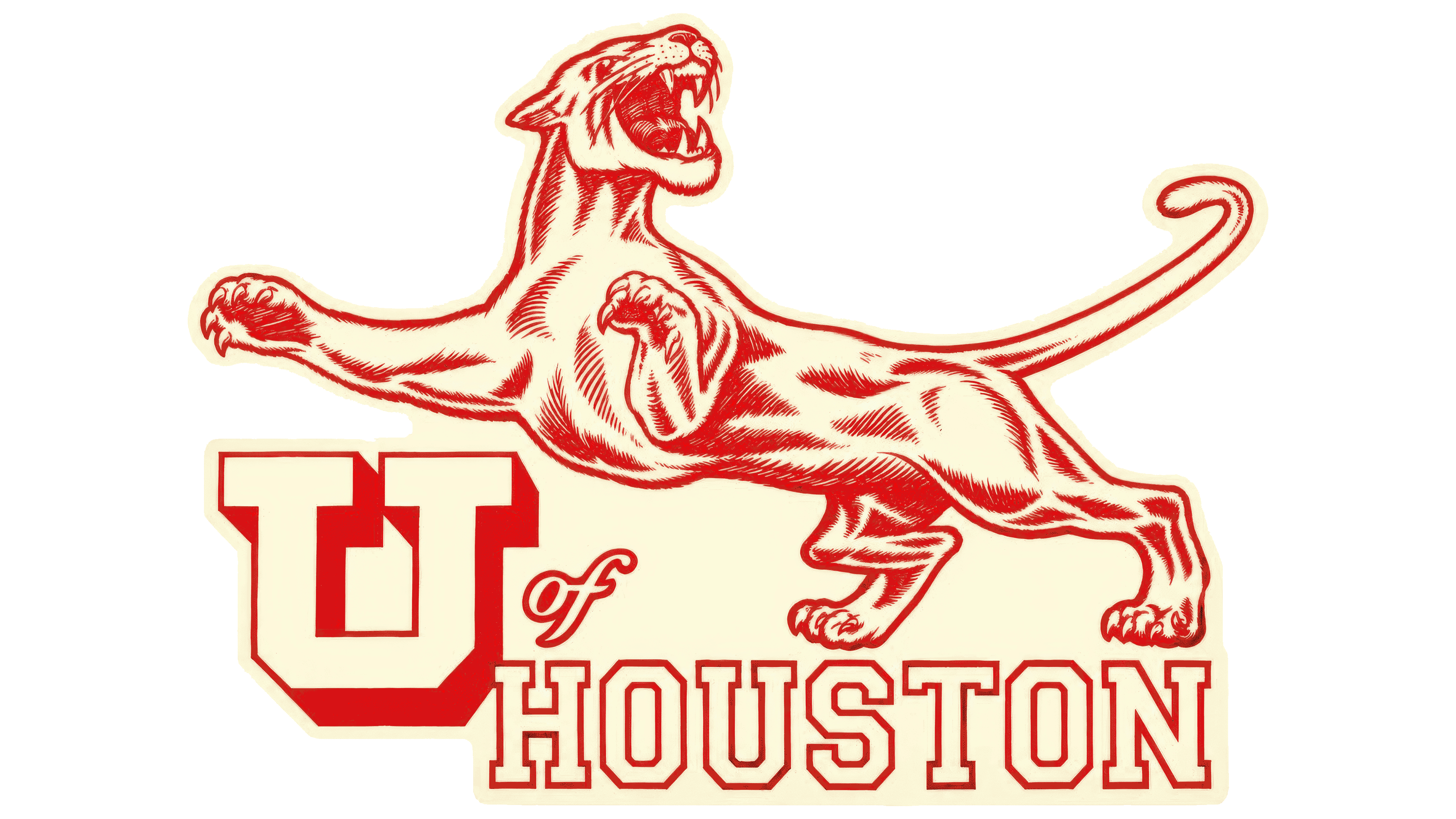
The Houston Cougars emblem used from 1951 to 1962 featured a cougar above U of Houston lettering. The University of Houston’s athletic nickname originated two decades before the logo, bringing together another institution’s traditions, a student newspaper, and early efforts to develop the teams’ identity.
The Texas institution opened in 1927 as Houston Junior College and became the University of Houston in 1934. Its athletic teams compete as the Houston Cougars. Houston identifies the city, while Cougars name the animal adopted as the mascot. Teacher and coach John Bender proposed the nickname. He had previously led the football team at Washington State University, where the cougar was already the mascot. After moving to Houston, Bender suggested introducing the animal into the college’s student life.
The name was initially proposed for the newspaper. Bender associated the cougar with grace, strength, and pride, and students supported Cougar as the title. Athletic teams and campus organizations then adopted it. In 1947, the university acquired a live cougar. A naming contest was won by student Joe Randol, who proposed Shasta as a play on the casual pronunciation of “she has to.” The name later passed to subsequent live mascots and illustrated versions of the university’s cougar.
University emblems developed alongside the nickname. Carroll Canatella created a cougar illustration for Houston Junior College in 1928. In the 1930s, an interlocking monogram joined the “U” and “H” initials of University and Houston. By 1935, red block letters appeared on the university hockey team’s uniforms. Hockey was among the first sports to use the monogram, before it became closely associated with football and basketball. The university’s identity was taking shape before the postwar expansion of its athletic program.
Red and white became the primary colors, officially named Scarlet Red and Albino White. University tradition associates red with courage and perseverance, and white with purity of purpose, service, and compassion. The monogram uses red letters with white separating lines or white letters on a red background. Over the years, cougar illustrations have added beige, black, navy, and gray.
A leaping cougar fills the upper portion of the primary Houston Cougars logo used from 1951 to 1962. Its body stretches horizontally; its front legs extend left; its head is raised; its mouth is open; and its long tail curves behind it. Red lines define the fur, muscles, and folds of the body, while the interior remains white. Beneath the animal sits a large “U” with a red shadow that adds depth. A small script “of” connects it to HOUSTON. The city name appears in outlined uppercase letters with rectangular serifs. Three lettering styles share the wordmark, while the cougar above is rendered in considerable detail.
1962 – 1996

The UH monogram returned as the Houston Cougars’ primary emblem in 1962 and remained in that role until 1996. Two interlocking letters replaced the full name and cougar illustration. The version later became known as Slender Interlocking UH, reflecting the letters’ narrow proportions and arrangement.
The red “U” sat above and to the left of the “H.” Their interlocking forms created a vertically elongated emblem with open spaces. Rectangular serifs and beveled lower corners on the “U” gave the monogram the appearance of a traditional collegiate patch.
1996 – 2000

In 1996, the cougar returned to the primary Houston Cougars logo, with the full athletic name beneath it. Used until 2000, the emblem paired the animal with two lines of text. The cougar’s front paws rested on HOUSTON, while smaller red COUGARS lettering appeared below on a white band.
Black outlines and a heavy shadow surrounded the tall red HOUSTON letters. The outer “H” and “N” rose above the rest of the line, framing the cougar on either side. Unlike the elongated silhouette of the 1950s, the animal occupied a compact space above the name. It faced the viewer with its head lowered, ears angled outward, and tail raised to the left. Black shadows defined the beige fur, while the teeth and claws remained white.
Alongside the primary version with the full team name, the university used a cougar paired with the monogram and a standalone head against claw marks. The animal connected all three versions.
2000 – 2012

The Houston Cougars returned to a lettermark in 2000. The monogram remained the primary emblem until 2012, while the cougar continued as a secondary mark. Compared with the slender 1962 letters, the revised “U” and “H” had heavier vertical strokes and serifs. Their arrangement remained unchanged, with the “U” at the upper left and the “H” at the lower right. Wider letters broadened the monogram, and the bottom of the “U” became angular.
Navy and white outlines surrounded the red fill. At the intersections, white edging separated the letters and helped distinguish their contours within the interlocking design.
Joe Bosack & Co. created a secondary emblem combining the monogram and mascot in 2003. A cougar head occupied the upper portion, with UH below. This version remained in use until the 2012 update. The agency later continued developing the university’s cougar imagery for the next collection of marks.
2012 – 2017

The 2012 Houston Cougars identity update accompanied preparations for new athletic facilities and a planned move to the Big East Conference. Athletic director Mack Rhoades connected the logo changes to the university’s broader plans. The goal was to refresh the athletic identity while maintaining ties to earlier imagery. Coaches, staff, alumni, and donors provided feedback during development. The new emblems were unveiled on April 10.
Revised proportions brought the UH monogram closer to its early form. The letter strokes fell between the slender interlocking design of the 1960s and the heavy 2000 monogram. The strokes became thinner, and the navy outline disappeared, leaving red and white. Light and dark facets inside the letters created depth, with a darker red shade suggesting beveled surfaces. Athletic identity standards specified Pantone 186 for the primary red and Pantone 188 for shaded areas. A white border separated the letters at their intersections. It continued along the monogram’s outer edge, surrounded by a red outline.
The university introduced Oval Cougar alongside UH. Developed by Joe Bosack & Co., it placed a cougar’s head within an elongated oval. The animal faces right, with angular contours defining the muzzle, ear, and neck. The full-color version combined red, navy, and gray. Although navy had been removed from the monogram, it remained in the cougar illustration until 2017. A red Oval Cougar existed alongside the full-color version. After navy was eliminated, the oval emblem was used exclusively in red.
2017 – today

The flat UH monogram became the Houston Cougars’ primary emblem in December 2017. Previously, it had been a secondary option. Athletic standards began favoring flat versions of the marks at the same time. The 2012 monogram was updated with a different fill while retaining the letterforms.
Uniform red replaced the interior facets and dark red areas that had created an illusion of depth. The proportions and arrangement of the “U” and “H,” rectangular serifs, and white outline remained unchanged.
Usage guidelines determine the letter color according to the background. Red UH appears on other-colored backgrounds, retaining its white inner outline. A white monogram with a red inner outline is used on red backgrounds.