The iconic Hunter x Hunter logo reflects the brand’s dual name. Some elements are reminiscent of the fact that the multimedia franchise originated in Japan. And the overall style of the emblem symbolizes the entertainment focus of all products – from manga to series.
Hunter x Hunter: Brand overview
| Founded: | March 16, 1998 – present |
| Founder: | Yoshihiro Togashi |
| Headquarters: | Japan |
Meaning and History
Yoshihiro Togashi was fond of collecting, so for a long time, he wanted to use the word “Hunter” at the end of the name of the manga (meaning “hunter for something”). He coined the phrase “Hunter x Hunter” while watching the Japanese variety show Downtown no Gaki no Tsukai ya Arahende !!, which repeated the same phrases twice for fun.
It is still not completely clear what the author meant by the “x” sign. Some people think that this is just a letter of the English alphabet, which should be pronounced as “ex.” Others skip the “x” altogether when reading the name of a manga or anime. Still, others replace the incomprehensible symbol with the words “for” (“by”) or “against” (“versus”) because the plot focuses on battles between hunters. Rational Hunter x Hunter fans believe the “x” is nothing more than a decorative element. They see it not as a letter but as a mathematical sign of multiplication. If this version is true, then the pronunciation of “Hunter-Hunter” (without the “x”) is fully justified.
The name with the duplicated word became the basis for both logos. Moreover, the designer has interestingly played with the symbol “x,” dividing with its help two parts of the mirrored inscription.
What is Hunter x Hunter?
Hunter x Hunter is a media franchise based on a Japanese manga about Gon Freecss. In its fictional universe, people with supernatural abilities live, fighting dangerous creatures, searching for treasures, and helping to combat crime. Gon’s missing father was one such individual. The young boy embarks on a journey to find him. The manga was created by Yoshihiro Togashi and has inspired several anime, video games, and musicals.
1998 – today
The initial chapters of the manga were published in 1998. At the same time, a colorful emblem appeared, which in the future graced the cover of the first tankobon volume and was used in the anime series. It is still relevant today because the story is unfinished, and comics continue to appear, albeit with long interruptions.
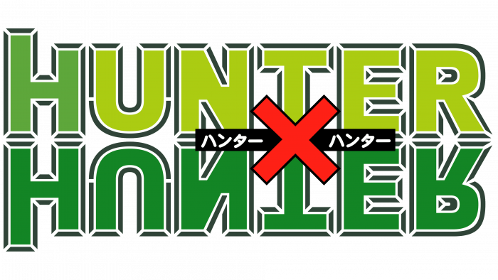
The logo consists of two words, “HUNTER” written in bold sans serif type. The top line is unevenly colored: a dark green “H” is paired with lemon yellow “U,” “N,” “T,” “E,” and “R.” In this case, the left vertical stroke of “H” is longer than the right one and goes beyond the border of the inscription.
The word “HUNTER” in the second line looks even more unusual. The designer has positioned it in such a way that it resembles a mirror image. Each letter remains in its place (the order is preserved) but is turned upside down. Only dark green is used for this lettering. Between the two halves of the logo is a black rectangular plaque with white hieroglyphs. It is crossed out with a red cross, which consists of wide diagonal lines. This is how the author played with the “x” in the name of Hunter x Hunter.
2011 – 2014
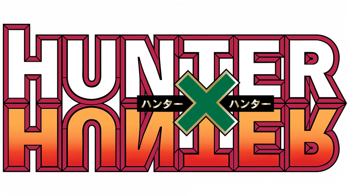
From 2011 to 2014, a remake of the first anime series was released on Nippon TV. A new logo was created for it, similar in structure to the previous one. The designers have kept the shape and arrangement of the elements but changed the color scheme. The letters have burgundy outlines in the form of a frame, folded from peculiar slats. The inside of the first word was completely white. An orange-red gradient was used for the upside-down stitch, and this created contrast. And the “x” in the middle turned blue-green and acquired a thin gold outline.
Hunter x Hunter: Interesting Facts
“Hunter x Hunter,” created by Yoshihiro Togashi, is a famous manga and anime loved for its detailed characters, engaging stories, and fresh approach to adventure.
- Start: Launched in 1998 in Weekly Shōnen Jump magazine, “Hunter x Hunter” has been a big hit, even with breaks in its publication.
- Breaks: Known for taking breaks, mostly because of the creator’s health, the series keeps its fans hooked and waiting for more.
- Anime Versions: There are two anime adaptations. The first came out from 1999 to 2001. A second, by Madhouse, began in 2011. It covers more of the story and earns praise for staying true to the manga.
- Nen System: The show features a special power called “Nen,” allowing characters to use their life energy in battle, adding depth and strategy to the story.
- Characters: Gon, Killua, Kurapika, and Leorio are memorable characters that fans adore for their growth and interactions.
- Chimera Ant Arc: This part of the story is celebrated for its intense themes, character growth, and thought-provoking questions, making it a standout in anime and manga.
- Unique Storytelling: Togashi often avoids typical story patterns, introducing unexpected turns and deep themes that attract a wide audience.
- Easter Eggs: The series includes nods to Togashi’s other work, “Yu Yu Hakusho,” and even hints at his wife’s creation, “Sailor Moon,” sparking fan theories.
- Influence: “Hunter x Hunter” has influenced many other manga, anime, and games, making its mark on pop culture.
- Personal Influence: Togashi’s hobbies and life experiences have shaped the series, adding a personal layer to its storytelling.
Despite publication gaps, “Hunter x Hunter” is a key name in anime and manga, known for its creativity, storytelling depth, and emotional impact.
Font and Colors
The logo of the Hunter x Hunter media franchise plays with its name. Obviously, “x” is not just a letter or a multiplication sign. This most likely implies an indefinite form of interaction; that is, “x” denotes a relationship between hunters, directed in both directions. In this case, it is understandable why this is the central element of the emblem.
The repetitive word also did not go unnoticed by the designers. The inscription is composed in such a way that each letter has its mirror image. They are all symmetrical, except for the top “H” with different lengths of vertical lines.
The Hunter x Hunter logo font vaguely resembles Arial Black, but they are not the same. There is a noticeable difference in the length and thickness of the strokes, the shape of the letters, and the size of the intra-letter gaps. It can be unambiguously argued that the developers used a bold sans serif with slightly rounded corners.
In the first version, the inscription looks very colorful: there is a lot of green in it, complemented by yellow, red, black, and white. The logo of the remake of the series is not as bright, although it does have a gradient. The basis of his palette is burgundy, white, orange, red, turquoise, and black.
Hunter x Hunter color codes
| Acid Green | Hex color: | #abcc12 |
|---|---|---|
| RGB: | 171 204 18 | |
| CMYK: | 16 0 91 20 | |
| Pantone: | PMS 375 C |
| Kelly Green | Hex color: | #5ea73b |
|---|---|---|
| RGB: | 94 167 59 | |
| CMYK: | 44 0 65 35 | |
| Pantone: | PMS 361 C |
| Forest Green | Hex color: | #138525 |
|---|---|---|
| RGB: | 19 133 37 | |
| CMYK: | 86 0 72 48 | |
| Pantone: | PMS 355 C |
| Medium Jungle Green | Hex color: | #304438 |
|---|---|---|
| RGB: | 48 68 56 | |
| CMYK: | 29 0 18 73 | |
| Pantone: | PMS 567 C |
| Neon Red | Hex color: | #fe2016 |
|---|---|---|
| RGB: | 254 32 22 | |
| CMYK: | 0 87 91 0 | |
| Pantone: | PMS 172 C |
| Black | Hex color: | #000000 |
|---|---|---|
| RGB: | 0 0 0 | |
| CMYK: | 0 0 0 100 | |
| Pantone: | PMS Process Black C |
