


![]() Hy Vee Logo PNG
Hy Vee Logo PNG
The Hy Vee logo is associated with reliability and quality, reflecting the company’s long history. Its bright colors emphasize the brand’s energy and dynamism. The unusual graphical elements symbolize the diversity of products and services offered by the supermarket chain.
Hy-Vee began in Iowa during the hard years before the Great Depression. Charles Hyde, who had run grocery stores since 1921, and David Vredenburg, linked to General Supply Company since 1917, became partners after Hyde bought half of a store in Kellerton in 1927. In 1930, they opened a small shop in Beaconsfield, selling groceries and household goods under a plain formula of good products, service, and low prices.
In 1933, the chain took the name Hyde & Vredenburg and introduced profit sharing for store managers. On January 1, 1938, the business became Hyde & Vredenburg, Inc., combining 15 stores in Iowa and Missouri. Dwight Vredenburg, David’s 23-year-old son, became the first president. Annual sales passed $1 million, and Lamoni served as the base for the office, warehouse, mill, meat department,t and bakery.
The company adopted self-service retailing in Centerville in 1940, moved headquarters to Chariton after buying Chariton Wholesale Grocery in 1945, and built a 72,000-square-foot warehouse in 1948. By 1949, it had 29 stores and $9.2 million in sales. The Hy-Vee name came from a 1952 employee contest that combined Hyde and Vredenburg; the first store with the new sign opened in Fairfield in 1953.
Hy-Vee added private-label goods in 1956, a bakery in 1957, and an employee stock trust in 1960. The slogan “Where There’s a Helpful Smile in Every Aisle” appeared on TV in 1963. Later growth included Drug Town in 1969, electronic registers in 1975, floral departments in 1979, former Safeway stores in 1982, Kansas expansion in 1988, competition with Kroger, $6.3 billion in sales by 2009, and a 2021 NIL deal with Caitlin Clark.
Meaning and History
![]()
The name Hy-Vee, reflected in most of the brand’s logos, was formed from “HYde” and “VrEdEnburg,” the surnames of the founders and original owners of the supermarket chain. Even though the company’s shares are now owned by its employees, the original name continues to be used as part of the historical legacy. Equally important to the visual identity is the color red, which is used to attract consumer attention. The red emblem is displayed above each store’s entrance, so drivers and pedestrians know where to find the products and services they need.
What is Hy Vee?
Hy Vee is a supermarket chain founded in the 1930s by David Vredenburg and Charles Hyde. Its largest stores offer a full range of services, including medical clinics, clothing boutiques, coffee kiosks, bakeries, delicatessens, and eateries. The company’s shares are owned by its employees. Its main office is located in West Des Moines.
1952 – 1955
![]()
The logo contains the white inscription “Hy-Vee” on a shapeless cloud made of numerous small dots. The letters are outlined in black contours of uneven thickness, clearly hand-drawn. The store’s name is positioned diagonally: the right side is raised, symbolizing the great potential of the developing supermarket chain. At the top is the line “IT PAYS TO SHOP AT,” where all words are in bold italics. Here, some glyphs have single square-shaped serifs. The lower-right corner features the two-level phrase “FOOD STORES,” set within a black rectangle with rounded corners.
1955 – 1963
![]()
The white name “Hy-Vee” is set against a black wave, its curves mimicking the inscription’s ascent, visually balancing the logo. In the lower right, the text “100% EMPLOYEE OWNED” is present.
1963 – 1994
![]()
In 1963, the company aired its first television advertisement, launched the famous slogan “Where there’s a helpful smile in every aisle,” and introduced a new emblem. Now, its name is in red letters on a plain white background. The font is similar to previous ones, but the ends of “H,” “y,” and “e” have diagonal cuts. The slanted positioning of the inscription is retained, but only in this version are the capital “H” and “V” lower than all other glyphs.
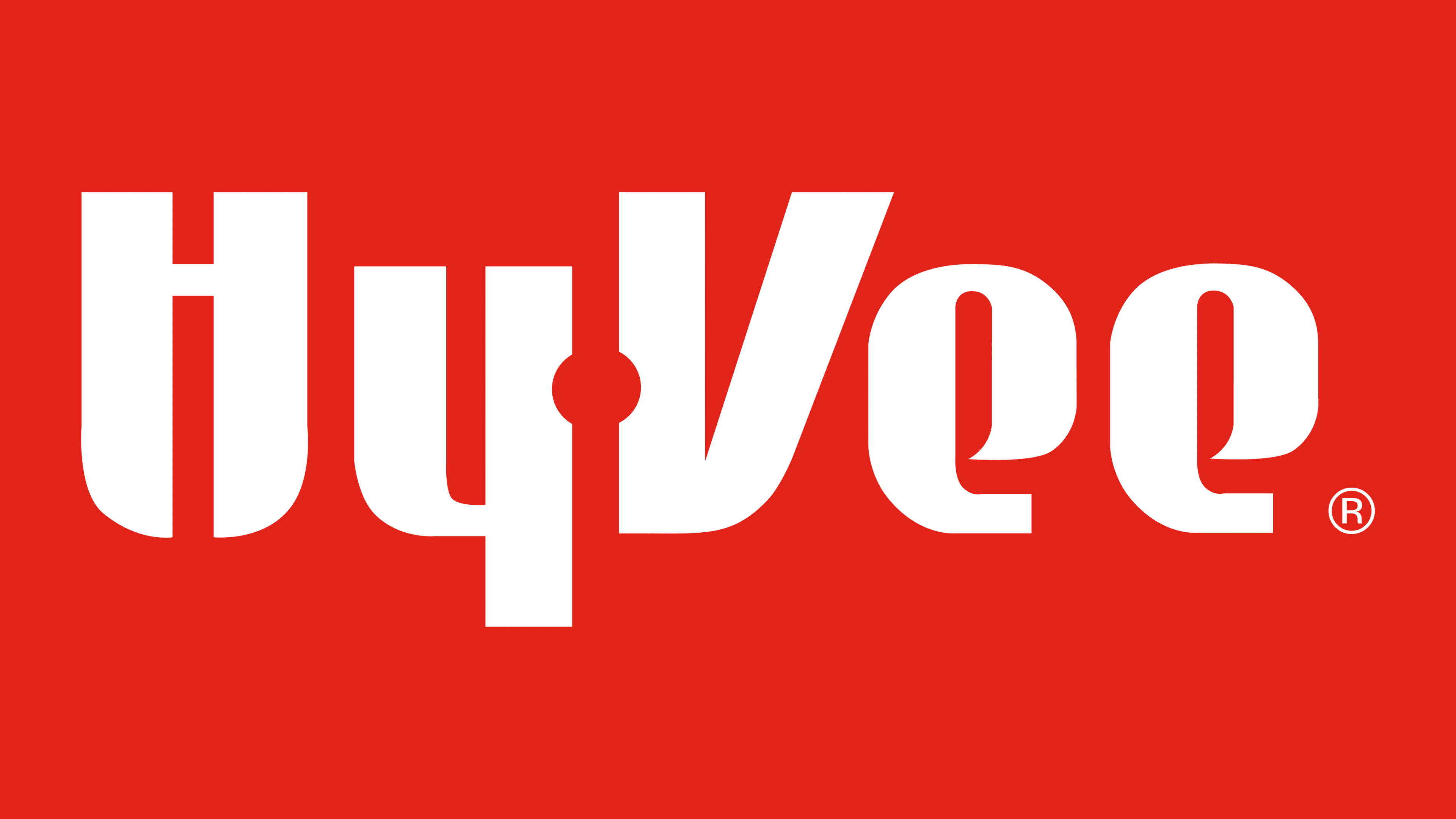
1995 – today
![]()
Hy-Vee customers first saw this bright red emblem on January 1, 1995. Here, the supermarket chain’s name is horizontally aligned and written in a custom font with an abundance of roundings where they usually aren’t. At the same time, the glyphs have many vertical strokes: even the left side of “V” is straight, not slanted. The “y” and “V” have small indents, between which a white circle is visible in the negative space. It replaces the usual hyphen and further softens the logo’s geometry. In the lower right corner, the phrase “EMPLOYEE OWNED” is written in small letters.
Font and Colors
The brand name uses a custom set of glyphs associated with innovation and modernity. Each letter looks unique and has no equivalents:
- “H” has rounded outer sides at the bottom, and the horizontal bar is raised higher than usual.
- “y” resembles “4” with a semi-circular notch;
- The left part of “V” is aligned horizontally.
- Both “e” s look like 360-degree inverted numbers “6” s and have an open intra-letter space.

Regarding the “EMPLOYEE OWNED” inscription, it is in a standard thin sans-serif font. All letters in the logo are painted the same red, symbolizing the company’s high potential and energy.