The HyperX logo is bold and open. The emblem demonstrates the process of development and progress in the field of computer technology. It shows that the company strives to keep up with the times, using advanced technologies.
HyperX: Brand overview
| Founded: | January 1, 2002 |
| Founder: | John Tu |
| Headquarters: | California, United States |
| Website: | hyperx.com |
Meaning and History
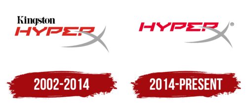
Changes to the HyperX logo mark the brand’s establishment and development milestones. Starting as the name of one product, the name gradually became a designation for a whole list of products for gaming PCs. Rebranding showed this expansion and departure from under the wing of the founding company. But changes to the logo were small. Originally, the sign included futurism, progress, and mathematical harmony elements. Therefore, radical changes were not required. Even after 12 years, the first symbol remained relevant and modern.
What is HyperX?
A brand that produces parts and peripherals for computers. The company’s products increase the speed of PCs, and accessories such as headphones and headsets are actively used in esports. This company owns the first USB with a volume of 1 TB and the fastest memory device of its time with a frequency of 2800 MHz.
2002 – 2014
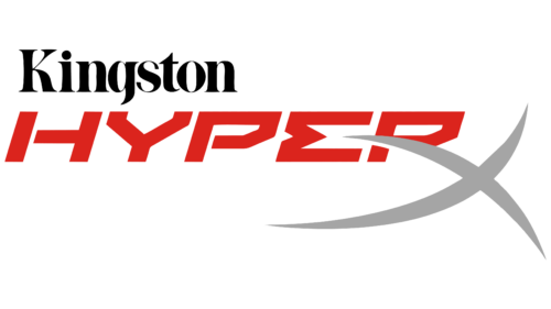
In 2002, the first DDR1 memory system was released. A special performance characterized it. The frequency was 370 MHz, and the volume was up to 512 MB. The RAM was considered gaming and powerful. Therefore, a strong and bright logo was developed for the device: a red angular inscription in capital letters leaning forward.
The shade conveyed expression and speed of work. The tilt embodied progress, a new step in the development of technology. The letters of the name seemed to be assembled from separate parts, just like memory blocks are formed from several modules.
The “E” is performed as a sum sign. The symbol confirms the joint work of individual elements. It is associated with mathematical processes and calculations in which RAM is involved.
The leg of the “R” was stylized as part of a large curved gray “X,” which was slightly below the main word.
The long stripes of “X” resembled DDR1 modules, and the increased size of the symbol, like the name Hyper, spoke of enhanced capabilities. The speed of a regular DDR was up to 200 MHz, and the volume was up to 128 MB. The Kingston Technology offers significantly exceeded the usual.
The two intersecting lines hinted at the decryption – Double Data Rate, which indicated double speed. This means the user could perform two procedures for recording information and two readings simultaneously. Therefore, exactly two lines in the logo are very symbolic.
The rounding of “X” is similar to a bird because, with the brand’s products, the PC’s speed soared.
Above the name in the company’s style, the name of the founding company – Kingston, is indicated in black letters. Adding the name of a well-known manufacturer was intended to increase attention to the novelty and inspire customer confidence.
2014 – today
HyperX has become a gaming sub-brand and focuses on products for gamers and esports athletes. Under the brand, they began to produce not only different types of memory but headsets, mice, and keyboards adapted to the needs of players.
The change of direction and range of goods was reflected in the logo as a futuristic inscription without unnecessary additions. In the context of the new direction, the large “X” letter resonated with the emblem of the Xbox company, for whose consoles HyperX accessories were licensed.
The name of the owning company, Kingston Technology, was removed to emphasize the independence of the division, which by that time had its headquarters. Over 12 years, the brand gained fame and popularity and no longer needed the support of the loud name of the founder.
A mission and direction were formed for the brand, so its logo set sail on its own from then on.
Font and Colors
The emblem’s red color symbolizes the products’ speed and premium features. It tells about properties suitable for gaming processes requiring more power and memory. The rightward tilt of the inscription confirms the idea of performance.
The logo font is unique due to semi-open glyphs and R transformation. The overall appearance of the letters is close to the style of the command line inscription. The choice indicates: under the brand, they produce internal parts of the computer, through which the user interacts with the processor and hard drive.
HyperX color codes
| Medium Candy Apple Red | Hex color: | #e7002d |
|---|---|---|
| RGB: | 231 0 45 | |
| CMYK: | 0 100 81 9 | |
| Pantone: | PMS Bright Red C |
| Quick Silver | Hex color: | #a5a5a5 |
|---|---|---|
| RGB: | 165 165 165 | |
| CMYK: | 0 0 0 35 | |
| Pantone: | PMS Cool Gray 6 C |
