![]()
Hyro, known for its pure and potent electrolyte blends, has introduced a new logo and packaging designed by Electric Brands. This rebranding aims to position Hyro as a leader in the hydration market, appealing to health-conscious individuals seeking optimal performance through proper hydration.
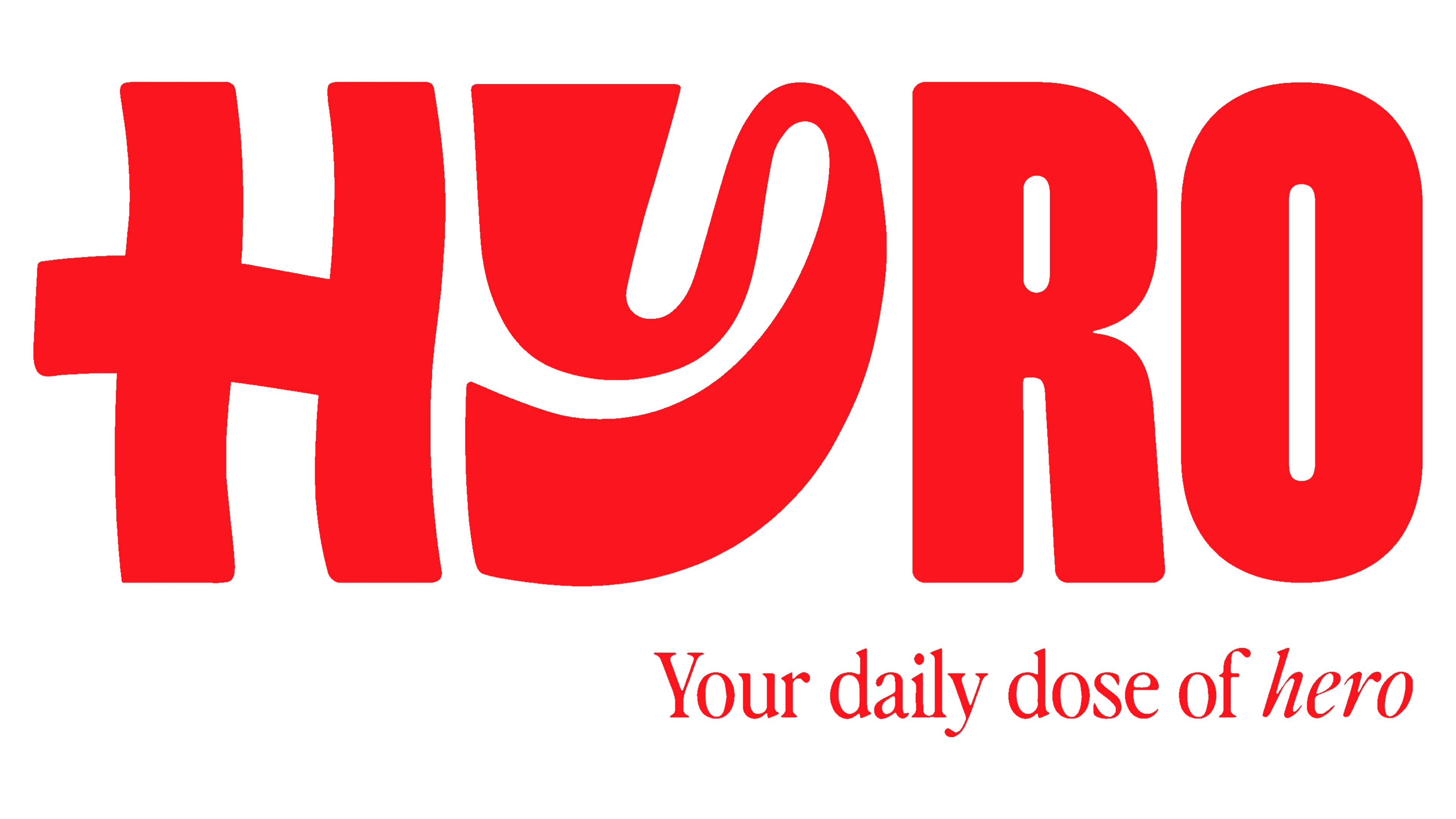
The new logo features a playful yet sophisticated design, emphasizing the letter “Y.” The “Y” has a distinctive squiggly design that adds a sense of movement and energy, aligning with the brand’s dynamic personality. This playful element contrasts with the condensed sans serif typeface used for the rest of the wordmark, creating a visually engaging logo.
The “H” in the logo is prominent, becoming the focal point of the monogram. The design of the “H” incorporates a wavy personality that complements the squiggly “Y,” creating a harmonious flow between these key elements. The crossbar of the “H” and the bottom curve of the “Y” connect subtly, enhancing the overall cohesion of the logo.
The letters “R” and “O” are straightforward in design, featuring a condensed style that contrasts with the more elaborate “H” and “Y.” This contrast creates a visual balance, though it may feel slightly disjointed to some. Despite this, the overall effect is bold and fun, making the logo stand out.

The packaging for Hyro is striking. It features a bright red background and a vibrant canvas for the stark white logo. This eye-catching color scheme exudes confidence, ensuring Hyro products stand out on shelves and online platforms. The packaging design extends to small sachets and larger bulk bags, maintaining consistency across different product formats.
One unique element of the packaging is using a serif typeface named Perfectly Nineties, which adds a touch of retro charm. This nostalgic element is subtly integrated, adding character without overwhelming the overall design.
Electric Brands’ design approach combines bold colors, playful typography, and confident language that appeals to many consumers. The new identity communicates Hyro’s brand values of purity, potency, and science-backed hydration.
Hyro’s new tagline, “Hydrate Smarter,” encapsulates the brand’s mission to provide superior hydration. Each sachet of Hyro contains an optimal blend of electrolytes and vitamins, including 500mg of sodium, 250mg of potassium, 100mg of magnesium, and 45mg of vitamin C. The product is formulated without added sugars or artificial ingredients, emphasizing its commitment to natural and effective hydration.
The rebranding highlights Hyro’s target audience—individuals seeking to seamlessly integrate work, life, and fitness. The brand is a companion for those striving to achieve their best through daily hydration, good sleep, and hard work. The new identity reflects this by presenting Hyro as a modern, trustworthy, aspirational brand.
In summary, Hyro’s new logo and packaging by Electric Brands mark a significant evolution in the brand’s identity. The playful yet sophisticated design, bold colors, and nostalgic touch create a memorable and engaging visual identity. This rebranding effort positions Hyro as a leading player in the hydration market, ready to meet the needs of health-conscious consumers with its pure, potent, and scientifically formulated products.