Iberdrola, a global leader in renewable energy, has debuted a revitalized brand identity, brought to life in collaboration with Design Bridge and Partners. The rebranding is a reflection of the company’s reality as a progressive, sustainable, and innovative world leader, mirroring societal needs and its commitment to environmental stewardship.
Iberdrola’s brand team again entrusted the strategic development of their new brand to Design Bridge and Partners, with the objective of depicting the current status of the company accurately. The outcome of this collaboration is a new brand image that builds on the existing logo, ensuring brand recognition and providing a unified symbol across the diverse nations where Iberdrola operates. Initially, the new brand image will be implemented digitally, with physical formats to follow.
The company’s brand identity has evolved to solidify its sustainable ethos and communicate its commitment to being digitally forward, accessible, and contemporary. In line with this, Iberdrola asserts its ambition to position itself as a leader in decarbonisation and societal welfare.
The new brand image faithfully encapsulates Iberdrola’s role as a critical actor in the economy’s electrification, fostering a societal drive to nurture and replenish the planet. It represents a brand that consistently evolves, takes progressive steps forward, and sets ambitious targets like achieving net-zero emissions by 2030 and supporting essential Sustainable Development Goals (SDGs).
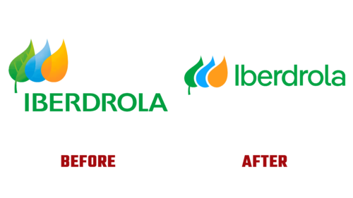
The fresh Iberdrola logo, an evolution of its predecessor, promises greater contrast and improved visibility across digital media, thereby simplifying the visual language. The revamped symbol acts as a binding element across all the countries where Iberdrola operates under different brands, such as Avangrid in the United States, Neoenergia in Brazil, and Scottish Power in the United Kingdom. Additionally, the new logo is 50% lighter, ensuring lower energy consumption, faster download speeds, and substantial savings on energy, costs, and time.
The remaining visual resources have also been redesigned to enhance brand application, reduce carbon footprint and energy consumption, streamline usage, and establish design application standards that support implementation. These standards range from eco-design and material selection to waste reduction, energy saving, and local production.
The new color palette employed is emblematic of Iberdrola’s worldview and commitment to the planet, associating the brand with three pivotal elements of its value proposition: renewable energy (green), water (blue), and the sun (orange).
The new brand deploys a unique font family, IberPangea, which offers increased variability, efficiency, and legibility. It has been designed to perform effectively in both digital and offline environments, further enhancing the brand’s new identity.


