![]() Iberdrola Logo PNG
Iberdrola Logo PNG
The modern logo of the Spanish energy company Iberdrola symbolizes the focus on “green” energy and sustainable development. The stylized image of tree leaves represents the company’s core principle of its operations.
The origins of Iberdrola trace back to Spain’s industrial expansion at the turn of the 20th century. On July 19, 1901, engineer Juan de Urrutia, backed by Banco de Vizcaya, founded Hidroeléctrica Ibérica in Bilbao to address a severe electricity shortage. In 1907, Hidroeléctrica Española was created to supply Madrid and Valencia, followed in 1918 by Saltos del Duero, focused on the Duero River. World War I accelerated network expansion and energy diversification across all three firms.
In 1935, Saltos del Duero launched the Ricobayo dam, Spain’s first large hydro facility. A merger in 1944 formed Iberduero, while Hidroeléctrica Española, known as Hidrola, continued separately. Both companies expanded their hydro and thermal generation and later entered the nuclear energy sector. The Santa María de Garoña plant opened in 1971, and Almaraz began operations in 1981 as part of a new generation of nuclear facilities.
Market pressure grew in the early 1990s as ENDESA expanded with government backing. In response, Iberduero and Hidrola agreed to merge, creating HI Holding in 1991. The process concluded on November 1, 1992, resulting in the formation of Iberdrola under the chairmanship of Íñigo de Oriol. The company expanded into Latin America over the decade, focusing on Mexico and Brazil, and acquired distributor CELPE in 2000.
A strategic shift followed in 2001 under CEO Ignacio Sánchez Galán, prioritizing renewable energy. Iberdrola acquired ScottishPower in 2007 for €17.1 billion and expanded into the United States with Energy East in 2008. The Whitelee wind farm opened in 2009 as Europe’s largest at the time. Further growth included Elektro in Brazil in 2011, UIL Holdings in 2015, leading to Avangrid, and Infigen Energy in Australia in 2020. In 2024, Iberdrola acquired an 88% stake in Electricity North West, strengthening its position in the UK network.
Meaning and History
![]()
Iberdrola was created in 1991 following the merger of two of Spain’s oldest electric power companies, Hidroelectrica Española and Iberduero. Hidroelectrica Espanola, better known as Hidrola, traces its history back to 1907, when it merged with Saltos-del-Duero and Iberduero, reorganizing Hidroelectrica Ibérica, which had been operating since 1901. Thus, Iberdrola is rightly considered Spain’s oldest energy company, with a range of power plants and related enterprises.
Since 1960, the company Hidroelectrica Espanyola, which later formed the basis of Iberdrola, has been involved in Spain’s nuclear energy development program. In 2001, it was headed by Jose Ignacio Sanchez Galan, who focused on renewable energy sources and began the active construction of wind and solar power stations throughout Europe and South America. In 2007, Iberdrola entered the energy markets of the United Kingdom and the USA.
Today, the company has over 33 million consumers, 10 million of which are in Spain; it owns five nuclear power plants, two thermal complexes, and three CORE renewable energy centers in Toledo, Portland, and Glasgow.
The company actively sponsors women’s sports in Spain, thereby enjoying strong public support and an impeccable reputation among consumers. The quality of services is always high, and the prices are affordable.
The modern Iberdrola logo reflects its commitment to environmental preservation and to generating environmentally safe energy. The history of the brand’s name dates back over a hundred years.
What is Iberdrola?
Iberdrola is a Spanish company that produces and distributes electricity. It emerged in the early 1990s following the merger of Iberduero and Hidrola. Over several years, it transformed into a large multinational group, acquiring Energy East and ScottishPower. Today, it is a leading energy supplier in Europe, Latin America, and the USA. Iberdrola ranks second globally in wind energy production and aims to reduce carbon emissions.
1901 – 1944
![]()
The initial logo of the electric power company contained the words “Hidroeléctrica Ibérica.” This was its name before it merged with other industrial enterprises. The phrase occupied two rows and had an arc-like form. Curved lines were set against a natural landscape background.
1907 – 1944
![]()
The next emblem version is more practical: characterized by simplicity, geometric structure, and a lack of fine detail. It was written in capital letters using the company’s then-name, Saltos del Duero, which merged with Hidroeléctrica Ibérica in 1944 to form the large energy organization Iberduero. The abbreviation “SD” consisted of straight trapezoidal segments arranged in an irregular black octagon.
1907 – 1991
![]()
This is another company’s logo that later became part of Iberdrola (in 1992). Its name was Hidroeléctrica Española. It served as the basis for a personal sign in the form of a short abbreviation “HE” with one shared side. White geometric letters were placed within a bright red double square.
1944 – 1991
![]()
As a result of the merger of several specialized companies, Iberduero emerged and adopted its logo. It was minimalist and looked like a large “O” letter crossed by a capital “I.” These are the letters “b” and “d” turned back-to-back, sharing a common part. And indeed, an “I” stands behind them. Below is the company’s full name, executed in smooth, chopped signs.
1991 – 2001
![]()
After extensive merging and rebranding, the energy company changed its logo design, retaining the previous colors – red and black. The same letter is depicted on a white background in lowercase and uppercase “i” and “iI.” This is an allegorical designation of the word “Iberdrola.” The first symbol’s upper dot is enlarged and merges with the lower part. Below the text is the company’s extended name, consisting of upper-case serif letters.
2001 – 2023
![]()
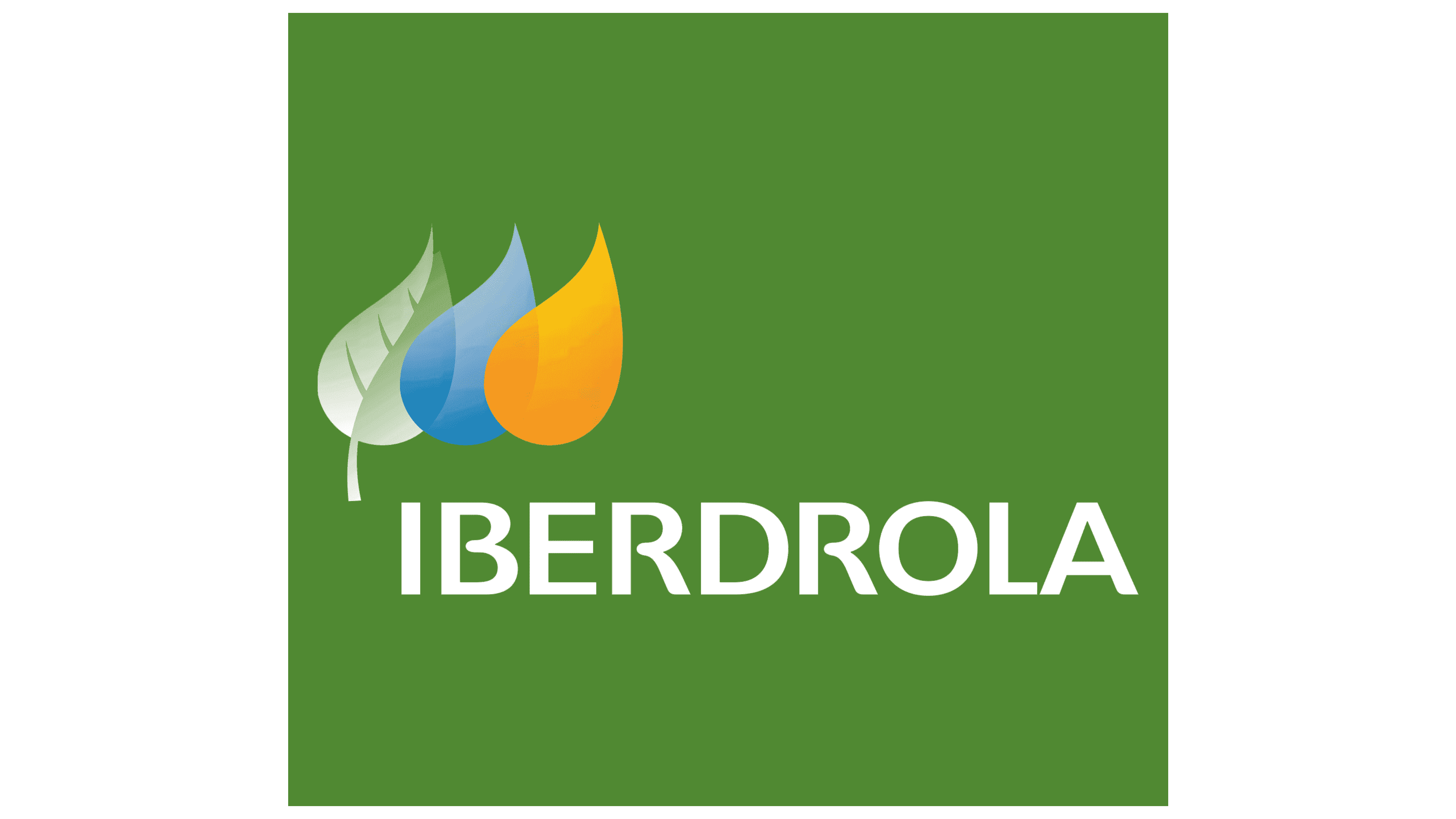
With the onset of renewable energy development, Iberdrola radically changed its logo. The full company name, written in green, was used to symbolize nature protection and eco-friendliness. Above the name on the left are three icons: a green leaf, a blue, and an orange drop. Each is filled with meaning:
- The green leaf signifies the use of safe and eco-friendly technologies.
- The blue drop symbolizes renewable wind energy and natural gas.
- The orange drop indicates solar energy.
- The first emblem’s background is white. Tinted plaques with blue and green backgrounds are also used; in this case, the company’s name is written in white.
The Iberdrola emblem is included in the Top Best Brands ranking as the one that most accurately reflects its business, ecological orientation, and environmental care.
2023 – today
![]()
The Iberdrola logo has undergone a stunning transformation, developed by the Iberdrola brand team and Design Bridge and Partners. This transformation holds immense significance, embodying Iberdrola’s current standing and ambitions. It speaks of a modern, accessible, connected identity that resonates with a global audience.
The brand’s emblem has evolved significantly, becoming more distinct and specifically adapted for digital platforms. This led to the creation of a design language that is simultaneously simple and comprehensible. The new symbol is particularly notable for uniting Iberdrola’s global markets, including the USA (Avangrid), Brazil (Neoenergia), and the United Kingdom (Scottish Power).
The brand emblem has elevated eco-friendliness to a new level with a revolutionary design. It’s 50% lighter than its predecessor, requires less energy, and offers higher loading speeds. This innovative design saves energy and money, reduces logo load time, and is a win-win for everyone.
Iberdrola chose a vibrant color palette to represent its commitment to the Earth: green for renewable energy, blue for water, and orange for the sun. This powerful color combination symbolizes the company’s commitment to environmental protection and investment in renewable energy, illustrating its desire to make a positive impact on our planet.
The IberPangea font family was chosen to complete the new branding, adding versatility and accessibility to the emblem across all media. Its variability, efficiency, and legibility make it the perfect choice for both digital and offline contexts, ensuring the brand remains visible and impactful across platforms.
Font and Colors
The text portion of the logo is set in a sans-serif font. That is, it’s a sans-serif grotesque font with straight ends. But the straight letters have one interesting feature: some of them lack a closed middle stroke. Specifically, the letters “B” and “R” don’t reach the front leg in the middle stroke, so the symbols seem unfinished. The inscription is in uppercase. The modern emblem uses a saturated palette: bright yellow, blue, and green in two shades.