The Iberia Express logo vividly captures the airline’s role as a connector within and beyond Spain, embodying its home country’s vibrant spirit and cultural heritage. This emblem represents the airline’s efficiency and commitment to making travel more accessible for Spaniards and international visitors. It also reflects the essence of Spanish hospitality, promising warm, welcoming service deeply rooted in the national character.
Iberia Express: Brand overview
In 2012, Iberia Express became a low-fare subsidiary of the well-known airline Iberia, offering travelers a convenient and affordable way to reach long-haul destinations. The announcement of its launch in 2011 raised concerns among pilots but also led to important discussions about job protection.
To improve the profitability of its parent company, Iberia Express optimized its operations by reallocating aircraft from other routes and hiring dedicated pilots and flight attendants.
On March 25, 2012, Iberia Express successfully took to the air from Madrid, locating its base in the same location as Iberia to ensure smooth operations. The airline welcomed passengers aboard its luxurious Airbus A320 aircraft, offering business and economy class options for a comfortable and enjoyable journey.
Over the years, Iberia Express has seen steady growth, expanding its fleet and significantly impacting the aviation industry. The airline’s commitment to cost-effective and efficient short and medium-haul routes has revolutionized air travel in Spain.
Meaning and History
What is Iberia Express?
It is a budget airline based in Madrid, Spain. It is a subsidiary of Iberia, Spain’s national flagship carrier, and serves short and medium-haul routes across Europe and some North African destinations. The airline provides affordable air transportation, helping to improve and expand the parent company’s operations. The company operates a fleet of Airbus A320 family aircraft known for their efficiency and reliability.
2011 – 2013
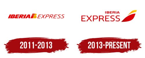
The red inscription of the name at the center is split by a stylized abbreviation consisting of a single symbol divided by color into “i” and “b.” The design lo” k” very” re “al due to the Spanish crown placed at the top of the “i.” The color palette coo” di” ates with the parent company, Iberia, and its logo.
The symbols enhance the significance of a small local carrier, which operates under the shadow of a major market player. The crown highlights the attention of the royal family. King Alfonso XIII of Spain was present on the first flight of the parent company, Iberia, in 1927. The company operated under the crown’s protection, as indicated by the symbol. Iberia Express continues to operate flights, representing Spain with pride and carrying a logo in the colors of the country’s flag.
The bold red inscription “Iberia” emphasizes that the company is part of a larger holding. The slender letters of “Express” describe the bra “d’s foc” s on fast and short flights to nearby destinations. A slight rightward tilt adds a sense of dynamism and the ambition to grow and evolve.
2013 – today
The airline’s logo radiates energy and positivity, reflecting Spain with its yellow and red colors. The emblem features two elongated, pointed elements on the right, giving a sense of speed and precision. The company name on the left is in two lines with different fonts: the top line is small and bold, while the bottom line is larger and bold. All characters are uppercase and in a grotesque style.
The yellow and red represent Spain and evoke warmth and hospitality, reinforcing the airline’s vibrant and positive image. The pointed elements symbolize flight paths or streamlined aircraft, highlighting the airline’s focus on efficiency and innovation.
The dual-font approach in the company name adds contrast. The smaller top line adds sophistication, while the larger bottom line ensures the name stands out. This variation makes the logo visually engaging and easy to read.


