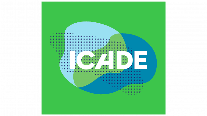
“By investing, the company sees the future of the building and the return that investors can expect,” says the Icade logo. The emblem elements combine two sectors of the corporation’s work – private and public. The organization gets the most out of each.
Icade: Brand overview
| Founded: | 1860 |
| Headquarters: | Issy-les-Moulineaux, Paris, France |
| Website: | icade.fr |
Icade is an international company that invests in private and public real estate. It was created in 1954 under the name SCIC. She received her current name in 2003. Since 2016 she has been engaged in advertising and the land market. He works in various sectors, including medical and public institutions, residential buildings, business parks, and offices.
Icade SA is a French company specializing in real estate investment and real estate development. The company was founded in 1954 and, throughout its history, has gone through several periods of growth and development. Over the years, Icade has acquired and developed many properties, including office buildings, shopping malls, logistics centers, and residential buildings. The company is also actively involved in projects to improve the environmental sustainability of properties and develop technologies to reduce energy consumption and environmental impact.
Meaning and History
Throughout its history, Icade has changed its logo and emblem numerous times to reflect changes in its operations and visual style. Each emblem reflects a particular feature or concept of the company and makes it easy to recognize Icade among other companies in the industry.
What is Icade?
Icade is one of France’s biggest representatives in the real estate market. This company creates various commercial and medical facilities, including warehouses, shopping centers, business parks, offices, nursing homes, and clinics. It also invests in projects that make buildings energy efficient, environmentally friendly, and reliable.
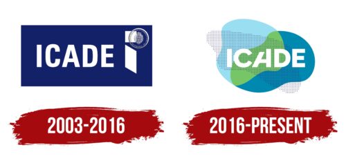
2003 – 2016
The first investment company logo appeared in 2003, immediately after the rebranding of the SCIC group. Its main element is the “Icade” lettering in a strict sans-serif typeface. There is no hidden meaning in the name: it is derived from Immobiliere Caisse des Depots’ words. On the right is a figure resembling the letter “i.” It consists of a square and a parallelogram. The color scheme is simple – white on blue.
2016 – today
On February 13, 2016, the company introduced a different logo. As CEO Olivier Wigniolle noted, the business changed its strategy over 15 years, so it was necessary to modernize the visual identity. He believed the new style was more customer-centric and less institutionalized.
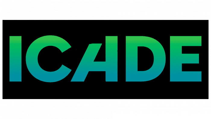
The modern logo also has the “Icade” inscription, but it looks completely different from the previous version. The top of the letter “A” is slightly cut off, which has become a recognizable brand identity. The motto “L’immobilier de tous vos futurs” is written under the bottom, obtained after a partial rebranding.
Another feature of the graphic sign is the original background. In the background, there are large chaotic spots of different colors. The palette includes blue, cyan, and green. One “cloud” consists of many black dots lined up at the same distance from each other.
Icade: Interesting Facts
Icade is a big name in French real estate, known for its forward-thinking urban projects. It started in 1954 and has grown to focus on more than just homes, including offices, healthcare, and public spaces.
- From the Start: Icade began as a housing company but now handles commercial properties like offices and healthcare centers.
- Urban Innovation: The company works on cool city projects that combine great design with eco-friendliness. Its aim is to make cities better places to live.
- Eco-Friendly: Going green is key for Icade. They build energy-saving buildings and add green spaces to help the environment.
- Healthcare Spaces: Icade is big in healthcare, owning clinics and medical offices. This makes them a top choice for healthcare real estate in France.
- Tech in Real Estate: They use technology to manage properties better, make smarter decisions, and make buildings more energy-efficient.
- Working Together: Icade teams up with public and private sectors for big city projects, helping build infrastructure and affordable homes.
- Going Global: While they focus on France, Icade also works in Europe, spreading their expertise and diversifying their work.
- Recognized Excellence: Their projects have won awards for their design and positive community impact.
- Cultural Projects: Beyond building, Icade helps preserve France’s cultural spots, turning old buildings into creative spaces.
- Community-Focused: They’re committed to making housing accessible, supporting diversity, and boosting local economies.
Icade’s work involves creating modern, sustainable, and friendly urban areas. Focusing on the environment, innovation, and community needs impacts how cities evolve in France and beyond.
Font and Colors
The Icade logo font is a classic version of the Sans Serif category. These are wide sans serif uppercase letters – chopped, smooth, even. In this case, they are distinguished by strict geometry and the absence of the upper left part “A.” It has half the top cut off, so the right side is slightly higher.
The color scheme consists of white (lettering), black (dots), blue (speckled cloud), green (another chaotic spot), and cyan (third cloud).
Icade color codes
| Light Blue | Hex color: | #acdeef |
|---|---|---|
| RGB: | 172 222 239 | |
| CMYK: | 28 7 0 6 | |
| Pantone: | PMS 304 C |
| Pistachio | Hex color: | #8cc66b |
|---|---|---|
| RGB: | 140 198 107 | |
| CMYK: | 29 0 46 22 | |
| Pantone: | PMS 360 C |
| Bondi Blue | Hex color: | #008aaf |
|---|---|---|
| RGB: | 0 138 175 | |
| CMYK: | 100 21 0 31 | |
| Pantone: | PMS 632 C |
