The Icelandair logo embodies the mystique and allure of Icelandic landscapes, reminiscent of the northern lights illuminating the skies above Iceland. Subtly hinting at adventure, it invites you to embrace Iceland’s outdoor wonders, from fjords to glaciers and quaint towns with unpronounceable names. The logo symbolizes an introduction to Iceland, a place both strange and stunning, a land rich in natural contrasts.
Icelandair: Brand overview
Originating in 1937 as Flugfélag Akureyrar, Icelandair has undergone a transformation journey. In 1940, the airline rebranded to Flugfélag Íslands and expanded its operations to include international flights to neighboring countries.
With the advent of long-haul aircraft, the airline made history in 1945 with the first transatlantic flight to the United States.
By the mid-1950s, Icelandair had firmly established itself as the foremost transatlantic carrier, offering passengers a convenient one-stop route between Europe and North America. The advent of jet aircraft in the 1960s further fueled the company’s growth, providing faster and more efficient long-haul service and capitalizing on Iceland’s position.
When the Icelandic aviation industry was deregulated in 1979, the airline adapted to the new environment and worked hard to provide exceptional customer service.
In the 1990s, Icelandair embarked on an ambitious journey of modernization and innovation. The airline invested in a new fleet of aircraft introduced exciting new routes, and used the latest technology to offer customers an unrivaled travel experience.
In 2002, Icelandair took a significant leap forward by becoming part of the Icelandair Group, a holding company combining the aviation and travel businesses.
Meaning and History
What is Icelandair?
Iceland’s national airline, based in Reykjavik, operates a network of international flights connecting Iceland to destinations in North America, Europe, and beyond. Known for its transatlantic routes, it offers passengers a unique opportunity to stay in Iceland without extra airfare, thus boosting tourism. The airline provides various classes of service, including economy, economy comfort, and Saga (business) class. The company is known for its modern aircraft fleet in Iceland’s tourism industry.
1937 – 1978
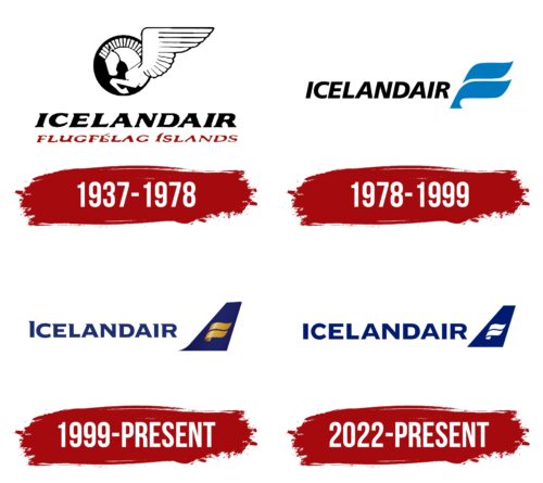
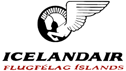
The first logo prominently features Pegasus within a black circle representing the sky, where the company’s planes soar. The winged horse symbolizes freedom, travel, and imagination, values that align with Icelandair’s, which aims to provide its passengers with comfortable and inspiring journeys.
Below, the brand’s name appears in bold black letters, representing persistence and determination. The company started with a single airplane, and after experiencing a crash, relocated and restarted with one airplane until it firmly established its presence in Iceland’s skies.
The name “Icelandair” was not officially used until 1979. Before this, the company was known internationally as Iceland Airways, a name derived from a combination of “Iceland” and “air,” which stemmed from the Icelandic name Flugfélag Îslands, mentioned beneath the logo in the early documents.
The black-and-white imagery highlights the country’s unique long durations of day and night and abundant snowfalls.
1978 – 1999
After the merger of two Icelandic airlines, Flugfélag Íslands, and Loftleiðir, into a single large organization named Icelandair, a decision was made to renew the emblem fundamentally. The new emblem features a modern and expressive design, reflecting a new chapter in the company’s history.
The design of the logo highlights clear, streamlined uppercase letters. These were crafted in a style that emphasized harmony and modernity, symbolizing the brand’s achievements and the technical excellence of its fleet. The precision of the lettering conveyed the impeccable organization and high quality of flights offered by Icelandair.
The logo design includes two blue stripes on the right side, symbolizing either a wing or the keel of an airplane. These elements, executed in a minimalist style, added lightness and dynamism to the image. Using blue, associated with the color of the sky and water, was deliberate, reflecting the company’s transatlantic flight specialization. Most of Icelandair’s flights cross the Atlantic Ocean to connect continents.
The dual symbolism in the stripes hinted at the merger of the two companies into the new Icelandair. This element emphasized the union that resulted in a refreshed and strengthened airline, ready to face new challenges and opportunities in international aviation.
1999 – today
The company logo’s dark blue color was meticulously selected to emphasize the depth and mystical beauty of the ocean and the cold waters around Iceland. This color reflects the natural characteristics of the region and lends an image of seriousness and professionalism. The dark blue imparts a visually professional and reliable appearance to the company’s airplanes, which is crucial for airlines seeking to strengthen passenger trust.
Gold flourishes gracefully designed on the emblem’s keel represented the luxury and comfort available on board Icelandair’s aircraft. These design elements indicate a high level of service and state-of-the-art technical equipment in the fleet, underlining the company’s commitment to providing safe and exceptionally comfortable flight conditions.
Entering the third millennium, the company actively adjusted its strategies, emphasizing the development of business travel and enhancing the level of business service on board.
2022 – today
Icelandair’s logo used to feature a Pegasus, but now it shows a stylized wing. The wing resembles two wide, wavy stripes with a small half-oval at the bottom. These white geometric elements sit inside a dark blue trapezoid, representing the top of an airplane’s tail. The company name is in a balanced sans-serif font. This logo has been in use since 2022.
The new design moves from mythical imagery to a modern look. The dark blue trapezoid suggests the sky or ocean, connecting to Iceland’s natural elements. The white wing elements provide a minimalist yet dynamic feel, symbolizing movement and flight. The sans-serif font enhances the modernity of the logo, showing professionalism and reliability.
Switching from the Pegasus to a stylized wing marks a shift to a cleaner brand identity. The dark blue evokes calm and trust, while the white wing elements add sleekness and sophistication. The choice of a sans-serif font underscores a modern and professional image, aligning with the airline’s streamlined operations and customer-focused services. The balanced text design complements the geometric wing, creating a cohesive and visually appealing logo.
