Through the distance, the messenger opens a window for communication over Internet wires. The ICQ logo tells the story. The program helps to create a community of completely different people. The correspondence visible on the emblem strengthens the relationship.
ICQ: Brand overview
| Founded: | November 15, 1996 |
| Founder: | Mirabilis |
| Website: | icq.com |
Meaning and History
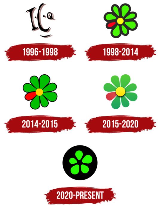
After the official launch of ICQ, the brand logo has been changed four times, and minimal adjustments have been made to it, making it even more recognizable among the target audience. Around the world, the messenger is associated with a green flower, but the first variation was completely different from the version familiar to users.
What is ICQ?
First of all, it is an opportunity not to be alone. With the help of the presented online messenger, you can find a friend at any time or chat with your friends for free.
1996 – 1998
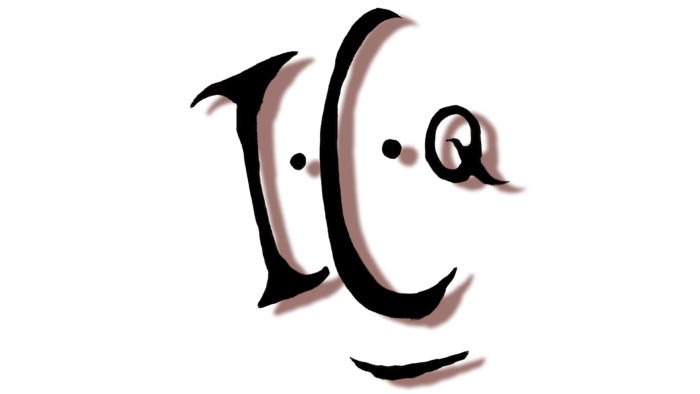
The first version of the logo consisted of three capital letters ICQ, separated by black dots. Interestingly, all characters in the messenger’s name have a different size. If “I” and “C” have minimal differences in volumes, then “Q” is significantly less. Each letter has a shadow, which creates a sense of a three-dimensional image. Under the letter, “C” is a horizontal line with a slight rounding. The logo is based on the principle of lettering when the letters seem to be drawn, not written. The non-standard logo attracted the attention of global network users with its minimalism, but two years later, it was radically changed.
1998 – 2014
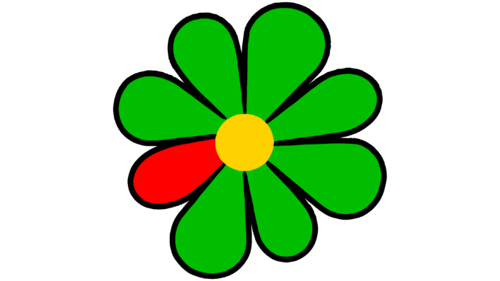
The next version of the logo existed for a long sixteen years. During this period, the presented online messenger enjoyed the greatest popularity among the target audience. This was largely because ICQ had no real analogs on the market. The emblem with which millions of users worldwide associate ICQ was introduced in 1998. The wordmark was completely removed, and a green flower appeared in its place. The circle in the center of the flower was represented by yellow. At the same time, seven of the eight petals were green. The latter, red, stood out and made the emblem more vivid and memorable. Each element of the emblem had a black outline separating one petal from another.
2014 – 2015
At this stage, the messenger logo acquired volume. This became possible after using the gradient of the primary colors presented in the image of the flower. In turn, the contours became less noticeable.
2015 – 2020
The volume of the emblem has been removed. At the same time, the distance between the color petals appeared, and the black contours were also removed. The 2015 redesign used brighter colors. The logo itself, in the end, became simpler compared to the previous version, but the company needed such changes.
2020 – today
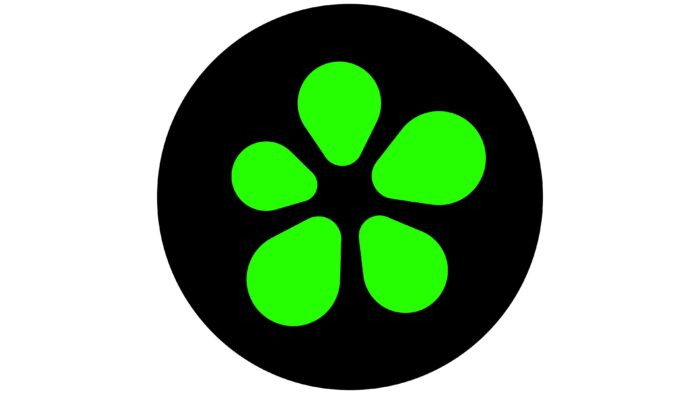
The most tangible changes since the first logo redesign were made in 2020. Now the flower consisting of five green petals was inside the black circle. The yellow center of the flower, as well as the red petal, have been removed. As a result, this version of the logo has become the most concise among all its predecessors.
If a black inscription with the name of the brand was sometimes used in previous versions, then here, it was absent in any variations.
Font and Colors
With the emblem of the online messenger from 1998 to 2020, its name was also used, made in a classic font using bold lowercase letters.
Also, during this period, the color palette of the emblem consisted of green, yellow, and red. The use of bright colors made it possible to attract the target audience’s attention. In the latest variation, the logo has become more progressive but, at the same time, noticeably gloomy compared to the options used in the previous stages of the platform’s operation. Green petals on a black background create a sense of concreteness and purposefulness of the company ICQ.
ICQ color codes
| Green | Hex color: | #24ff01 |
|---|---|---|
| RGB: | 36 255 1 | |
| CMYK: | 86 0 100 0 | |
| Pantone: | PMS 802 C |
| Black | Hex color: | #000000 |
|---|---|---|
| RGB: | 0 0 0 | |
| CMYK: | 0 0 0 100 | |
| Pantone: | PMS Process Black C |
