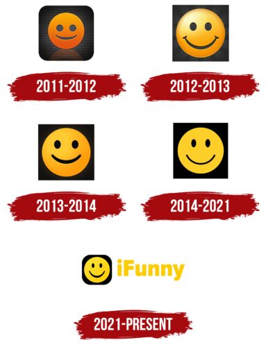
The iFunny logo conveys emotion. The emblem gushes with smiles and a good mood. Promises drive, communication and fun. Indicates the friendly interface of the application.
IFunny: Brand overview
| Founded: | April 26, 2011 |
| Founder: | FunCorp |
| Headquarters: | Russia |
| Website: | ifunny.co |
The creator and owner of IFunny are FunCorp, which develops entertainment services and develops the FunTech industry. It was registered in 2004 in Cyprus, although students from Penza founded it. The young team was producing funny apps, but no project was as popular as IFunny.
This community of memes and funny pictures appeared in 2011 – a year after the similar iOS application IdaPrikol. The Russian-language version became very popular in Russia and the CIS countries, so the developers decided to repeat their success in the North American market. Unlike AyDaPrikol, IFunny is designed for English-speaking users and, in 5 years, was able to become a full-fledged social media.
Meaning and History
The service for viewing entertainment content was initially available in iOS and Android applications that could be downloaded from the App Store and Google Play. Then the web version began to catch up with them, which also gradually gained popularity. Residents of the United States actively posted, viewed, and commented on funny pictures. Of course, they marked the memes they liked using emoticons – a similar system of likes operated in AyDaPrikol.
This explains why IFunny’s logos have always featured a large smiley face. Its appearance changed periodically, and the changes went from complex to simple. This trend was traced at all levels – from the disappearance of the gradient to the background adaptation.
What is IFunny?
IFunny is an entertainment website and app where users share memes. The brand is owned by FunCorp, a company legally registered in Cyprus but with Russian roots, as it was created by students from Penza. Essentially, IFunny is an English-language social network for fans of humorous images, GIFs, and videos. It has faced several controversies due to extremist content involving threats toward various individuals.
2011 – 2012
When the app first appeared, it had a visually heavy logo. The designers combined two dark elements: a yellow-orange smiley with holes instead of eyes and a mouth, and a square with rounded corners and a gray checkered pattern. The edges were black because the vignetting effect was very popular at the time. The background’s specular shine, the gradient, and the reflection of the smiley added dimension to the picture.
2012 – 2013
In 2012, the developers at FunCorp updated the IFunny logo for the first time. It became lighter by changing the color palette. Simultaneously, the smile gained a friendly look thanks to the new shape of the eyes and mouth. The specular reflection disappeared, as did the cellular background. The square now has full-fledged right angles and colors in the form of gray semi-blurred rays. The vignetting effect was not used, but the edges were still darkened due to the characteristic stripe shape.
2013 – 2014
After another redesign, the creators of IFunny approved a new icon: a large black square with a small smiley in the center. The designers changed the shape and position of the smile again. They also used a moderate amount of orange and made the background a solid color so that the image doesn’t feel as heavy as it used to be.
2014 – 2021
The trend towards simplification continued: in 2014, the gradient finally disappeared. But the smiley has become larger, so it is easy to notice it without any graphical techniques. Simultaneously, colors have lost their brightness and saturation, which makes the logo look faded.
2021 – today
After the redesign, the black square that serves as the background for the smiley has lost its right angles – they have been rounded off to make the drawing look more friendly. For the same purpose, the developers have changed the smile’s shape, expanding it at the bottom. At the same time, the orange color became light, almost yellow. To the right of the icon was the inscription “iFunny” of the same shade. It uses a bold geometric sans-serif typeface that is proportionately balanced. Only “F” is capitalized in the brand name, and all other letters are lowercase. The shape of the “F” makes it seem like there’s more spacing between it and the “u.”
IFunny: Interesting Facts
iFunny is a fun app that’s been around since April 2011, where people can laugh at memes, images, and videos. It started as a website but quickly became an app filled with funny content from all over the internet.
- Origin and Goal: Created to make people laugh by sharing various funny content collected online.
- User Content: Users add a lot to the app by uploading funny images and videos, keeping the content fresh and interesting.
- What You Can Do: In addition to enjoying memes, you can make your own, follow favorite topics or people, and interact with others through comments and likes.
- Impact on Culture: iFunny has helped spread internet jokes and trends, making it a key player in online humor.
- Popularity: With millions of active users and countless downloads, many people enjoy iFunny’s humor.
- Issues Faced: However, it’s not all laughs. iFunny has been criticized for not quickly removing harmful content and for instances of bullying, highlighting the need for better moderation.
- Finding What You Like: The app uses an algorithm to show you content it thinks you’ll enjoy based on what you interact with.
- Spotlight on Creators: Occasionally, iFunny features certain posts, giving them more attention and a chance to go viral.
- Diverse Communities: Inside iFunny, smaller groups are centered around particular jokes or interests, adding variety to the offerings.
- Run-ins with the Law: Some users have gotten into trouble for things posted on iFunny, asking questions about the app’s role in monitoring content.
iFunny mirrors many of the ups and downs of the digital and social media world, balancing fun with the need for responsibility and exploring how online humor evolves.
Font and Colors
The owners of IFunny have experimented for a long time with the logo’s graphic design without changing the key elements. Now it consists of a square (background), a circle (head), two mini-ovals (eyes), and an arc (mouth). With the simplest set of geometric shapes, the designers were able to convey the whole essence of the entertainment service. Firstly, the smiling emoticon symbolizes the good mood that users get when viewing funny pictures. Secondly, it is presented in the system of likes on the site and applications.
The IFunny logo does not contain inscriptions. This is a simple two-color drawing. The artists used the shade Golden Tainoi (# FFC449) for the smiley and the square – Black Russian (# 212124).
IFunny color codes
| Tangerine Yellow | Hex color: | #ffcf29 |
|---|---|---|
| RGB: | 255 207 41 | |
| CMYK: | 0 19 84 0 | |
| Pantone: | PMS 122 C |
| Black | Hex color: | #000000 |
|---|---|---|
| RGB: | 0 0 0 | |
| CMYK: | 0 0 0 100 | |
| Pantone: | PMS Process Black C |

