The IGN logo embodies the energy, passion, and enthusiasm associated with video games. It reflects the dynamism typical of the interactive entertainment industry. In addition, the emblem represents a commitment to gamer culture and is a recognizable sign among its fans – novices and professional esports athletes.
IGN: Brand overview
| Founded: | September 29, 1996 |
| Founder: | Jonathan Simpson-Bint |
| Headquarters: | San Francisco, California, United States[ |
| Website: | ign.com |
Meaning and History
In 1996 the N64 gaming site was launched, dedicated to Nintendo 64. It became so popular that the console manufacturer began worrying about trademark infringement. As a result, the platform changed its name to IGN64. This happened in 1998 and contributed to the emergence of the independent IGN brand.
It united several entertainment online resources of the Imagine Games Network, which previously used different emblems. When they formed a whole, they needed a common logo. Designers developed for IGN a symbol with an image of a D-pad – a cross made up of several buttons. This joystick detail allows you to direct characters in the desired direction.
The website was rapidly developing, and by 2010, the leaders decided it needed a more attractive appearance. They turned to the British creative agency ATTIK, known for its collaboration with Adidas, MTV, PlayStation, and Coca-Cola. The specialists kept the D-pad but improved its style, adding modernity to the emblem. All changes to the IGN logo are associated with the desire to please a broad audience of gamers.
What is IGN?
IGN is a website owned by the American media company IGN Entertainment. It specializes in video games but also pays attention to movies, comics, and other directions of the entertainment industry. The platform publishes news, podcasts, exclusive interviews, reports, previews, reviews, and more. Since February 2013, the IGN brand has been owned by Ziff Davis.
1996 – 2009
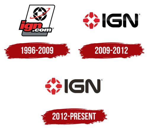
This logo was noticed on the IGN website around 1998. It contains an image of a D-pad, which underlines the platform’s focus on video games and matches the thematic content. Four triangular buttons are located in a white circle with a black frame. They are surrounded by a thin diagonal red line resembling Saturn’s ring.
Below is the address of the online platform. It’s split into two lines of different colors: the first level houses the red “ign,” and the second – the white “.com.” All letters are bold, italic, and outlined in black. The background for the image and inscription is a white parallelogram with a gray base.
2009 – 2012
The number of visitors to the site was steadily increasing, and the owning company, IGN Entertainment, decided that it was time to adapt the brand to the modern, youthful audience. The new corporate style was developed by the British creative agency ATTIK. The designers removed the “.com” inscription and completely changed the shape of the remaining letters. They created a custom set of glyphs with rounded corners and smooth curves. Now the inscription is on the right side and is colored in black with a gradient that starts from the middle and extends upwards. The use of uppercase font makes the word “IGN” dominate.
The diagonal ring, associated with Saturn, was removed from the cross. In the middle of the updated D-pad are two intersecting white lines in the form of the letter “X.” In the gaps between them, four red pentagons are depicted, pointed with sharp angles toward the center. The background for the geometric figures is a red ring divided into several segments. This logo appeared on the website in January 2010.
2012 – today
After the redesign, color transitions that made the emblem shiny and voluminous disappeared. The chosen shades of red and black look pale, but that’s exactly what the developers were aiming for: they wanted to give the logo a minimalist look to fit into the new corporate style of the online platform. At the same time, neither the shape nor the arrangement of elements changed. The wordmark still has smooth curves and is supplemented with the image of the D-pad. This is the most important part of the game controller – buttons that control the character’s movement. The site uses this graphic symbol to show its connection with gamers and esports athletes. The image emphasizes IGN’s focus on video game information, reviews, and news.
Font and Colors
The IGN title is typed in capital letters, most of which are rounded. This is not a font but a set of glyphs created by ATTIK specifically for IGN Entertainment and its affiliated brands. There are approximately similar fonts: for example, Good Times Heavy by Ray Larabie.
The website’s color scheme was chosen back in the late 1990s, and it’s what determined the logo’s look. Over many years, three colors have dominated: black, white, and red. Only their shades changed. If they were saturated and even had a gradient, by 2012, black and red lost their brightness. Nonetheless, their combination still embodies energy and dynamism. This is a classic combination associated with enthusiasm, creativity, and passion, and in the context of IGN, it symbolizes love for video games.
IGN color codes
| Medium Candy Apple Red | Hex color: | #d9272e |
|---|---|---|
| RGB: | 217 39 46 | |
| CMYK: | 0 82 79 15 | |
| Pantone: | PMS 185 C |
| Black Pepper | Hex color: | #2f2a25 |
|---|---|---|
| RGB: | 47 42 37 | |
| CMYK: | 0 11 21 82 | |
| Pantone: | PMS Black 4 C |
