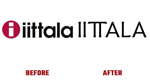
Founded in 1881 in Iittala, Finland, the esteemed design brand Iittala has long been recognized for its pioneering contributions to avant-garde design and colored glass. Renowned for its collaborations with designers and artists, Iittala’s portfolio includes various kitchen and household items, from drinkware and plates to cutlery, cookware, and home decor. Among its iconic collaborations is the Aalto vase, designed by Alvar Aalto in 1936, which remains a symbol of modern Scandinavian design.
Now, stepping into a new era under the creative direction of Janni Vepsäläinen, Iittala has introduced a refreshed brand identity designed in collaboration with Aleksi Tammi. This move signifies a renewed commitment to innovation while honoring the brand’s rich history. The new identity comes when Iittala expands its expertise beyond glass to include ceramics, metal, and a broader array of household items, reinforcing its position as a comprehensive provider of modern living.
The transformation of the Iittala logo – a symbol that has carried the brand’s legacy since its creation by Timo Sarpaneva in 1956 – marks a significant shift. Sarpaneva’s design, emblematic of the 1950s and 60s corporate design ethos, combined geometric sans-serif typography with a minimalist aesthetic. This logo not only represented the brand but also became an integral part of Iittala’s products, to the extent that consumers often chose to keep the logo sticker on their items as a badge of quality and authenticity.
In contrast, the new logo embraces contemporary design trends while seeking to maintain a connection with Iittala’s traditional values. The redesign skillfully navigates the challenge presented by Iittala’s unique letter combinations, crafting a logo that stands out for its creativity and balance. The use of widened glyphs for the “II” and “TT” pairs alongside the naturally broad “A”s and “L” creates a distinctive visual rhythm. Flared serifs add a touch of luxury and daring, bridging the gap between Iittala’s historical elegance and modern aspirations.
The updated Iittala logo reflects a broader shift in the brand’s visual identity, aiming to resonate more closely with contemporary aesthetics and consumer expectations. While the change has sparked mixed reactions from the brand’s loyal following, it represents Iittala’s forward-looking vision and dedication to evolving.
This rebranding effort extends beyond the logo itself. The newly designed wordmark, developed in collaboration with Tammi and Letters from Sweden, transforms into a full typeface that embodies elegance and a sense of history. With its unique details and chiseled appearance, this typeface complements the new logo, enriching Iittala’s visual narrative.


