


 UIC Flames Logo (Illinois-Chicago Flames Logo) PNG
The Illinois-Chicago Flames logo reflects the University of Illinois at Chicago’s fiery spirit and sports interests. The modern style showcases the club’s primary colors and characteristics, emphasizing its affiliation with the university in its name.
Illinois-Chicago Flames formed within a large urban university without early facilities or long traditions. Athletic activity dates to the 1880s, when the College of Physicians and Surgeons fielded football and basketball teams in “red and iodoform.” The modern basketball program began in 1947 and spent years in the NAIA.
In 1981, the university entered NCAA Division I as Chicago Circle, without a nickname or conference. A year later, the University of Illinois at Chicago Circle merged with the University of Illinois Medical Center. Students chose the name Flames, referencing the Great Chicago Fire of 1871, and adopted red and dark blue from the city flag.
UIC became a founding member of the Association of Mid-Continent Universities in 1982 with Cleveland State, Northern Illinois, Wisconsin–Green Bay, and Wright State. In 1983–84, the team won the Mid-Continent title with a 12:2 record and reached 22 wins. Under Stanley Hallberg, UIC added three straight titles from 1992 to 1994.
In 1994, the program moved to the Midwestern Collegiate Conference, later known as the Horizon League. The program made its first NCAA Tournament appearance in 1998, under Jimmy Collins, against Florida. The program returned in 2002 and 2004, with 24 wins in the latter season. Collins led the program from 1996 to 2010, recording 218 wins.
Baseball produced Curtis Granderson, later an MLB All-Star and the 2016 Roberto Clemente Award winner, who donated $5 million toward a stadium. Women’s softball reached the Women’s College World Series in 1994, while volleyball won four AIAW titles from 1972 to 1975.
In January 2022, UIC announced it would join the Missouri Valley Conference, alongside Drake, Loyola Chicago, and Missouri State, with play starting in July.
Meaning and History
The last two versions of the Illinois-Chicago Flames logo are very similar. The designers made no changes other than modifying the palette. Now, it closely matches the university’s official color scheme, which includes dark blue and red similar to those of a fire truck.
What is Illinois-Chicago Flames?
The Illinois-Chicago Flames (more precisely, the UIC Flames) are the University of Illinois at Chicago’s sports program, comprising 18 student teams. They compete in NCAA Division I. As of the 2022-2023 season, all participants are members of the Missouri Valley Conference. Two men’s teams compete in the Southland (tennis) and the MAC (swimming and diving).
1965 – 1982

Before adopting the Flames name, the university’s athletic teams represented the University of Illinois at Chicago Circle. The Chicago Circle campus opened in 1965, bringing the abbreviation UICC into use. The teams were briefly known as the Chikas before switching to Chicago Circle.
From 1965 to 1982, the university used a red lettermark made of four angular blocks. Narrow white cuts defined the “U,” “I,” and two “C” letters. The sans-serif forms had 90-degree corners, with their upper and lower edges aligned horizontally. The logo consisted solely of the abbreviation.
The merger of two university campuses in 1982 led to a new athletic name. Students supported “Flames,” connecting the teams to the memory of the Great Chicago Fire of 1871. The university later broadened the name’s meaning to include Chicago’s recovery, the city’s transformation, and the revival of urban life. The official athletic name combined the UIC abbreviation with Flames.
1982 – 1996
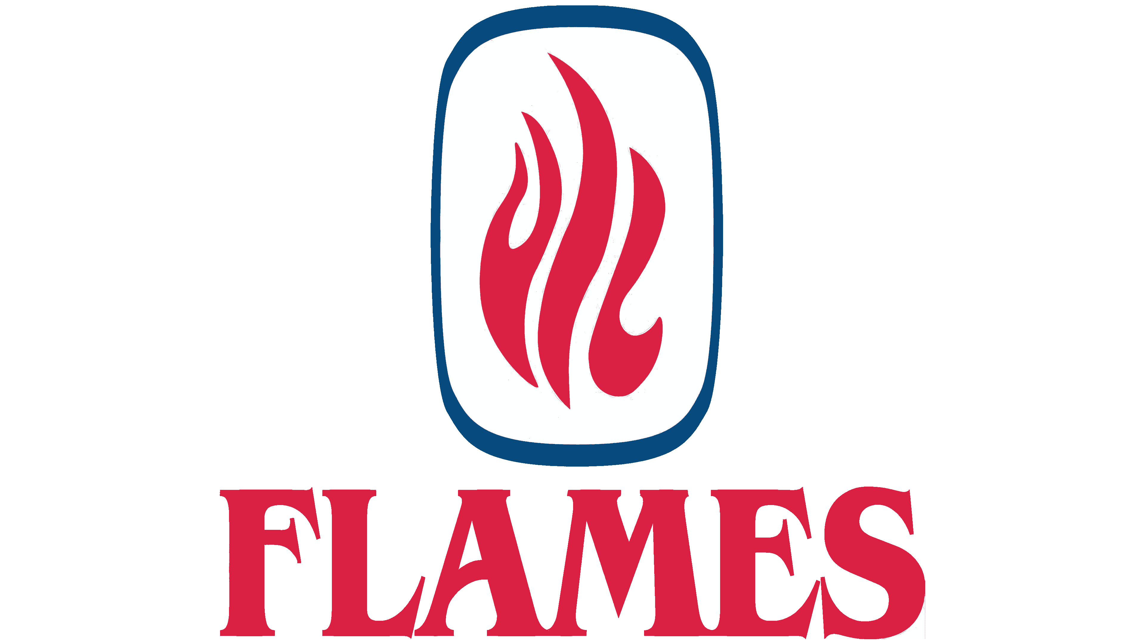
UIC replaced UICC after Chicago Circle merged with the medical campus in 1982. The university’s name change was reflected in the athletic emblem, where the three letters took the form of flames. The university paired its fire symbol with red “FLAMES” lettering to identify its athletic teams.
The red flame appeared inside a tall blue frame with rounded corners. White gaps separated the fiery shapes, whose curves formed “UIC.” Beneath the frame, “FLAMES” appeared in red uppercase serif letters. The vertical emblem and horizontal wordmark formed two distinct parts of the logo. The emblem remained in use until 1996.
A fire-breathing dragon mascot extended the fire theme. According to university lore, it hatched on October 11, 1986, from a large egg discovered several weeks earlier in the Pavilion. The costumed character represented the Flames at sporting events. The university’s red and blue colors connected it to the teams’ uniforms and emblems.
1996 – 2010
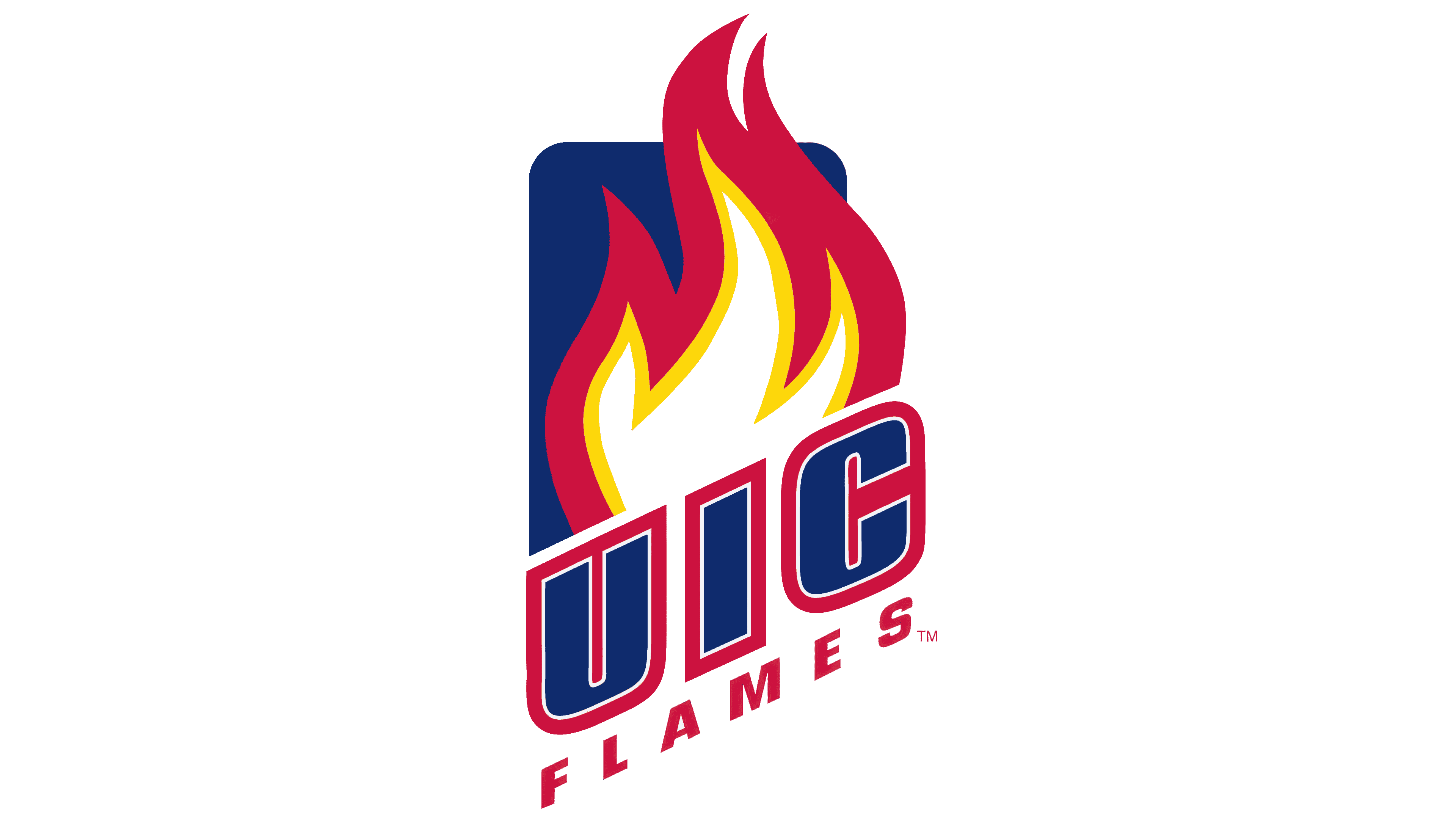
The 1996 UIC Flames update combined a tall flame with two diagonal lines of lettering. Large blue sans-serif “UIC” letters crossed the lower portion of the flame, rising from left to right. Widely spaced red “FLAMES” lettering followed the same diagonal beneath them.
The background was a blue shape with a flat base, vertical sides, and rounded upper corners. Red flame tips extended above its upper edge. Within the red silhouette, a yellow layer surrounded a white core. In the original version, white and red outlines framed each UIC letter separately. This version was used from 1996 into the early part of the following decade.
2010 – 2015
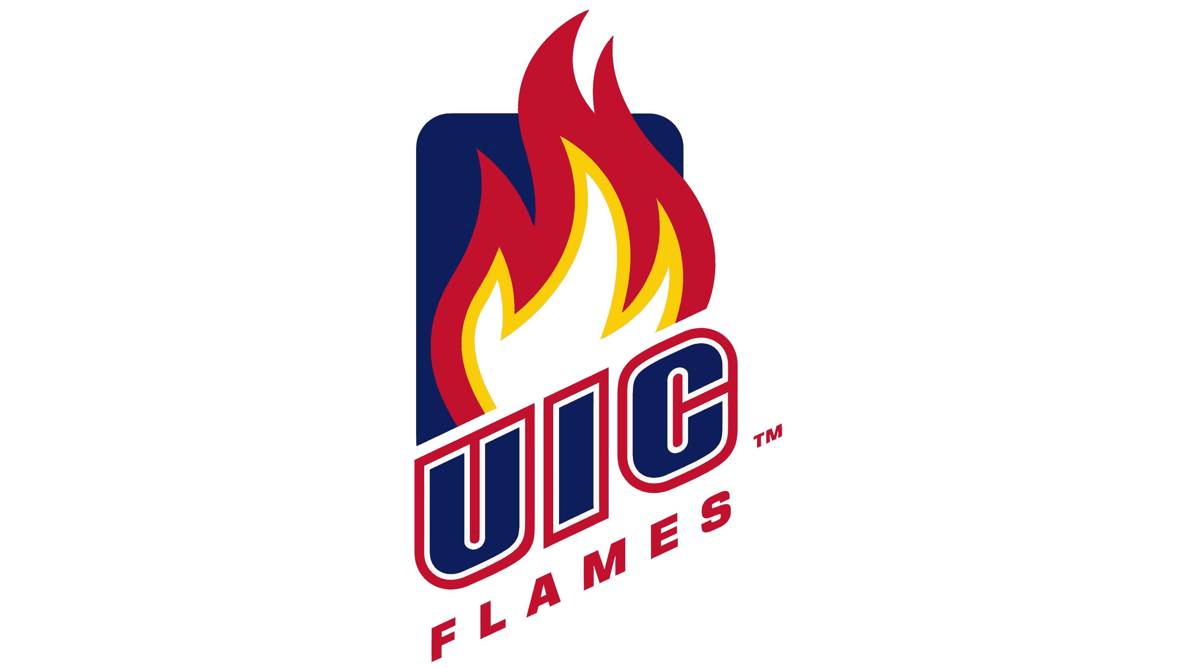
The next UIC Flames update united the initials within a shared red outline. The lettering became a single block, with adjusted proportions. All parts of the emblem retained their positions.
Some of the flame’s curves were revised. The fire remained against a blue background, with a white core surrounded by yellow.
2015 – 2020
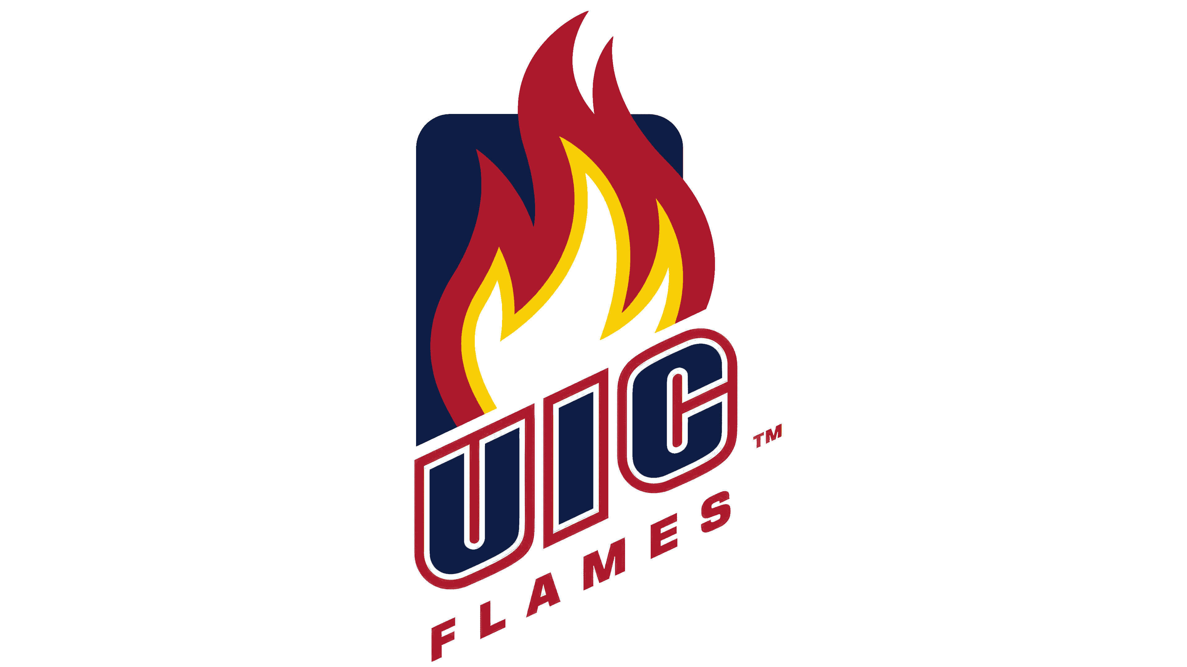
The final multicolored version of the UIC Flames emblem introduced revised shades. The red shifted toward burgundy, and the blue became darker. The arrangement remained unchanged. The flame rose above the diagonal UIC abbreviation, with “FLAMES” beneath it. The emblem remained in use until the 2020 update.
2020 – today

The slogan “For Chicago” connected the updated UIC Flames identity to the city’s history and its recovery from the fire. In October 2020, a standalone, slanted UIC abbreviation already used in the university’s athletic branding became the primary emblem. The full identity system was introduced on December 9.
Three heavy blue letters replaced the flame, background frame, and “FLAMES” wordmark. They appeared on a horizontal line while retaining their rightward slant. A white outline separated the lettering from a shared red border that followed its contours. The rounded lower portions of the “U” and “C” were paired with straight, angled strokes. The red and blue shades were adjusted along with the emblem.
Senior Associate Athletic Director Dan Yopchick and Director of Brand Advancement Kyle Decker led the work. Contributors included designer Laura White, designer Darius Thomas, Doron Tamari, and the team at 4FRONT. Preparation included discussions with students, student-athletes, alumni, coaches, university staff, and adidas representatives.
A red script “Flames” wordmark complemented UIC on alternate uniforms and team apparel. The capital “F” had a long lower curve, the lowercase letters were connected, and the “s” terminal extended into a long underline. Both logos had versions for light and dark backgrounds. The approved artwork included white and colored outlines, which had to be retained when reproducing it.
The primary colors were named Fire Engine Red and Navy Pier Blue. Red Pantone 199 C connected the identity to the fire theme. In comparison, dark blue Pantone 2758 C recalled the university’s Navy Pier campus. Supporting colors reflected other aspects of Chicago’s history and the university’s athletic heritage. Chicago Blue referred to the city’s flag, while Steel Gray represented industry, the elevated railway, and skyscrapers. Expo White recalled the white facades of the 1893 World’s Fair, and Champions Gold represented athletic victories.
On January 28, 2021, the university introduced an updated Sparky. The dragon carried on the fire theme after the flame was removed from the primary logo. His backstory described his birth from the embers of the Great Chicago Fire. At the same time, his smile conveyed friendliness and a welcoming spirit toward university visitors.
Font and Colors

The main symbol of the Illinois-Chicago Flames team is a blazing flame with scarlet and yellow stripes. Below, diagonally, is the acronym “UIC,” representing the University of Illinois at Chicago, and the nickname “Flames.” Both words are written in a sans-serif font.